


There are plenty of studies that discuss the gender pay gap. But as a data practitioner, I find those studies a bit frustrating. Not because I reject these pay gaps, but because the studies don’t allow people to dig into the data to better understand exactly how this trend manifests itself.

To address this frustration, I decided to get into the relevant datasets to explore them, let them speak, and understand a bit better exactly what we mean when we talk about the gender pay gap.
Finding Salary Data Is Not Easy
The first and perhaps most important thing I discovered was that finding good data about salaries is a challenge. People are still not keen to share what is considered to be very private information. Some regulatory bodies (like the Government Equalities Office [GEO] in Great Britain) are slowly beginning to require salary reporting, which is, in my opinion, a good first step in addressing the gender pay gap; however, they certainly do not make that data public.
Additionally, websites like glassdoor.com let people willingly share some information about their earnings. But very often, those comments are anonymous; and on top of that, the data belongs to Glassdoor and thus cannot be freely used.
Coming from a financial background, I used to work a lot with the yahoo.com website. Yet it’s only recently that I noticed among the information published from the listed companies’ quarterly reports, one can also find a list of key executives, their titles, their year of birth, and sometimes… their earnings!
Although we can argue that the listed companies in the U.S. represent only a tiny subset of the overall economy, and the list of key executives an even smaller subset of the overall workforce of the country, I thought it was a very good start to try and find at least some information on such a sensitive topic.
So with one Python script to make requests to Yahoo and using the visual recipes from Dataiku, I gathered a dataset of public information from 5,427 listed companies, including the details of about 25,000 key executives, 11,000 of which shared details on their compensation packages.
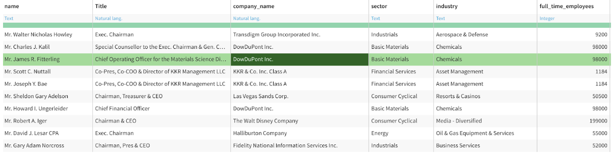
Here is a list of the top 10 most-paid men in this dataset:
 And a list of the top 10 most-paid women in this dataset:
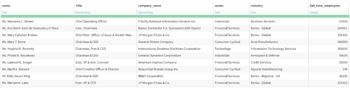 Although the existence of this dataset seems quite promising, I was not sure about its significance — would it really be representative of the U.S. economy such that any results prove relevant?
After some necessary cleaning and enrichment (like adding data from a ticker to retrieve the company name and industry), I had confirmation that this snapshot — although not perfect — represents the U.S. economy well enough.
Indeed, I found that financial services, healthcare, and technology are among the most predominant sectors in this dataset both in terms of headcount and also in money paid in those sectors.
A Hypothesis: At the Top, Inequalities Should Be Less Visible
Before really getting into the data, here is a common hypothesis that I read quite often in the news: at the top of the workforce, if you are really good, you are going to get picked up. Either by way of promotion into a higher position for the company you are working for, or hired by the competition.
In that sense, in theory, the number of women listed in this dataset should be a bit higher than the 30% in executive positions. Also the gender pay gap should be less than 25% for the same principle: if you are really good, you can get a better compensation package at the competition.
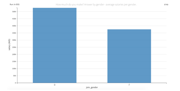
It was with a bit of surprise, embarrassment, and disappointment that I realized my hypothesis was knocked out before the end of the first round. All across the board, you can see that women in this dataset are actually way below the 20% watermark — not even close to my hypothesis that the pay gap for this group should be less than 25%. 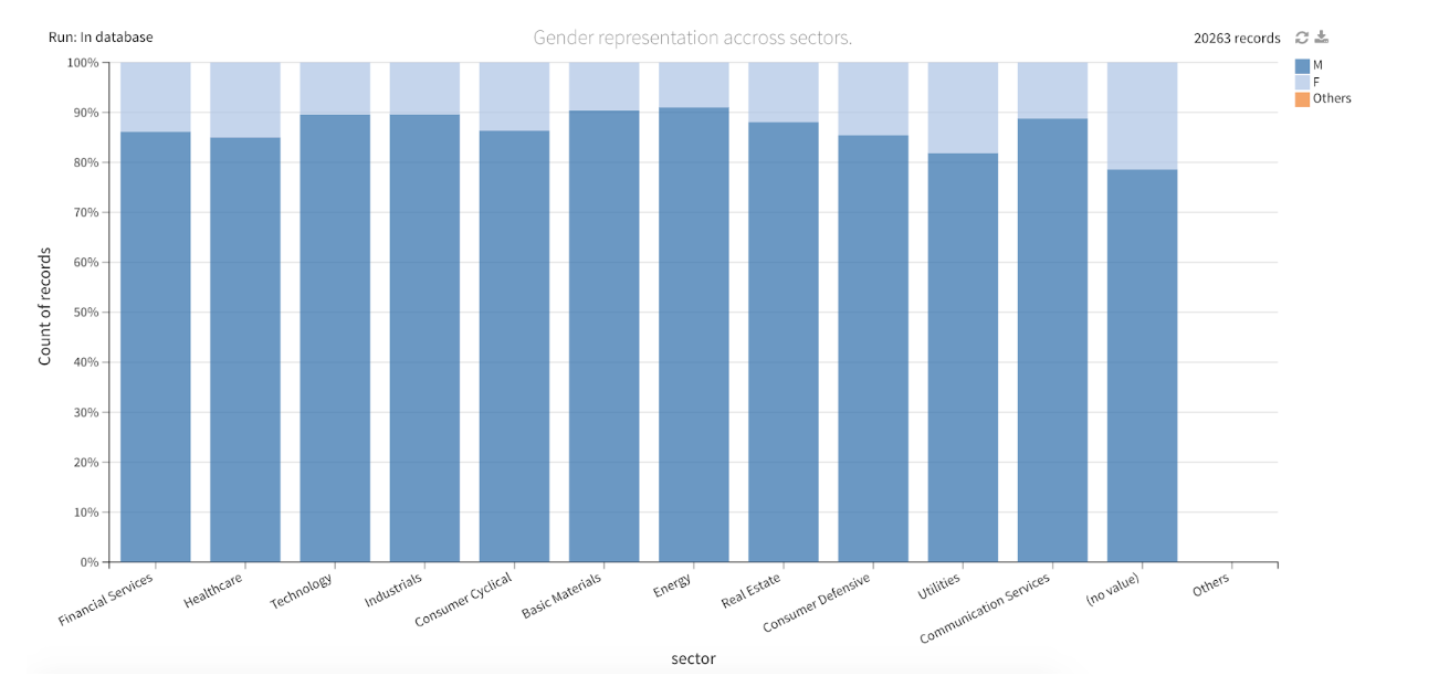 Overall, women only represent 12.5% of this dataset. Although this figure is quite disappointing, it is really important to remember that this is a very specific snapshot of the key executives reported by listed companies.
So Where Does the Money Go in the End?
Another big surprise for me in this data was the gap between the key executives themselves. A CEO earns in average of five times the salary of a VP. One figure I found that was crazy to me is that among all the $10.3 billion distributed in compensation, 53% was shared between the CEO and CFO. Meanwhile, this data showed that an Exec VP earns an average of $943,000 annually, while a VP will pocket a humble $555,000 this year on average.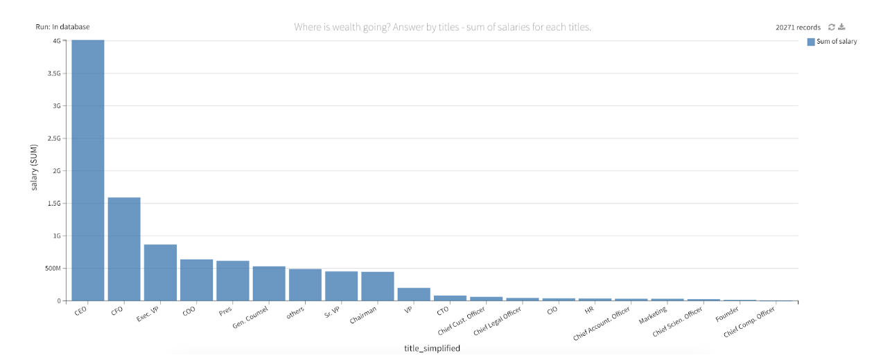 What about women in that story?
I was pleasantly surprised to see a couple of outliers in the Exec Chairman group and also among CIOs. However, overall, the data showed that women on average earn about 10% less in every single job title category.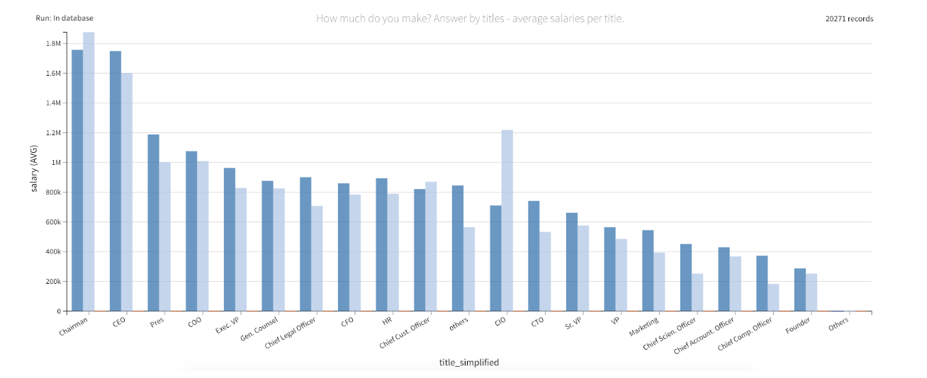 I first thought that my hypothesis was validated: at the very top, women have access to the right level of information, which makes it more difficult to offer them a less attractive package. But then I looked at things from a different perspective.
If the previous hypothesis is true, then how can I explain this huge gap between what males and females in this dataset are earning each year? The devil is in the details.
What the previous chart actually shows is that once a woman manages to reach the top of the scale (remember that they are only 1 out of 10), they earn 10% less on very common and valuable titles at the top of the chain — the likes of CEO, CTO, Exec Chairman, CFO, etc. But what about the “other” category? Where I did put titles that are less meaningful at that level of management or titles that are very specific to a sector (Portfolio Manager, for instance)?
For these “other” titles, men on average will earn $850,000, and women $565,000. That’s 40% less. Just because. Of course, it is again just a small subset of the reality in America, but this is the only true source of information I managed to collect on the matter.
And this is just at the top of the scale. At the end of the day, we are talking about people making about $500,000 (or more) a year. Not that I think this is ok, but one could have imagined that at this level, it is easier to get fairly compensated — otherwise you would go to the competition.
Imagine what we could uncover with more access to data on this topic, including data for non-executives (who likely have less access to information and fewer job opportunities and demand from the market)?
What About Age?
There is a recent trend among young workers like myself saying they want to work as hard as possible right now to be able to retire early — it is called the FIRE movement. It is an extremely seductive idea in line with the next generation’s expectations: willing to dedicate life to experiences and less to careers and professional choices.
However, it is worth noting that at this level of management, you start to truly bank your investment in your career when you get above 40 years old:
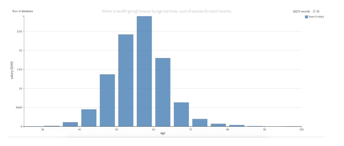 Maybe there is some middle ground to explore between going full FIRE and not turning back on a huge pile of money that could, for sure, guarantee you easier days in 15 years.
A Slight Shift in Mentality, but Still Too Early to Draw Any Conclusions!
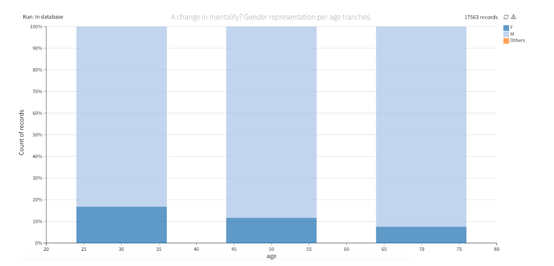
Cliché, so cliché. Even at the top of the chain — HR, marketing, compliance; is that all we have to offer to women?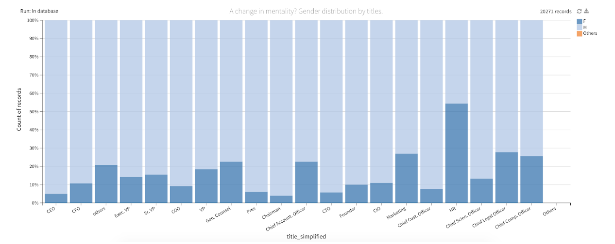 However, looking at the same data with the bias of age, there are some promising signs that tend to confirm that we should keep talking about this issue as much as possible.
Here is a representation of the number of women in this dataset by age. The highest representation percentage-wise is in the 20- to 40-year-old slice, which is encouraging.
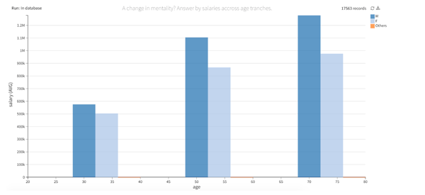
And this tends to be confirmed money-wise as well.
To Conclude
If you want to make some serious cash next year in the U.S., here is your game plan:
- Become an Exec VP, CFO, or CEO — “Founder” is not enough.
- If you are young, don't rush; wealth comes with time. Focus on the right career choices rather than the short-term money gain.
- Be a man.
On a more personal note, it would be interesting (or very scary) to see how ethnicity is represented in this dataset. An improvement to this analysis could be to try to identify ethnicities based on listed names. One could train a deep learning model on the characters of a dataset of first names and make some inferences here. If you are willing to try, contact me at alexandre.hubert@dataiku.com, and I’ll share either the data or the yahoo scraper. You can also use Dataiku for free to do your analysis.