Note: This blog post contains screenshots from an older version of Dataiku, though all of the functionality described still exists. Watch the on-demand demo to take a look at the latest release of Dataiku in action.
Running predictive models is pretty easy in Dataiku DSS. In a few clicks, you have the ability to predict a variable from the data you have. Once you have tried, you will never see your data the same way. You will want to try with anything. Find out how I used Dataiku DSS to predict who is most likely to survive the Titanic shipwreck.
This blog post is the second one of a series. In the previous post, I imported the train dataset containing information about 891 passengers of the Titanic. The idea is to find out what sorts of people were most likely to survive the shipwreck.
The initial exploration of the dataset with Dataiku DSS already gave us a good overview:
- 342 out of the 891 people in our dataset survived.
- Being a child or a woman strongly increased one's chances of survival.
- Being from an upper-class background also increased chances of survival.
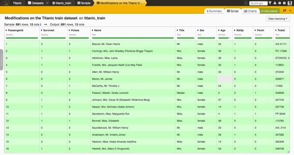
In the screenshot below, you can see the dataset we are going to use for the predictions. Remember that we have generated a new column with the title of each passenger.
What's a Predictive Model ?
The next step is definitely the coolest part of our work. The goal is to predict the Survived variable (1=survived, 0=deceased) of a passenger. We want to find a model that gives the best predictions.
A variety of models can be used, which apply various statistics and machine learning techniques. Basically, a model would use all the information available about the passengers to learn what are the characteristics of a survivor. Then, it would output a decision (survive or not) for other passengers (that we would have kept with the objective of testing our model).
To select the best model, we score each one. Two famous metrics are:
- Accuracy: proportion of correct predictions (total number of "good" predictions divided by the total number of predictions)
- AUC: the Area Under the ROC Curve (from 0.5 for a random model to 1 for a perfect model)
Before going further, let's illustrate with a basic case what can be a model. (If you already know what is a predictive algorithm, just skip this section.)
If we keep only the Survived, Age and Sex variables of our passengers and from what we saw in the previous example (ie. using our own common sense), we could create a simple decision tree to predict if a passenger is likely to have survived or not:
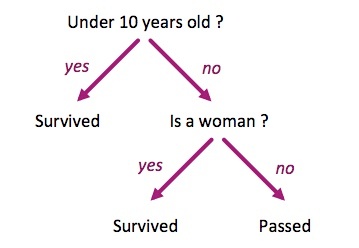
If we apply this algorithm on a sample of our dataset, we would get something like that:
| Age | Sex | Survived | Prediction | |
|---|---|---|---|---|
| 40 | male | 0 | 0 | -> good prediction ! |
| 18 | female | 0 | 1 | -> bad prediction |
| 24 | female | 1 | 1 | -> good prediction ! |
| 7 | female | 1 | 1 | -> good prediction ! |
| 47 | male | 1 | 0 | -> bad prediction |
The prediction accuracy of this sample is 0.6.
It is a really basic and naive predictive model. We can expect a bad accuracy score if we run this model on the full dataset. Plus, remember that we have 20% of missing data for the Age variable. Because our algorithm doesn't handle this case, we are already sure that the accuracy cannot be better than a 80%.
The Kaggle website actually published a tutorial to build a similar algorithm with Excel. Even though it is really not a great way to run predictions in reality, it is good to practice.
Running the First Prediction
The Data Science Studio provides four predictive models for running a classification of this kind within our intuitive graphical interface: Logistic Regression, Random Forest, Support Vector Machine and Stochastic Gradient Descent. The studio will automatically choose the best parameters for you, which is great when you are a beginner like me.
Let's run our first predictions with the default settings and then explore what we get.
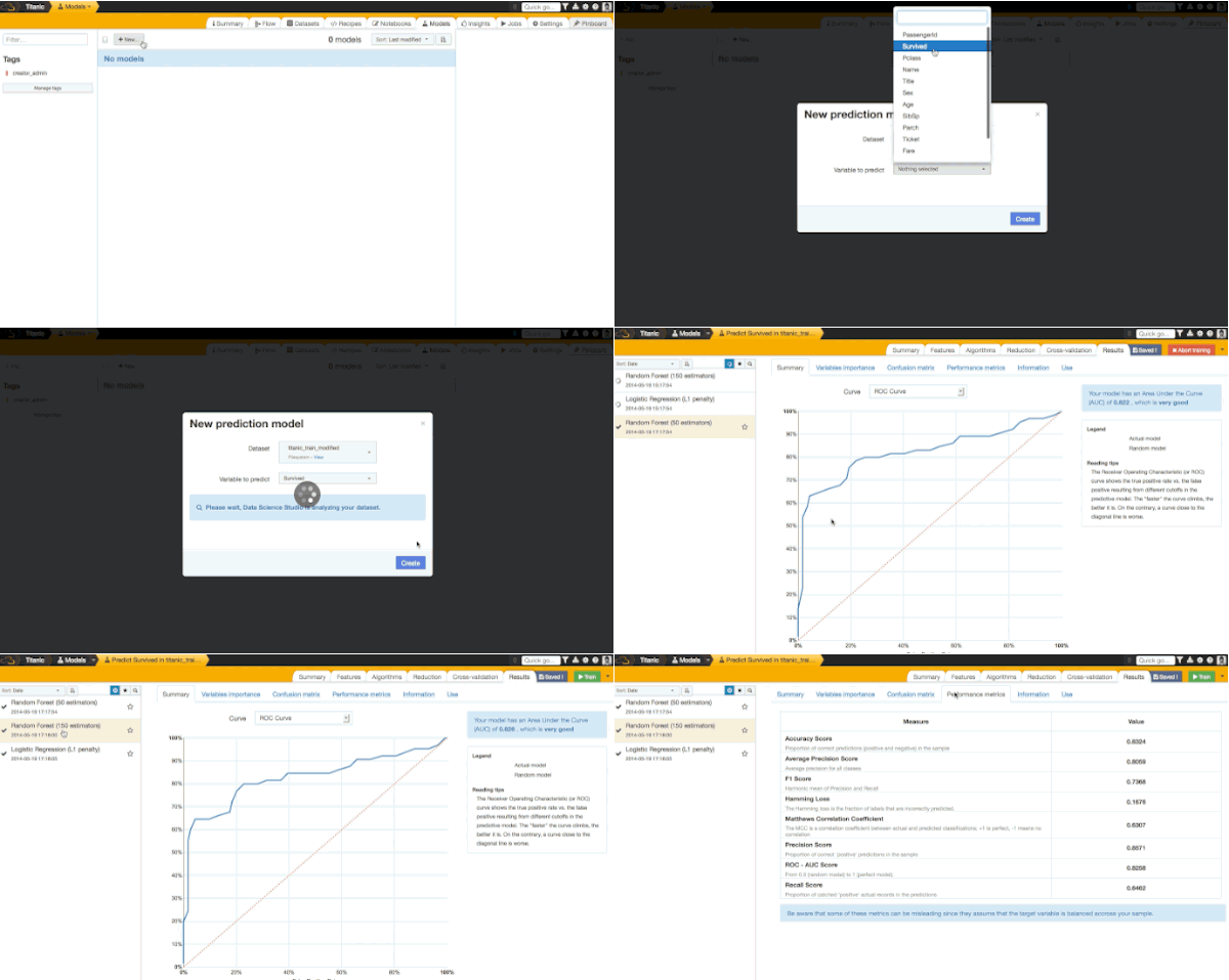
By default, three models were run with adapted settings: two with the Random Forest algorithms (with different parameters) and one with the Logistic Regression. Let's explore results of the second Random Forest model.
We get an accuracy score of 0.8324. It means that our model would predict well survival for 83% of our passengers (it was calculated on a different sample, there is more about it later in this post). It is quite a good result, isn't it?!
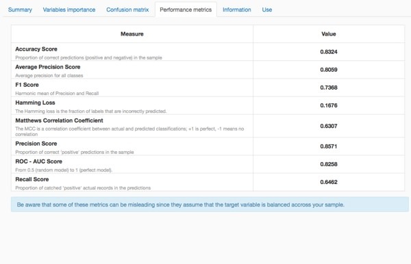
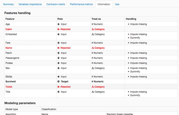
The studio automatically pre-processed the data before modelling:
- Some variables with no relation to the variable we're trying to predict (such as the Name) were automatically thrown aside.
- It created dummy variables to measure the effect of each value of some variables (Sex and Title for instance).
- It inputted missing values for the numerical variables (Age).
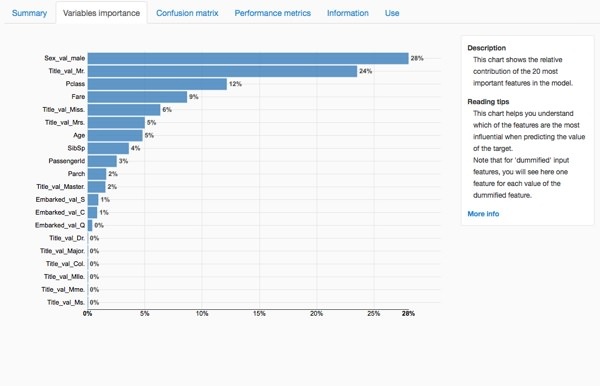
The chart of variable importance highlights the variables that the algorithm used the most to decide whether each passenger would have survived or not. In our case, the most important elements are: male , Mr. , passenger class, fare and Miss. It seems to reinforce our first analysis from the previous article.
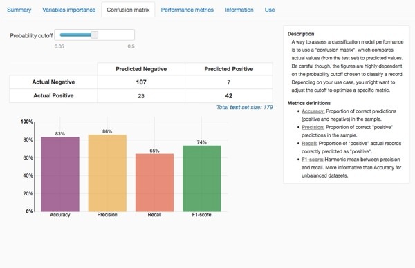
The confusion matrix goes further in the understanding of the predictions. It compares the repartition between the actual values of survival with the predicted values.
A Bit of Personalization
In order to have a better model, I decide to make some changes in the default parameters chosen by the studio. I drop the PassengerID column (not meaningfull at all for the prediction) and dummify the passenger class variable to count the separate impact of each value.
One last thing you need to know: only 80% of the passengers in our dataset were used to train our model and 20% were kept to test the model. This technique is known as cross validation: we score the model on a different sample that the one used for the training. It's a good practice in order to detect overfitting (one of the worst nightmares of a data scientist, I was told).
When you are done with your model training, you should use the full dataset to obtain the best model. Let's do that.
First Submission on Kaggle
As said in the previous post, the Titanic problem is part of a competition on Kaggle. Up until now, we had used a dataset of 891 passengers for whom we know whether they survived or not. Kaggle provides another dataset of 418 different passengers without revealing if they survived or not. The challenge is to run our model on this dataset, to export the result in a CSV file, and then to upload it on the website to get a score.
Let's download the test.csv file and upload on the studio. In a few clicks, we apply the same modifications we did before. Once done, we apply our model to the new dataset. A new column appears in the dataset: predicted values.
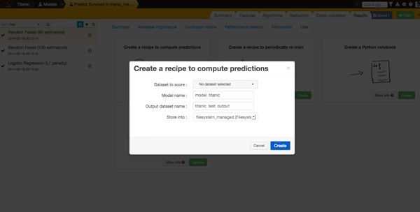
For these 418 passengers, we now have predictions about the survival. This is the moment you really feel the power of Data Science :-)
The last step is to export the results as a CSV file and to upload it on Kaggle to get a score.
And the result is... 78% of our predictions were correct on this dataset. This is quite good!

Making our first predictive machine learning model in Dataiku DSS wasn't too complicated, was it?


