


For many organizations, the most difficult part of a data project is not the collection of the data, but rather the ability to extract actionable insights in a scalable way and in a specific time frame (especially for critical operations).
This problem was at the center of the challenge organized by the NATO Innovation Hub, which was sponsored by the Allied Command Transformation. The challenge asked the participants to provide a solution for "Data Filtering and Fusing, Visualization, and Predictive Analytics” in an imaginary assistance mission scenario for a disease outbreak in a landlocked country, leading to a public health crisis complicated by the emergence of rebel groups attacking medical supplies.
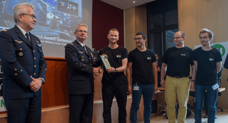
Dataiku participated in the challenge, delivering a pitch in Paris on May 29th, and we’re happy to announce that we won two of the three prizes that day (and were awarded these prizes by the Supreme Commander of ACT himself!).
This blog post will delve into the approach to the challenge, the model submitted, and the methodology used.
The Philosophy
In order to approach the challenge, we created a team mixing a fictive commanding officer with a data scientist to show how teams can leverage operational expertise with technical expertise to come up with actionable insights.
The overall philosophy of our approach was to highlight that predictive analytics as a tool can enhance human knowledge and expertise to understand how and why certain solutions are effective rather than a black-box experience where a model spits out a result that cannot be easily explained. Indeed, when it comes to critical operations (such as a peacekeeping intervention), it’s essential to understand what lies behind the insights on which you base your decisions.
For the challenge, we also wanted to show how quickly our solution could be designed, because we wanted to propose a solution that would be viable in real-life situations where time is of the essence.
The Data
Since no data was provided, we had to simulate own data environment. We decided to illustrate how we could both enrich our own fictive operational data (mostly satellite imagery) as well as combine it with enriched open-source data.
Therefore, the datasets we used were:
- Cars Overhead With Context (COWC), which contains overhead imagery for mostly urban environnements. It also contains images of countryside (with large crop fields) and industrial areas. The dataset’s images were coming from Toronto (Canada), Selwyn (New Zealand), Potsdam (Germany), and Utah (USA). Because the imagery contains both urban and countryside situations, the resulting solution could be adaptable to a wide variety of environments.
- (Fictional) TripAdvisor data, which gave us an interesting way to detect weak signals on the progression of the disease by using the statistics of the attendance at restaurants.
- OpenStreetMaps, because we imagined that country members of NATO might not want to share raw satellite imagery data with other countries. So instead of that, we displayed detected objects on a non-sensitive OpenStreetMap map.
- Twitter, so that we could analyze every message sent on the platform within a designated perimeter using Natural Language Processing (NLP) methods. We could extract things like general mood, what people are discussing, potential reports from alarmed citizens, or even the position of rebels.
- The GDELT database, which stores press release of most countries in real-time.
The Methodology
(For a more technical look at how the team tackled object detection for aerial imagery, read the post in Data from the Trenches.)
For the challenge, we tried to create models that would deliver critical support during operations by integrating different branches (medic, intelligence, operations, logistics, etc.), compensating for the scarcity of information collection systems, and taking a comprehensive approach thanks to the integration and fusion of different data types/sources.
Put simply, we wanted to highlight the ability of predictive analytics, data science, and machine learning to leverage human expertise in an evolutive way.
For instance, if our medic tells us that attendance in restaurants can be a weak signal of the presence of the disease in an area, we can use the data from TripAdvisor to generate automatically updated insights that will be pushed to our experts to back up their ability to understand, assess, and react to the situation.
It may also be very important to monitor the press and social medias in time of crisis. From the press we can get the general feeling, but also the latest on-the-ground developments that we may not be aware of:
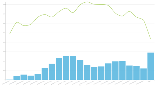
Figure 3: Press/Tweet volume and its average sentiment
All of this data combined was summarized in a single map chart.
The Result
The overall result stood true to the goal, which was to come up with a system that would not make decisions for people, but rather push the relevant information that can then help on-the-ground personnel with knowledge of the situation make good decisions.
Another positive result was the flexibility of the project, which could be adapted to work on multiple situations if conditions change or if other scenarios arise. In the long run, this saves resources (and more importantly time) and allows on-the-ground teams to remain agile.
For example, let’s say that during the course of operations, a new infection zone was detected. Since we already know the location of the units thanks to Blue Force Tracking, and that we can define geographical coordinates for the contamination zone, we can cross the two to determine which units have potentially been exposed (with a trust threshold that can be modified by the medic).
To illustrate another example of the agility of the developed model, we extended the scope and adapted our work to to detect ships from satellite imagery:
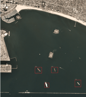
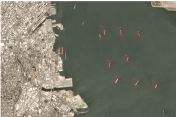
Figure 5: Detected ships on satellite imagery
This shows the real force of Dataiku: write a solution once, reuse it many times. The car detection algorithm was packaged as a plugin, and more importantly, it was made to be generic enough so that we can use it for any detection problem: satellite, aerial, but also images from the ground.
This isn’t the only time a Dataiku team has won a contest (#HumbleBrag) - see how another team won the Real-Time Crime Forecasting Challenge to predict crime hotspots in the city of Portland, Oregon put on by the National Institute of Justice (NIJ).