


This is part three of a series of articles, "Deep Beers Playing With Deep Recommendation Engines Using Keras." In Part 1, we created two explicit recommendation engines model, a matrix factorization and a deeper model. We found that we got a clear improvement when using a Concat layer as input to Dense layers instead of the Dot layer. More precisely, we went from 0.42 to 0.205 in MSE validation loss, so we basically cut the error by half. In Part 2, we focused on trying to interpret the embeddings of each models.
Part 3 is dedicated to improving the performance by changing the model architecture.
- We will first try to cross validate other architecture ideas, inspired by the Dot product and the Dense model.
- Then we will try to incorporate metadata in order to cope with the cold start problem.
- Finally we’ll come back to t-sne for nice visualizations.
Grid Searching the Architecture
The architectures of the models we have been working with so far are rather simple. You can check out the Part 1 article for more details, but it was either a dot product between user and beer embeddings or a two dense layers on top of the same embeddings. Now, we’re going to try to gain performance by modifying the network architecture.
Here are a few ideas I tried:
- Change the Dot/Concat merge layer by a Multiply one. The idea here is to keep the dot multiplication structure while relaxing the Dot layer so that the network can choose it’s own weighted dot product.
- The second idea is to try to improve the dot network by making it deeper. We may want to keep the final Dot layer for interpretability or speed in serving the predictions. The problem is that we cannot add a dense layer after the dot since we are left with only one scalar value. As a result, the only way to make the network deeper is to add dense layers before the dot product.
- Reuse the previous idea with other merge layers and create a network with two dense layers on top of the embeddings, a concat layer, and then other dense layers.
First Idea: Use the Multiply Layer to Merge Embeddings
Let’s make this a little more concrete. This is what the first idea looks like in Keras:
If you’ve read Part 1, this code is really similar to what we started with. There are a few modifications:
- Line 17: use of a Multiply layer instead of Concat or Dot
- Line 18: I started using some dropout to try to improve the performance.
- Line 14 and 15: changes relative to the second idea, which I will describe later.
Using keras.utils plot_model function, we can generate our model graph.
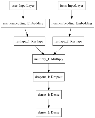 Schema of our "multiply" model
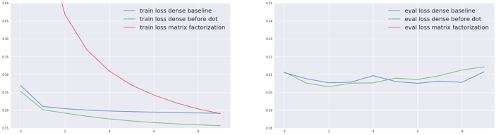
The following charts show the loss for different multiply architectures. I varied:
- the depth of the network and size of layers after the merge layer (one dense 128 or two dense layers (64,64) or three dense layers (128,64,32))
- as well as the presence of Dropout layers with 0.2 dropout rate after the Dense layers and (or not) the Multiply layer.
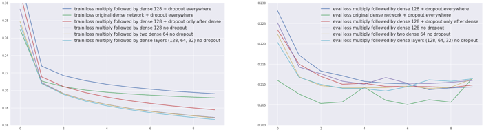 Training (left) and evaluation (right) errors for the two models.
- We can see differences depending on the presence or absence of dropout. The green and dark blue curves correspond to adding dropout after the Multiply or Concat as well as the Dense layers- the red curve to adding dropout after the Dense layers only (no dropout added to the others).
- It’s worth noting that compared to our baseline with a similar dropout pattern the Multiply layer leads to a higher training error (dark blue versus green).
- Adding depth does not change the error by much.
And when observing the evaluation error:
- For Multiply models, the lower the training error is, the lower the validation error is. Could we be under fitting ?
- None of these models seem to beat our previous benchmark (dark blue). This probably means that we have enough data for the network to be able to create its own merging function and that the constraint brought by the Multiply layer does not help.
So the Multiply idea does not work. Let’s move on and try the next architecture.
Second Idea: Improving the Dot Architecture
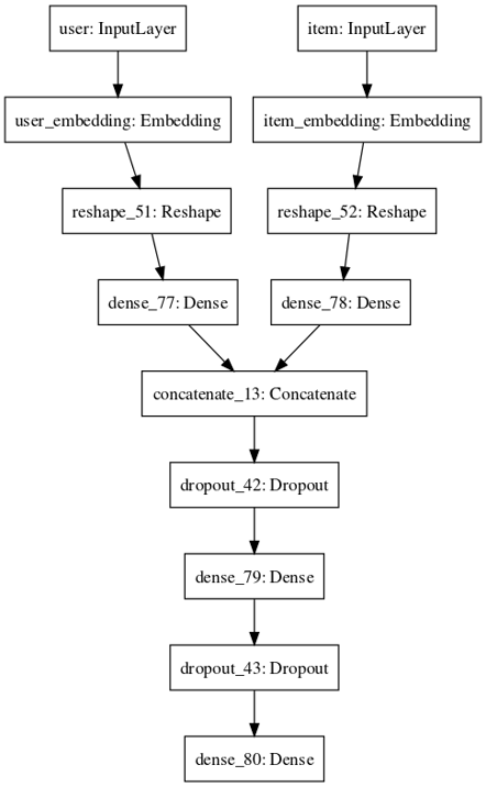
Since we cannot add dense layers after the dot product, we can add dense layers on top of the embeddings before merging instead. I call this adding “towers” to the models because somehow it makes me think of the Marina Bay architecture.
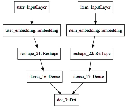 Schema of our "dense before dot" model
To create this architecture, uncomment the lines 14 and 15 in the code above and replace the Multiply by a Dot layer. I tried with a Dense 128 layer and no dropout and this is the comparative performance I got.
 Training (left) and evaluation (right) loss for the compared models
Adding these dense layers before the dot product works great. As expected, it improves drastically over the matrix factorization (the corresponding evaluation loss is out of the picture here because it’s around 0.4). But it also slightly beats the dense model, lowering the loss from 0.2051 to 0.2031. It’s also interesting to see that the evaluation loss is very similar to our dense benchmark, and goes even lower.
Third Idea: Applying “Towers” to Dense Models as Well
Since the “tower” idea works for the Dot model, it’s reasonable to try it on the dense one too.
We use dense 64 layers in the towers before the merge layer. This model gives us the best performance so far with an evaluation loss of 0.1997, our first model with loss under 0.2! Adding an extra dense layer after the Concat layer, or making bigger “towers” (for example with two 64 dense layers instead of one), leads to a small drop of performance.
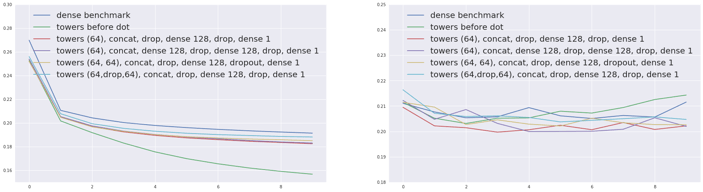 Training (left) and evaluation (right) errors for the compared models
As a result, our best model architecture is a dense layer on each embedding before concatenating them and adding two dense layers on top. Notice that the performance of all these models are still very close and we might start manually overfitting our internal test set.
 Our winning architecture so far
A Note on the Embeddings
In the previous article of our Deep Beer series, we showed that the Euclidian distance in beer embeddings made sense for matrix factorization models, but not for dense ones. This is still true for “tower” models. Models containing dense layers have non interpretable embeddings while we can still find meaning of Dot models embeddings.
Back to our beers now. It’s possible to look at the representation of a beer at several levels of the towers before the merge layer, at the input embedding but also at the values of the dense layer on top of it! For example, below are the closest beers to Chimay for embeddings of the “dense before dot” model.
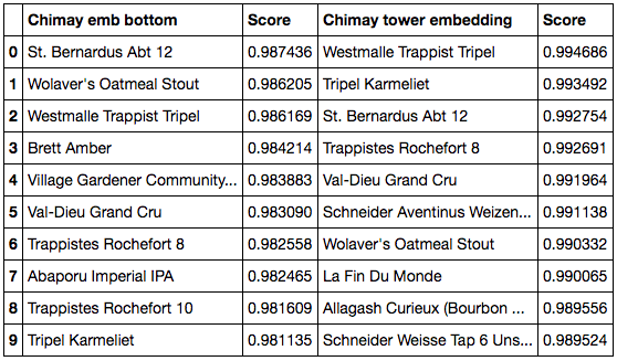 Cosine similarity closest beers to Chimay at the bottom (left) and tower (right) embeddings
Using Metadata
Why look at metadata?
In our original model we used the beer ratings as our input data (the userid, the beerid and the rating) to recommend beers. But we have also collected some metadata attached to the beers and the users, so we can use this to add more data to our model.
The beer data we have for this project looks like this for the beers:
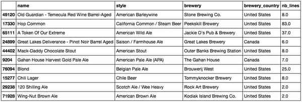 Head of the beer metadata dataset
and this for the users:
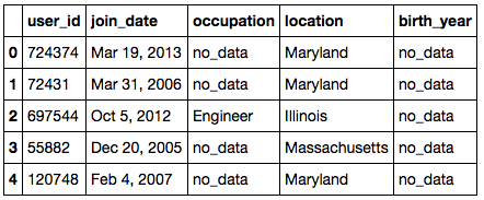 Head of the user metadata dataset
It would be a shame not to make something out of all the additional information we have.
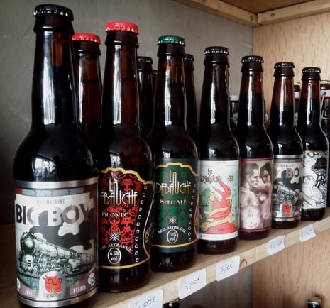
Why should we use metadata when we already have so many ratings? It will allow us to work around the cold start problem. Let’s say you have a new product that has not been rated yet. Collaborative filtering approaches (basically what we have been doing) will fail to recommend this item since they cannot rely on any data. On the other hand, a content based approach might just work. Let’s consider the Big boy, a French imperial stout brewed with chili (a really good one!) from the La Débauche brewery. There are no ratings on this beer, yet I can safely recommend it to people who like strong dark spicy beer.
The same idea applies to new users. Maybe we can provide better off the shelf recommendations if the user gives us his age and location fro example? The intuition would say yes. Instead of recommending the trendiest beer globally, we can recommend a popular one for 30-year-olds in Paris.
A system that uses both metadata and explicit or implicit feedback is called a hybrid recommendation engine. The good news is, it’s actually very easy to modify our existing architecture to make the most of the metadata.
Adding the Country Information
Let’s start with the addition of the country of the beer brewery.
The code is very similar to what we previously did, except for the third added input, the country. Notice there is also a country embedding representation that will be learned during training.
The model now looks like:
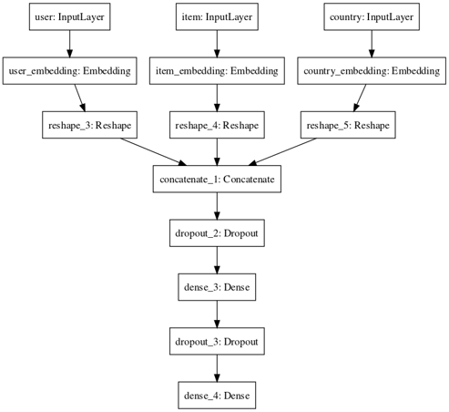 How to incorporate country metadata information
After training, we get a better MSE of 0.203, compared to the previous 0.205. This is a significant improvement since so far all our deep models performance were in the [0.200, 0.205] range.
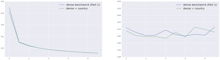 Training (left) and evaluation (right) errors for the compared models
More Metadata and Grid Searching the Architecture
Now that we have added the brewery country, we will add all the metadata we have, summarized in the following table.
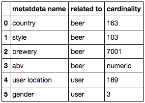 Cardinality of the metadata available
Notice we have three genders — that’s because I added a missing value category for each metadata column.
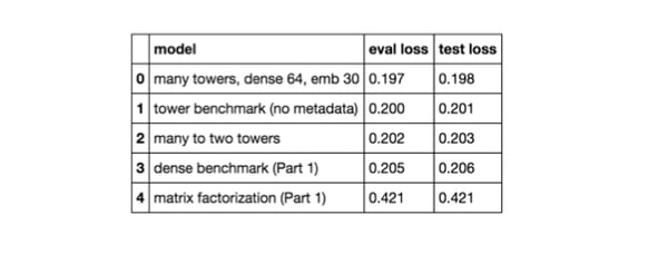
Since our previous experiments showed that the tower idea worked out, I chose to compare the following architectures:
- “no towers”: concatenate all embeddings together then apply dense layers.
- “two towers”: we concatenate all the information from the user on one side, and then all embeddings related to the item on the other side. We apply dense on these before concatenating again (and applying dense). In the charts below this is the “concat(tower user, tower beer)” model. We can also apply two dense layers between the two concat layers (“concat(2x tower user,2x tower beer)” model)
- “many to two towers”: this is the same idea as above except that we add a dense after each embedding before concatenating them in either user or item tower (“many to two towers” model).
- “many towers”: applying a dense on each embedding before concatenating them all (and applying dense). We do not force common embeddings for user and item anymore. These are the “many towers” models.
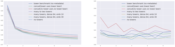 Training (left) and evaluation (right) errors for the compared models
For a fixed type of architecture, adding metadata improves the performance of the model a little.
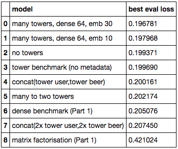 Our model's performance
Indeed, the “no tower” model improves over the dense baseline and the “many towers” (one possible generalization) over the tower benchmark. Grid searching around the latest architecture gives us our best score yet: 0.1968.
However, though at first creating two towers - one for users and one for beer - made sense, it seems that this strategy does not help improve our performance, with either two towers (concatenating all beer information and all user information in parallel) or many to two towers (apply dense for each embedding before creating the two towers). This may be due to overfitting since these architectures often contain more layers.
It is worth noting that adding metadata somehow allows us to use a larger embeddings size. I set the same number of dimensions for all inputs but this can be questioned. For example gender has only 3 possible values whereas brewery has 7001. I also observed that setting Dropout layer after the final merge improves performance while it does not when applying it inside the “towers”.
So what’s our best model architecture? This one! (Note that I seem to have forgotten a Dense on top of the country embedding for this model).
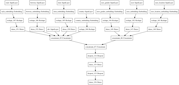 Schema of our best architecture
That’s it! This is the best score I achieved on this project.
However, a concern we could now have is: “Did I somehow manually overfit ?” Indeed, every time I found an idea that seemed to work well I followed it. We now need to check wether our results are reproducible on the test set. Below are the results.
 Though we have a slight drop of performance in our models, the good news is, our results are consistent and extremely stable. No sign of overfitting here!
Yet Another Note on the Embeddings
Though the “many to two towers” is not the best performing model, it has the advantage of having parallel intermediate embeddings (beers and users) containing metadata information that can be visualized.
Let’s start with the closest beer to Chimay. Below, the left column represents the closest beers to Chimay in the beer embedding space at the bottom of the network (just after input), while the columns on the right shows the same thing for the item embedding just before the merge with user information.
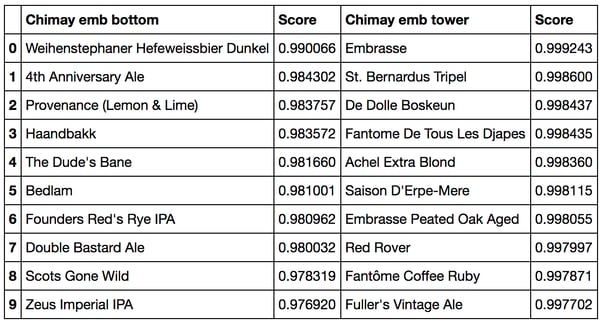 Cosine similarity closest beers to Chimay at the bottom (left) and tower (right) embeddings
Interestingly, this time the first list (left) does not make much sense whereas some structure can be found in the second one (which contains mostly Belgium beers). This may be because the information that I consider structured, such as the style or the country is now already included in the style and country embeddings. As a result, the input beer embedding probably tries to catch the additional information, which leads to non-interpretable results.
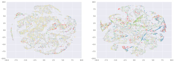
It’s difficult to find any structure directly in the embedding of the beer, perhaps for the reason mentioned above. However, we can find some in the dense layer created from the concatenation of the beer and its metadata embeddings. Let’s have a look at the t-sne representation of this layer. Since t-sne computation time would not be tractable for the whole dataset, I chose to sample the 10.000 most rated beers on one side, and the 10.000 least rated beers on the other side. Below are the corresponding t-sne representations, colored by average rating.
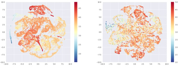 Wow, that t-sne looks good! Left: 10,000 most rated beers, Right: 10,000 least rated beers, Color: Average rating
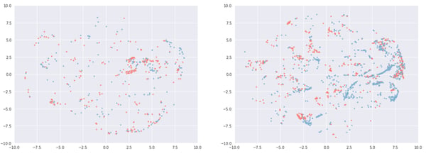
Note that since the embeddings include information from the ABV - the style the country and the brewery - we should expect the second dimensional map not to display perfect separations between all axes (ABV, style,…).
When we display the average rating on the map, both graphs exhibit structure. This structure is more explicit on the left side (beers with numerous ratings).
For the ABV (bellow) however the structure is clearer on the right side. Note that the ABV is still correlated with the average rating, and that beers with a lot of ratings are in general stronger.
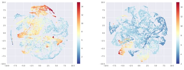 Left: 10,000 most rated beers, Right: 10,000 least rated beers, Color: ABV
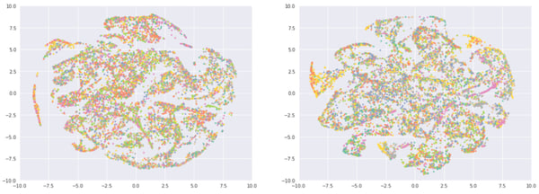
In the following maps, colored by beer country, there is a clear variability in the country distribution. This is due to the fact that we have a large US user beer drinking population, who enjoy (and rate) US beers. We can see more clusters on the right side, with English beers in blue and German in red as well as one in the middle (Australia in green).
 Left: 10,000 most rated beers, Right: 10,000 least rated beers, Color: Country (Poor color choice and no legend, almost deserves a WTFviz)
To get a more precise idea, if we filter the beers coming from Germany or England we get:
We can see more clusters on the right side here. Remember that style, ABV or breweries also play a role. This means that we will probably never have perfectly separate clusters.
By now, you have probably guessed where all of this is going. It seems that embeddings on the left (popular) are more driven by ratings…, while the ones on the right (least rated beers) display more metadata clusters. Cold start anyone ?
Let’s end this by checking out style, which is more apparent in the right chart. On the left we can see orange and yellow clusters made of Euro Pale lager (think Heineken) and American Adjunct Lager (think Budweiser). On the bottom, we have a yellow and grey cluster of German Pilsener (like Beck’s) and English Pale Ale (London Pride). The bottom left (green) is mostly imperial stout (see also the red region in the ABV chart).
 Left: 10,000 most rated beers, Right: 10,000 least rated beers, Color: Style
I manually checked and could not find pertinent clusters on the left side map, but that conclusion doesn’t sound quite as serious as the rest of the article. So to back my theory with data, I tried to predict the country based on the x and y coordinates of the embeddings.
I used a random forest and kept only the top countries: USA, Canada, Australia, England, Belgium and Germany (the rest was grouped in “Others”). With the most rated beers (left map), I got a MAUC of 0.646 and the best one class AUC (predict one country vs the rest) was 0.681 for Belgium. For the least rated beers, I got a MAUC of 0.792 with a one class AUC up to 0.863 for Germany or 0.923 for Australia. So basically the embeddings on the right are more country oriented than the ones on the left.
I also tried to predict the country based on the presence of “stout” in the style name. I got an AUC of 0.722 for the popular beers and 0.778 for the beers rated only once. If we model the presence of “imperial stout”, the gap is similar with AUCs of 0.882 and 0.928 respectively.
I find this result fascinating because it means the following:
- for heavily rated beers, the distance between two beers is mostly driven by how well they are rated. The style or country of the beer has a marginal impact.
- for beers that have only one rating, the distance is driven by the metadata: abv, style, country (and probably brewery).
This illustrates a transition phase from a content based recommendation engine (no rating information, use of metadata) to a collaborative filtering one (use of the ratings only). It explains how deep learning architecture can perform well in different rating regimes, by creating their own mix between collaborative and content based approaches.
Finally, I spent some time manually annotating the right embeddings by looking at every beer. Some tedious work, so let me share the results!
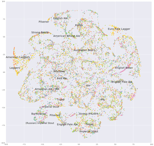 Our final beer map: Ales in the middle, United States of Lagers in the west, and old world beers in the east
Btw: If you’re a beer expert, you can see my data is old because it was before the Sour revival. No mention of these beers here.
Conclusion
So what’s next?
I was disappointed by the small loss decrease due to the metadata, far less than what I was expecting. My current guess is that framing the problem as a regression one is wrong. People will tend to rate beer that they liked, leading to low variation in user ratings. On the contrary, taking into account implicit feedback could be really useful.
For example, from a user that gave a 4 rating to an imperial IPA and an Imperial stout, we should be able to deduce the fact that he does not like light beers because he never drank/rated one. This is definitely something I will be working on. Spoiler: I think that a two headed model predicting if the beer was drank or not, as well as the potential rating might be the killer model. The final ranking would be based on the product of the two predictions.
The second subject that needs to be treated is how to yield the recommendations. I never actually showed how to generate actual recommendations from this model. Also, it will help us visualize and compare different recommender systems based on their output. And finally because it will bring the Dot layer back in the game. Indeed, if we want to generate recommendations for a user using the dense model we need to run all beers through the network and pick the highest scores. This may just be too much. Using the Dot layer, we can save user and item embeddings and use nearest neighbors to generate recommendations instead.