


Dataiku 10 has facilitated not only easy access to performing complex operations for geographical data but also the ability to leverage in-database performance and increased options for drawing insights on a map. Here, we will continue our walk-through of applying these features to communicate the results of our use case, which is distributional modeling of a bird species, paying particular attention to the visualizations and the performance merits. In the first part of this article series, we covered the data preparation and enrichment steps. Now, we are ready to move on to the modeling stage.
Modeling Encounter Rate
For the modeling part, we will use the visual machine learning feature of Dataiku and, for the scope of this article, we will keep our focus on geospatial aspects of our use case.
As described by Strimas-Mackey et al. (2020), modeling encounter rate on the eBird dataset poses three important challenges, which are class imbalance (more non-detections than detections), spatial bias, and temporal bias (tendency of the data to be distributed non-randomly in space and time). To mitigate these biases, we will need to perform subsampling prior to modeling.
In order to perform spatiotemporal subsampling, we will define an equal area hexagonal grid across the study region to deal with spatial distortion (Strimas-Mackey et al., 2020). We will then use this new feature, which is a particular grid/cell number on the surface of the earth depending on the predetermined resolution, to be used in sampling based on several other variables of interest, such as year and week of observation as well as detection and non-detection information. Figure 12 below depicts the part of the flow in Dataiku that is performing the operations of modeling data preparation, model creation, and evaluation.
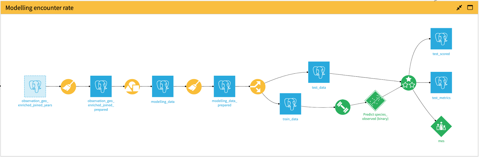
Figure 12 - The part of the flow that shows the operations for train/test data preparation, model creation, and model evaluation.
Prediction Area Data Preparation
After fitting species distribution models, the goal is to make predictions throughout the study area. Since we are interested in the entire study area regardless of whether we have checklist information for a particular sub-area, we will generate latitude and longitude values within our bounding geometry, which is shown in Figure 5 (in the first part of this article series). Afterwards, as displayed in Figure 13, we will create rectangular polygons with 2.5 km width and 4 km height, which have been defined with the objective of maximizing the neighborhood area without overlapping with adjacent neighborhoods.
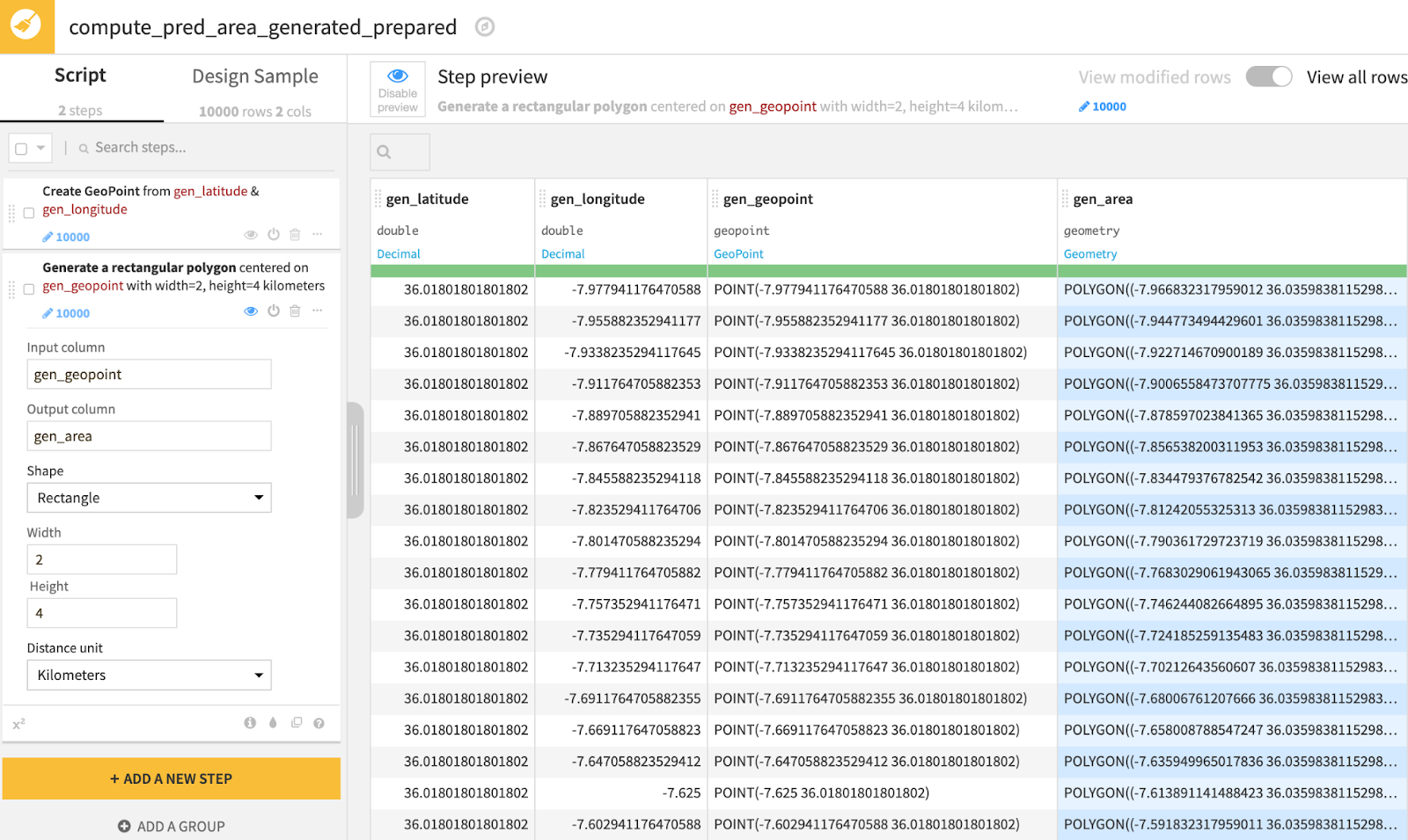
Figure 13 - Step preview of prepare recipe that shows geospatial transformation using the ‘Create area around geopoint’ processor with a rectangle shape to maximize coverage of the neighborhood that will act as a proxy for prediction area
Let’s have a look at the impact of this transformation using map visualizations. Figure 14 shows land cover classes that belong to the most recent year of the available data, which is 2020, for a random sample of geopoints (on the left) as well as for the rectangular neighborhoods of those corresponding geopoints (on the right).

Figure 14 - Geometry maps illustrating land cover classes in 2020 for (left) a random sample of geopoints and (right) rectangular neighborhoods centered around the same sample of geopoints as depicted in the visualization on the left. For all class values definitions, see Figure 3 (in the first part of this article series). Both visualizations show a zoomed-in view of the prediction area to confirm the geographical transformation.
For habitat features enrichment for the prediction area, we follow a similar methodology of using a geo-join recipe followed by land proportion calculations as presented earlier so that we create the same environmental features that our model needs to be able to make predictions. We further add date, time, and effort variables assuming that the predictions will be made for a standard eBird checklist which has 1 km travel distance within one hour starting at the peak time of day for detecting the species of interest (Strimas-Mackey et al., 2020).
Regarding the identification of the peak time of day for detection, we will use the value that we extracted from exploratory data analysis which is not included in the scope of this article, yet can be viewed in this ebook. According to the exploratory data analysis, the detection frequency is at its peak between 5-6 a.m. Finally, with regards to the date, we will choose April 1, 2020. It is possible to make naive assumptions such as reckoning the land cover data stays the same for the years of 2021 and 2022, so that our predictions can be considered for the current year and a date in the future (at the time of writing this article).
Predicting Encounter Rate
After complementing the environmental features with these effort variables, we can finally make predictions to estimate the encounter rate of our species of interest. Next, we just need to apply a scoring recipe to the data we prepared in the previous section, ‘et voila’. Using the output dataset, we can create visuals such as Figure 15 which illustrates the predicted encounter rate using two different types of maps in Dataiku charts.
Looking at the geometry map, we can deduce that the encounter rate for our bird species is higher where there are nature parks and reserves. The domain knowledge on our bird species suggests that they inhabit forests, open woodlands often along water bodies and shrubland. So, given their preferred natural habitat for this migratory bird species, the encounter rate predictions seem to make sense.
Also, in order to include all areas of species presence, we have optimized the model for higher sensitivity (i.e., recall). This is a choice we made during modeling and it provides an indication for potential spots to visit when one is interested in observing the species. However, it would be interesting to overlay these maps with encounter prediction rates produced by a model optimized for high specificity (i.e., precision), so that one can make more informed decisions on which particular area to go birding in order to observe this species and perhaps hear them sing.
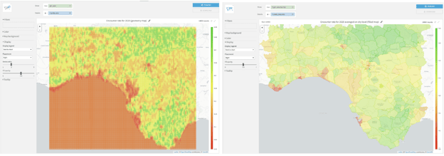
Figure 15 - (left) Geometry map showing the rectangular polygons we have generated and their corresponding encounter rate for April 1, 2020 5:30 a.m. and (right) Filled administrative map showing the average encounter rate on the municipality level for April 1, 2020 5:30 a.m. For both maps, the greener the area, the higher probability of encountering the bird species of interest provided that one spends one hour traveling a distance of 1 km.
Performance
For the final part, let’s zoom out and discuss performance improvements introduced in Dataiku 10 regarding the use of PostGIS extension in PostgreSQL database. Figure 16 depicts the overview of the computation engines used in the project, highlighting the recipes that leverage the SQL engine. During the SQL connection setup, by enabling the PostGIS extension, we have leveraged the ability to off-load the memory-heavy geospatial computations (especially the geo-join recipes) to the SQL engine. This feature has made memory requirements significantly manageable for this project.

Figure 16 - Overview of the recipe engines used in this project, with particular emphasis on SQL engine for geospatial analytics.
Before You Go...
Thanks for reading thus far, I hope you enjoyed the content. Curious about which bird species we have been studying in this article series?
Well, after a brief period of suspense and two articles, here is the revelation: The scientific name field that we viewed in Figure 2 had only one value ‘Luscinia megarhynchos’ which is known as the ‘Common Nightingale.’ If you are a Dataiku user, this is the bird (as an icon) that you click on to go to your homepage and also the bird that’s represented in the Dataiku logo!
Thanks to Clémence Bic, Makoto Miyazaki and Vivien Tran-Thien for their feedback and contributions on this two-part article series.