


The ability to predict the activity of a factory can turn out to be very handy to anticipate disruptions or unveil new business opportunities. But how exactly is that possible if access to data on business activity is limited? And how can you concretely do this using Dataiku?
This article aims to show the way one can predict the activity of factories using alternative data. We will go through the process step by step. Kayrros, a company that specializes in this type of data and a partner of Dataiku, helped us get the necessary resources to explore this subject, taking the interesting case of cement plants, an industry made of many interdependencies.

The Dilemmas of Cement Production
Mainly composed of about 80% limestone and 20% clay (and a hint of gypsum), cement is the basis material for a very wide variety of construction materials. Concrete, the second most used resource in the world after water, cannot be obtained without a binder: cement. Since almost all building projects depend upon its availability, the production of cement has many implications, economic as well as political.
After ingredients are crushed down together in powder, they go into a furnace where they melt together to form clinker, the raw form of cement. This process is hugely power intensive as the temperature that needs to be reached is around 1450°C (2640°F). It represents very important electricity consumption that usually weighs a lot on the grid and must be taken into account by authorities that regulate power supply. To avoid this dependency, the cement plants of certain countries come with their own power generation unit, in most cases from coal.
These specificities of cement production involve careful monitoring of the times when the plant is active or not. It is essential to anticipate the level of energy consumption and drive energy production. To add to this, the long supply chain of cement production involves many sub-industries, a lot of which are very reliant on its activity (i.e., transport, concrete plants, quarries, etc.). Unfortunately, not everyone has access to the production levels, implying that decisions might be only done reactively to the production of cement.
What if we could go around this problem, get the information we are looking for somewhere else, and make a prediction? That’s what this article is all about.
Data on Cement Plants
When a good question arises like “How can we predict cement plant production?” nothing is possible if we don’t start with data. For this part, we knocked on the door of one of our partners: the data provider Kayrros. Together, we published a study on the recovery of the automotive industry as well as mall attendance during the global health crisis.
Luckily, Kayrros has managed to gather the locations of more than 100 cement plants in Europe. Because of their proximity to limestone quarries, cement plants are usually located in remote locations. With their experience in handling satellite images, the Kayrros teams leveraged one of the specificities of cement plants we mentioned earlier: the cooking process to obtain clinker. With heat capturing sensors, the information on the activity of a plant can be inferred. More information on the way Kayrros did this can be found here.
Below is an image that demonstrates the heat activity detection overlaid on a high resolution basemap, showing the month-long shutdown of HeidelbergCement’s Rezzato-Mazzano plant in March 2020.
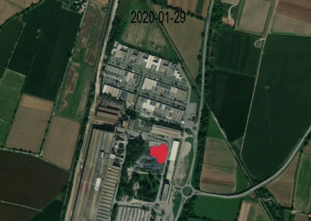
Source: Kayrros, Mapbox, contains modified Copernicus Sentinel data (2020-2021)
After processing satellite images with computer vision algorithms, Kayrros shares the business output of their image analysis: the activity for each cement plant in Europe every week for the past three years.
With the data in our hands, we uploaded everything into Dataiku to start the study that would allow us to predict the activity of these cement plants.
The Project, Step by Step
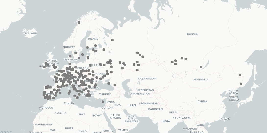
The plants covered in this project.
The Input: A New Plugin
We incorporate Kayrros’s data with the help of a new plugin we recently developed! This plugin requests data from Kayrros’s API and formats it into a Dataiku dataset, easily connecting both platforms. It will be available in the Dataiku plugin store soon after the publication of this article, and, as any other plugin, will be open source and freely downloadable by every Dataiku user.
This interface (shown below) allows the user to enter their credentials from Kayrros’s API platform and choose the collection and dataset they want to display. After that, the connection to the data source is established and the project can begin!
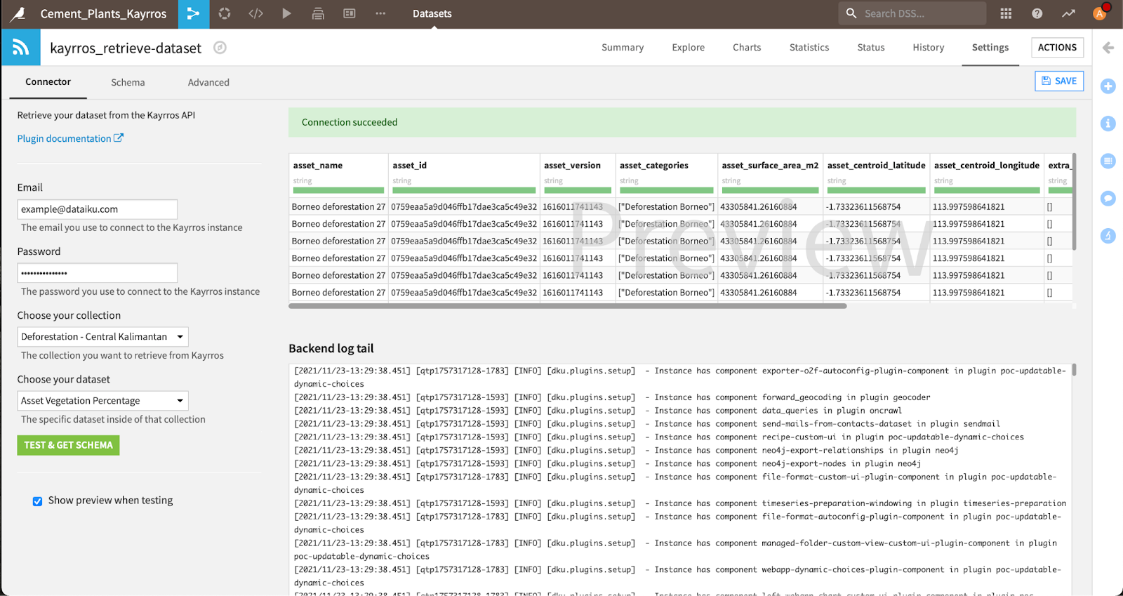
The settings of our connector.
We can then move to the construction of the flow as such. The project works in three large steps, as shown in the flow below with the three flow zones.
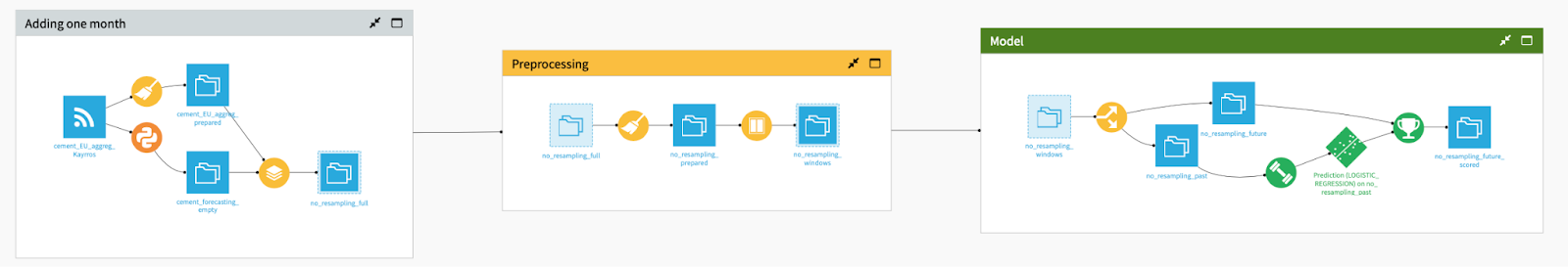
The flow of our project.
This project aims to predict the future activity of cement plants in three steps:
- The first step consists of cleaning the past data and adding a new month as future data to score.
- The second step provides feature enrichment to our dataset in order to provide more knowledge to the model.
- The last step involves building the model to predict whether cement plants are open or not, and apply it to forecast the activity of cement plants in the next month.
Let’s review those steps one by one.
1. Data Cleaning
The Kayrros connector plugin outputs the first dataset (the first blue square on the left, for non-Dataiku experts!). We then use a “Prepare Recipe" to parse the date provided by Kayrros to make sure it’s understandable by a computer. We also delete some columns that are not useful anymore, to output a dataset that looks like the one below. For every plant and date, we retrieve the feature for activity: 0 for inactive plants, 1 for active plants, and a value between both for a plant which is only partially active.
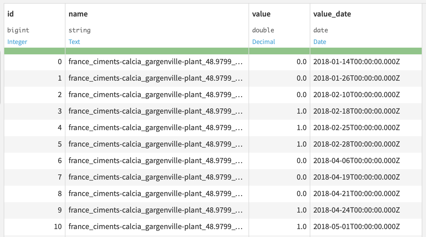
The cement plants dataset visualized in Dataiku.
After this, we include a Python recipe that artificially generates one month of new, unlabeled data, that we can use to predict future activity of cement plants.
Finally, in the last recipe of that first step, we stack those two datasets in order to apply similar treatments both to the original dataset and to the additional month that will be used for scoring. This step is important as we don’t want to duplicate the future steps, between past data and data that we will predict data — instead, we apply the same treatment to those two sets.
From this dataset, we can already build a graph that displays the overall activity of cement plants in Europe. We see that the cement plants have yearly seasonal activity, with ups during the middle of the year and downs during Christmas season.
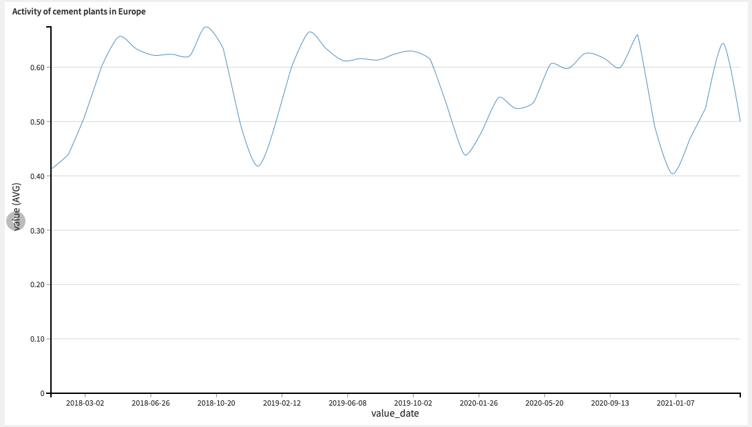
Overall activity of cement plants in Europe, on average, since 2018 to now.
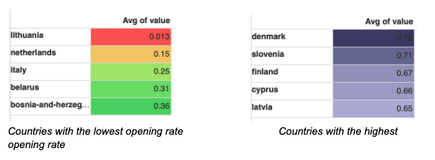
We can also use Dataiku graph features to show which countries have the lowest or highest cement plant opening rates:
2. Data Enrichment
In the next flow zone, there are two additional data preparation recipes. The first one is a preparation recipe, which extracts additional columns like:
Features derived from the date:
- Year, month, day, day of week, week of year
- Sines and cosines of the month, to create cyclical behavior
- Before or after the start of the COVID-19 pandemic
- Whether this is a weekend or a bank holiday
Features derived from geography:
- A geopoint, to create visualisations
- Distances to major points of interest
We bin the variable of interest: If the plant is active more than half the time, (value ≥ 0.5), it is considered active (we input value = 1), otherwise it is considered inactive (value = 0).
Then, the “Window” recipe allows us to compute the moving average of the variable to predict whether the plant was active or not in the past two weeks. That will help us to understand whether plants are only inactive on a specific day by exception or if there is a long-term trend of inactivity. Even though this brings us useful hints on the past activity, this feature will not be built on all the future data. Indeed, one month into the future, knowing what would have been the average opening of cement plants during the last 15 days is a skill only soothsayers could have. So, we will not use it during the model that we tackle in the next section of our flow.
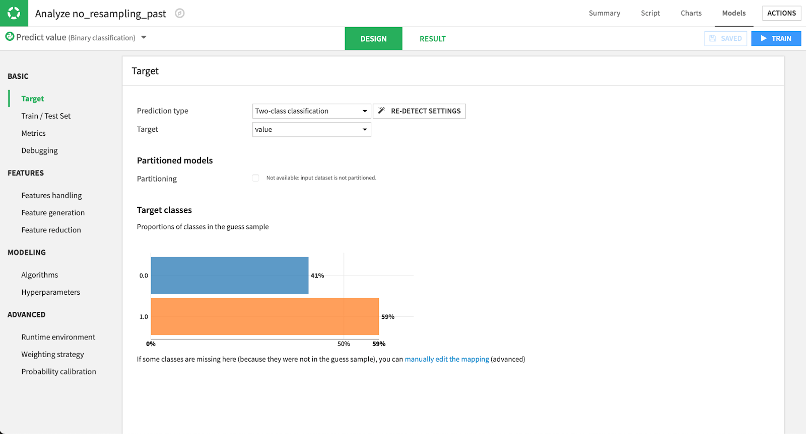
3. Data Modeling
In this third step, we aim to find the features that influence whether or not a cement plant is active to create a model which will mimic that behavior. First, we use a “Split Recipe” in order to unstack the data and split it into labeled and unlabeled data, in order to build an algorithm on labeled data and score future dates with it.
Visual modeling in Dataiku.
We used a machine learning algorithm instead of a time series forecasting analysis because the data has a lot of empty dates (the visibility conditions on the images were such that it was sometimes difficult to detect whether or not the plant was active). Using time series analysis, we would have to resample that data and create “fake” data points for the empty values, which would deeply corrupt our data. Therefore, we maintained a standard ML practice, where the date is not an index, but a feature among others.
The split between the train and test sets is made on the date. However, we trained our algorithm on the dates from the far past and tested it on fresher data.
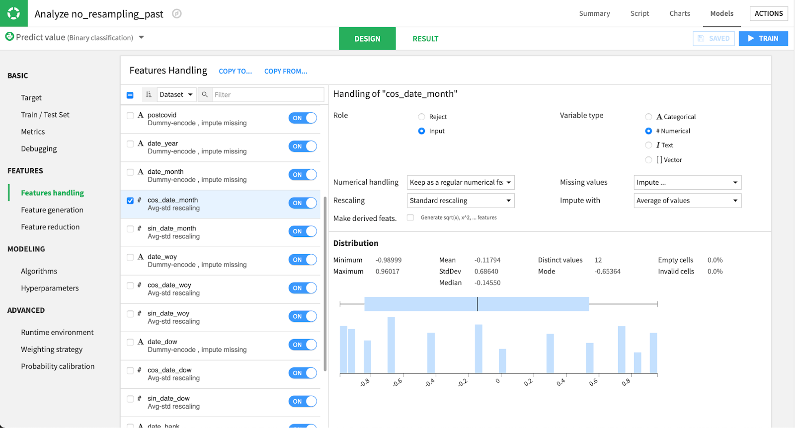
After this, we choose which variables to include in our analysis. For each of them, we can choose to treat them as numerical or categorical, how to rescale it, deal with missing values, etc. After that, we choose the algorithms we want to test on our data!
We selected three very standard algorithms: logistic (L2-regularized – Ridge) regression, random forest, and XGBoost. We kept the basic settings from Dataiku, as we wanted to show that, even without fine-tuning those algorithms very far, the model would give a decent result.
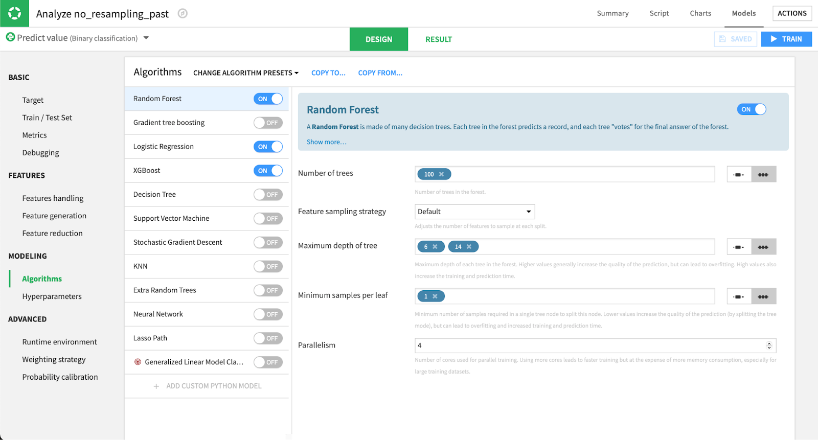
Choosing an algorithm in Dataiku.
After selecting those algorithms, we train our models and explore the results!
As we chose to use ROC AUC to compare our models (we didn’t decide on the threshold to apply yet, so we wanted a threshold-independent metric), our three algorithms all have comparable performances: 0.753 for XGBoost, 0.767 for random forest, and 0.807 for logistic regression.
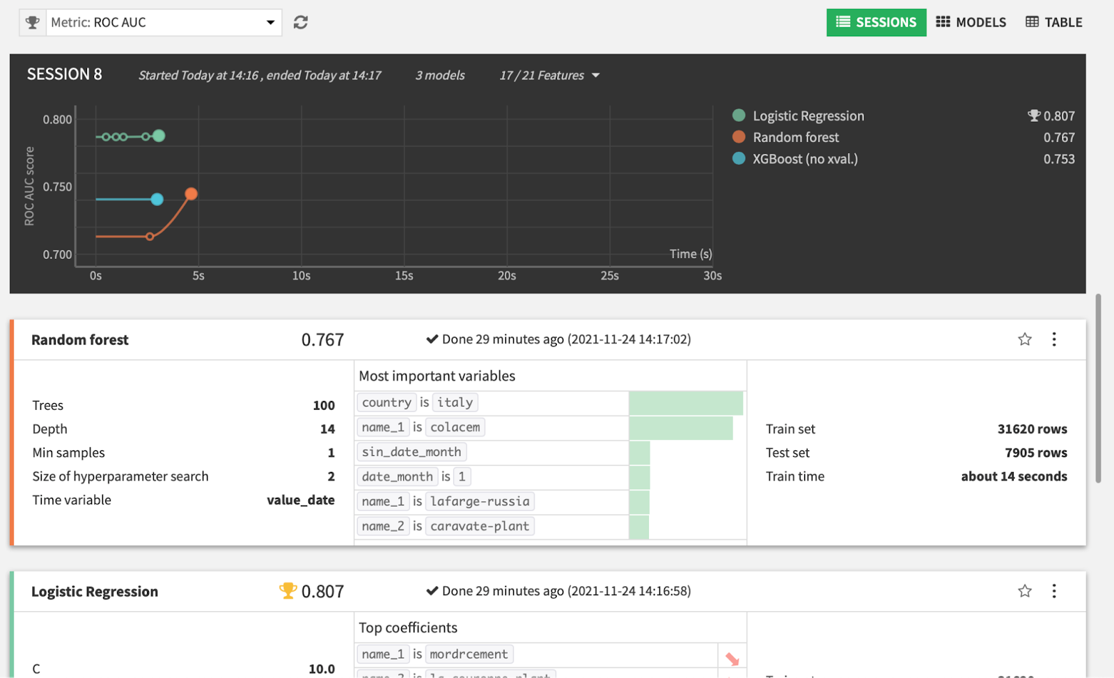
The most important features are location features: Persistence of the same behaviors at the plant level seems more important than analyzing the date. Countries are also important (being in Italy is the fifth most important feature and influences the openness of plants negatively).
The “before or after the start of the COVID-19 pandemic” feature doesn’t have a high significance value: Its coefficient is small (0.41) and doesn’t seem to affect the result.
As for the performance result, we kept the threshold at 0.225, which is the one that maximizes F1-score, at 79%.
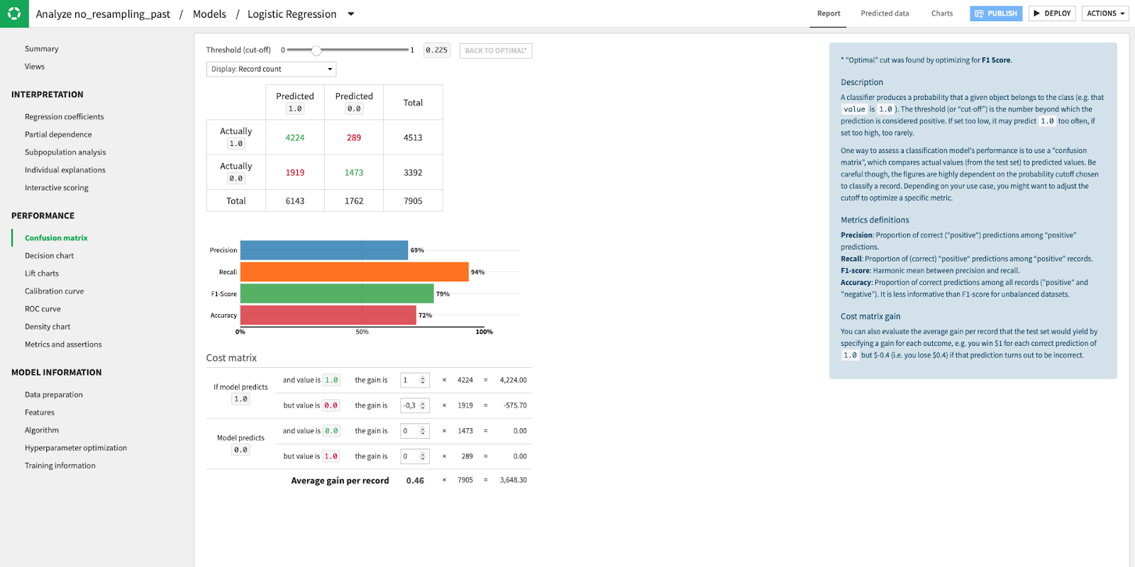
Main metrics of the algorithm, and choice of the threshold.
Even though those metrics are good and we are confident that a good proportion of our future data will be correctly classified, they could be better. We often say that a bad algorithm with a lot of data will be more useful than an outstanding algorithm with less data, and it appears to be the case here. Even though the number of data points is quite large (~39K), the number of plants is also quite important and we have more than three years of data available, following that the dataset is not as dense as it could be. More data would make it easier to model for a computer.
After deploying my model to my flow, I score my unlabeled data, which concludes the project. A next step would be to move this project to production to score fresh data on a weekly or monthly basis.
Visualizing Results
This modeling task allowed us to build some more visualization to understand the crucial business we are tackling.
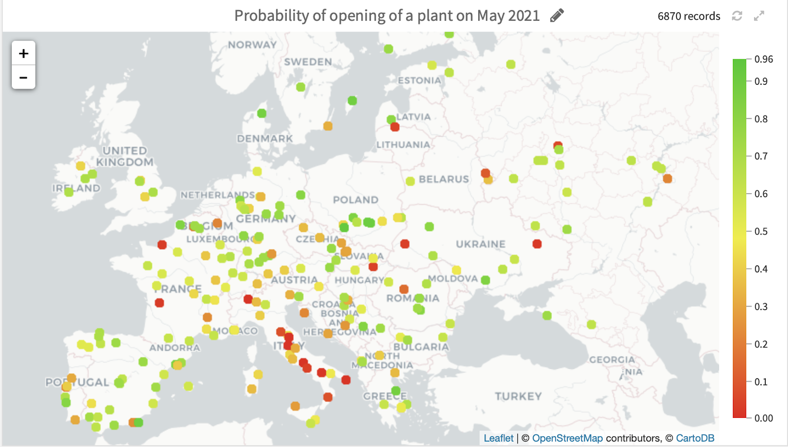
Here, for instance, we displayed the future expected activity per country and by plant, for the month of May 2021 (the month for which we had no labeled data, which was scored by the algorithm).
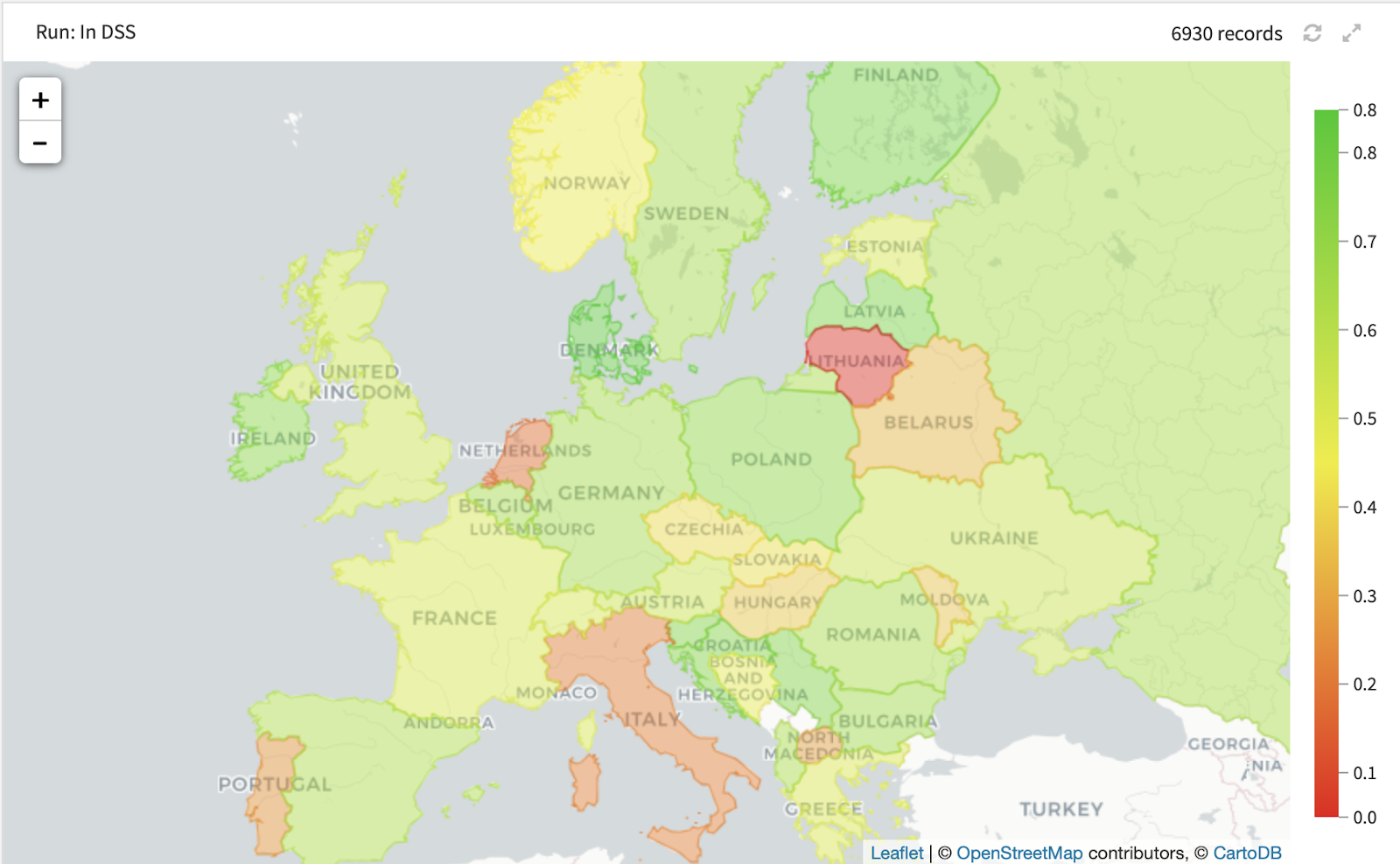
Activity per country, forecasted in May 2021.
Activity by cement plant, forecasted in May 2021.
We see that our algorithm predicts the cement-making activity to be slower in some countries (such as Italy) and stronger in Sweden. It would be interesting to understand which economic conditions made those plants less effective! This could lead to interesting developments.
Interested in replicating this project? To find the data you need to replicate this project, please reach out to contact@kayrros.com or hugo.schmitt@dataiku.com. You can also reach out to Kayrros directly to become a Kayrros customer and have access to data like the one we used to predict cement plant activity.