


This is a guest article by Augusto González Bonorinois. Bonorinois is a first-year Ph.D. candidate in economics, neuroeconomics path, at Claremont Graduate University. He is a passionate advocate of interdisciplinarity. His latest efforts in merging his interests with various other sciences include learning quantum computing to solve high-dimensional matrix Riccati differential equations. Currently, he is exploring quantum machine learning, computational neuroscience, AI in finance, causal machine learning, and behavioral economics.
With the advent of data science and data analysis-related opportunities, Python gained popularity at a breathtaking pace. This programming language’s simple syntax, various modules, multiprocessing support, and active community made it a user favorite for everyday science, research, and business analytics tasks.
In data science, Python plays a vital role. Libraries such as NumPy, pandas, scikit-learn, TensorFlow, and PyTorch make it easy to implement and prototype machine learning (ML) algorithms, create processing pipelines, and perform statistical analyses on large datasets. Furthermore, Python supports graphical user interfaces to build web applications to help you communicate your findings to stakeholders. The true power of Python is its flexibility, which enables users to perform a series of different tasks in the same language. Coding these pipelines, though, often requires several lines of code and various libraries.
Data analysts or ML practitioners are primarily interested in data analysis and would love to reduce coding needs to a minimum. This article shows you how to accomplish this with Dataiku, a central solution for designing, deploying, governing, and managing AI applications. This article explores how some of the most time-consuming tasks in any data science project — like data wrangling, feature engineering, and exploratory data analysis (EDA) — can be tedious and tasking and how you can replace them with Dataiku tools.
Save Time With Dataiku
In this test project, you’re interested in studying the salaries of various data science positions. You’ll use a great dataset provided by Kaggle and compare the time it takes to perform these steps manually to the time it takes using Dataiku.
To join the fun, you should be familiar with Python, scikit-learn, pandas, and Matplotlib. Additionally, ensure you create a free Dataiku account for the second part of this project.
The following sections cover the steps to complete this data science task, both with Python and with Dataiku’s platform. However, we won’t demonstrate how to deploy a full model step by step, as the emphasis is only on the most time-consuming tasks.
Create an ML Model With Python
Once the libraries are loaded into your environment, proceed to import the dataset. The dataset is in comma-separated values format, which you can easily read with pandas.
To create your ML model, you’ll need the following libraries:
import pandas as pd
import numpy as np
import matplotlib as mpl
import matplotlib.pyplot as plt
import seaborn as sns
import missingno as msno
import plotly.express as px
import plotly.figure_factory as ff
import plotly.graph_objects as go
from wordcloud import WordCloud
import nltk
from sklearn.model_selection import train_test_split
from sklearn.pipeline import make_pipeline
from sklearn.impute import SimpleImputer
from sklearn.preprocessing import StandardScaler, OneHotEncoder
from sklearn.compose import make_column_transformer
from sklearn.linear_model import LinearRegression, Ridge, Lasso
Note the descriptive statistics using the data frame methods .describe and .info. There are no null values but a few features with incorrect data types.
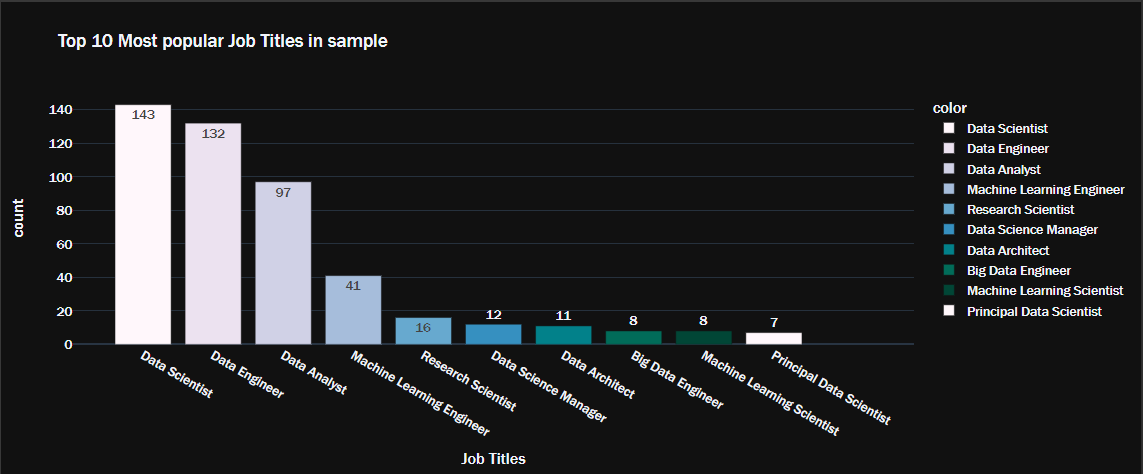
The following code produces a bar plot of the dataset’s top ten most popular job titles:
fig = px.bar(y=top10.values,
x=top10.index,
range_x = [-1, 11],
color = top10.index,
color_discrete_sequence=px.colors.sequential.PuBuGn,
text=top10.values,
title= 'Top 10 Most popular Job Titles in sample',
template= 'plotly_dark')
fig.update_layout(
xaxis_title="Job Titles",
yaxis_title="count",
font = dict(size=15,family="Franklin Gothic"))
fig.show()
This produces a beautiful, interactive bar chart characteristic of the plotly package.
Next, convert the currency from Indian rupees (INR) to U.S. dollars (USD) to see the salary for each position. At the current exchange rate, one dollar equals 81.2 rupees. You can code this as a Python function like this:
def to_usd(rupees):
return round(rupees / 81.2, 2)
Now, you can create a new column to represent the salary in U.S. dollars.
data['Salary_In_Rupees'] = data['Salary_In_Rupees'].apply(
lambda x: float(x.split()[0].replace('.00', '').replace(',', '')
))
data['Salary_In_Dollars'] = to_usd(data['Salary_In_Rupees'])
Using the same dataset, you can also explore the relationship between salary, job description, and working location. For example, you can explore how salary relates to remote versus on-premise work.
To do so, you group the dataset by both Designation and Remote_Working_Ratio. With this grouping, each row represents a unique combination of job position and its respective remote work ratio. Run the code below to see the mean salary per job designation and its remote working ratio:
remote_pos = data.groupby(['Designation','Remote_Working_Ratio']).mean()
remote_pos.head(6)
This code snippet above prints the first six rows, as shown in the table below:
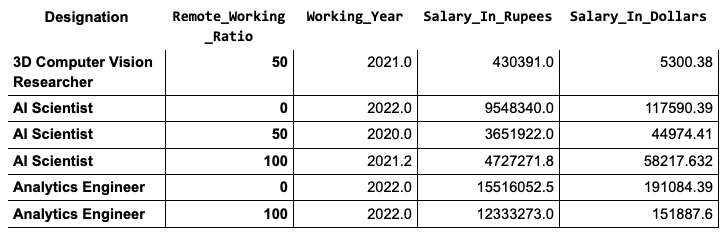
As the results here show, people with a higher remote working ratio earn significantly less than those with lower ratios.
Then, you can plot your results and evaluate your findings visually. Before coding the visualization, drop the Working_Year and Salary_in_Rupees columns to focus on the distribution in U.S. dollars. It will also make plotting easier.
remote_pos = remote_pos.drop(["Working_Year", "Salary_In_Rupees"], axis=1)
Then, use the code below to plot exactly the same aggregated data you just looked at:
remote_pos.head(6).unstack().plot(kind='bar', rot=15, figsize=(7, 6))
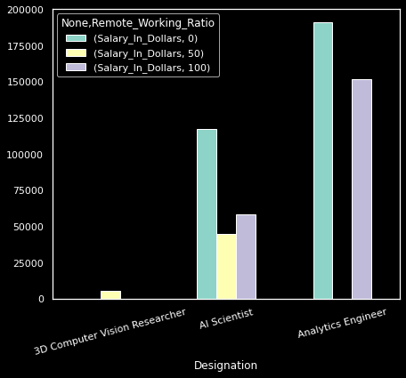
Producing this plot required subsetting the full sample, unstacking the MultiIndex DataFrame, and setting minimal parameters to customize the bar chart.
Once you have a solid understanding of your data, as seen in the examples above, you can use more advanced methods to improve its quality. These include sampling — commonly done with the Random package — and further analysis by plotting correlation matrices or relevant statistical tests.
The final step in the project is to partition and process the data for model training. Use scikit-learn's computers and encoders to create a pipeline that handles numeric and categorical values.
num_xformer=make_pipeline(SimpleImputer(strategy="median"),StandardScaler())
cat_xformer=make_pipeline(SimpleImputer(strategy="most_frequent"),
OneHotEncoder(handle_unknown='ignore'))
numeric_features=X_train.select_dtypes(include=['int64','float64']).columns
categorical_features=X_train.select_dtypes(include=['object','category']).columns
preprocessor = make_column_transformer((num_xformer, numeric_features), (cat_xformer, categorical_features))
And finally, train a linear regression model with this pipeline:
pipe = make_pipeline(preprocessor, LinearRegression())
pipe.fit(X_train, y_train)
It’s extremely unlikely that you’ll get the perfect model right away. Therefore, hyperparameter tuning and post-training updates are key to optimize a model’s learning process.
From scikit-learn, import the GridSearchCV object. Then, select the parameters you’d like to tune. This demonstration uses ridge regression, which has the alpha parameter available to tune. Specify a dictionary with the various values of alpha that you’d like to experiment with.
Lastly, apply grid search on a new pipeline. Specify the parameters and values to try, the evaluation metric, and the number of cross-validations, among other arguments.
Your code should look like this:
from sklearn.model_selection import GridSearchCV
param_grid = {'ridge__alpha': [0,0.001,0.01,0.1,1,10,100,1000]}
grid = GridSearchCV(make_pipeline(preprocessor, Ridge(alpha=0.07)),
param_grid,
scoring= 'neg_mean_absolute_error',
cv=5, n_jobs = -1, verbose = 5)
grid.fit(X_train, y_train);
> Fitting 5 folds for each of 8 candidates, totalling 40 fits
Create an ML Model With Dataiku
The previous example highlights the main stages of any data science project. You will likely repeat similar steps in the future with slightly different applications. Although the example above is a very simple ML project, it’s no walk in the park. Even with minimal data to clean, this multi-step process highlights how burdensome this process would be at scale. Furthermore, the above process doesn’t account for the multiple iterations and tweaks necessary to ensure that the visualizations, feature engineering, and model settings are just right.
If you’re a disciplined coder, you may have a series of code samples ready to adapt to reduce development time for your pipelines. Still, at the very minimum, it will involve a lot of copying and pasting.
Moreover, there are reasonable limits to how many charts you can code and how many models you can test. What if you must submit a report or create a dashboard? Dataiku’s platform provides the capabilities to conduct this analysis with minimal coding.
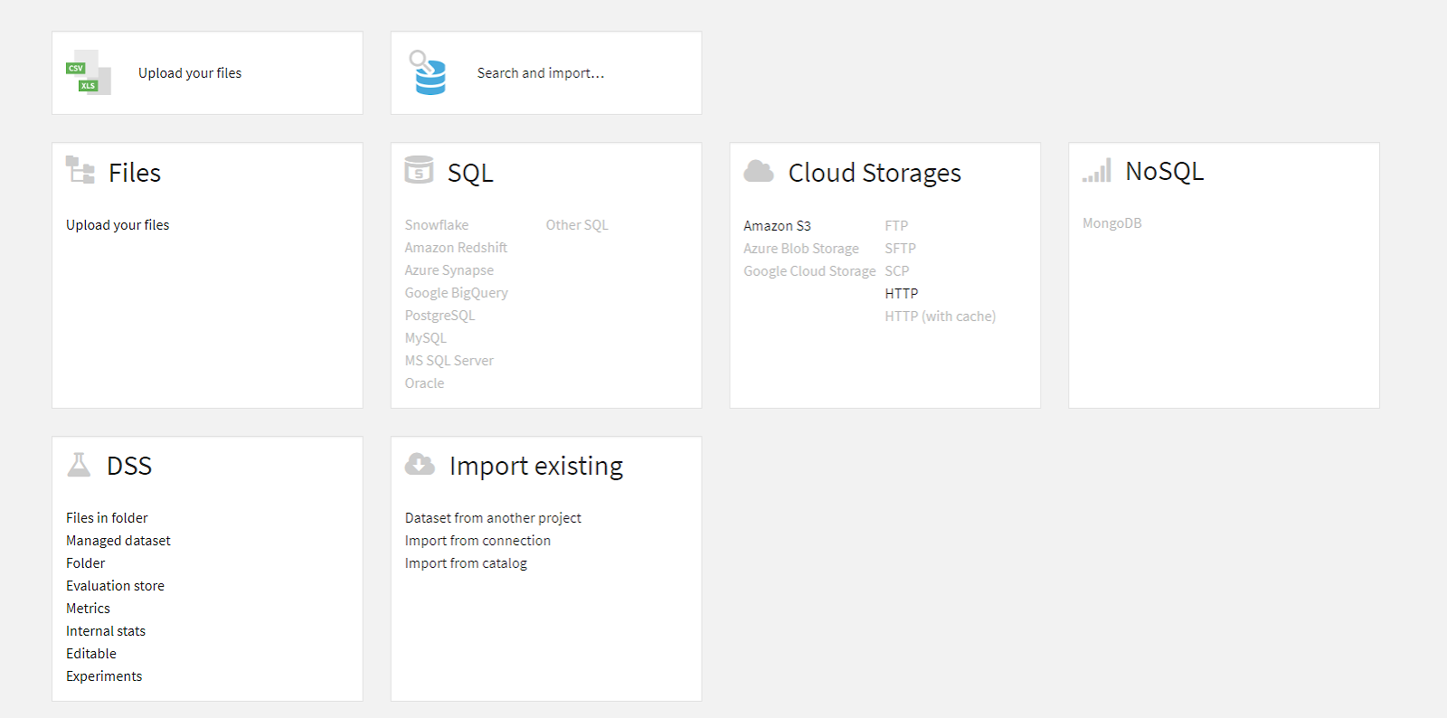
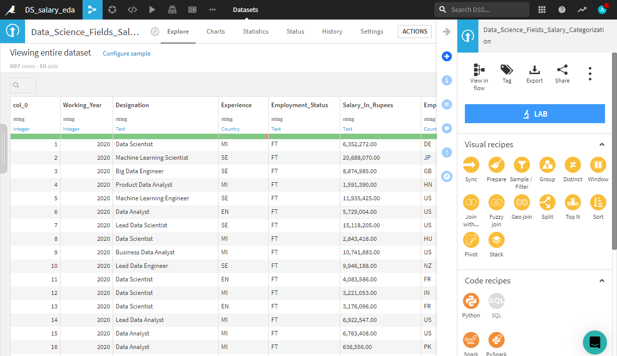
First, import the dataset by navigating to the Datasets tab. Or, if it’s a new project, it will prompt you automatically. The Datasets tab is under the drop-down menu labeled by a network icon, located to the right of the project name. The interface looks like this:
Data Preparation
Virtually any format or data source is an input dataset on the Dataiku platform. You could potentially connect to sources like SQL databases, cloud storage, or special file formats. Once the upload is complete, Dataiku will prompt you to create the dataset and then take you to the Explore view.
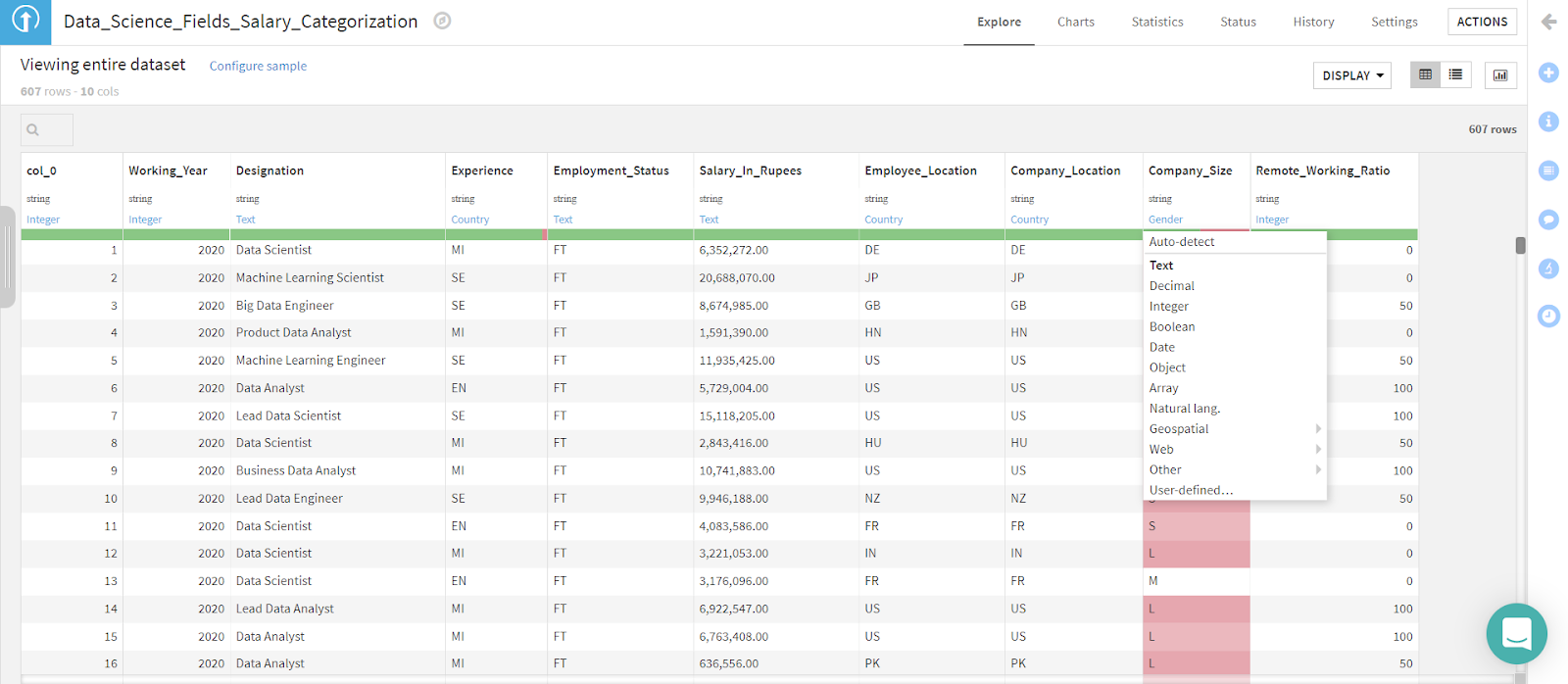
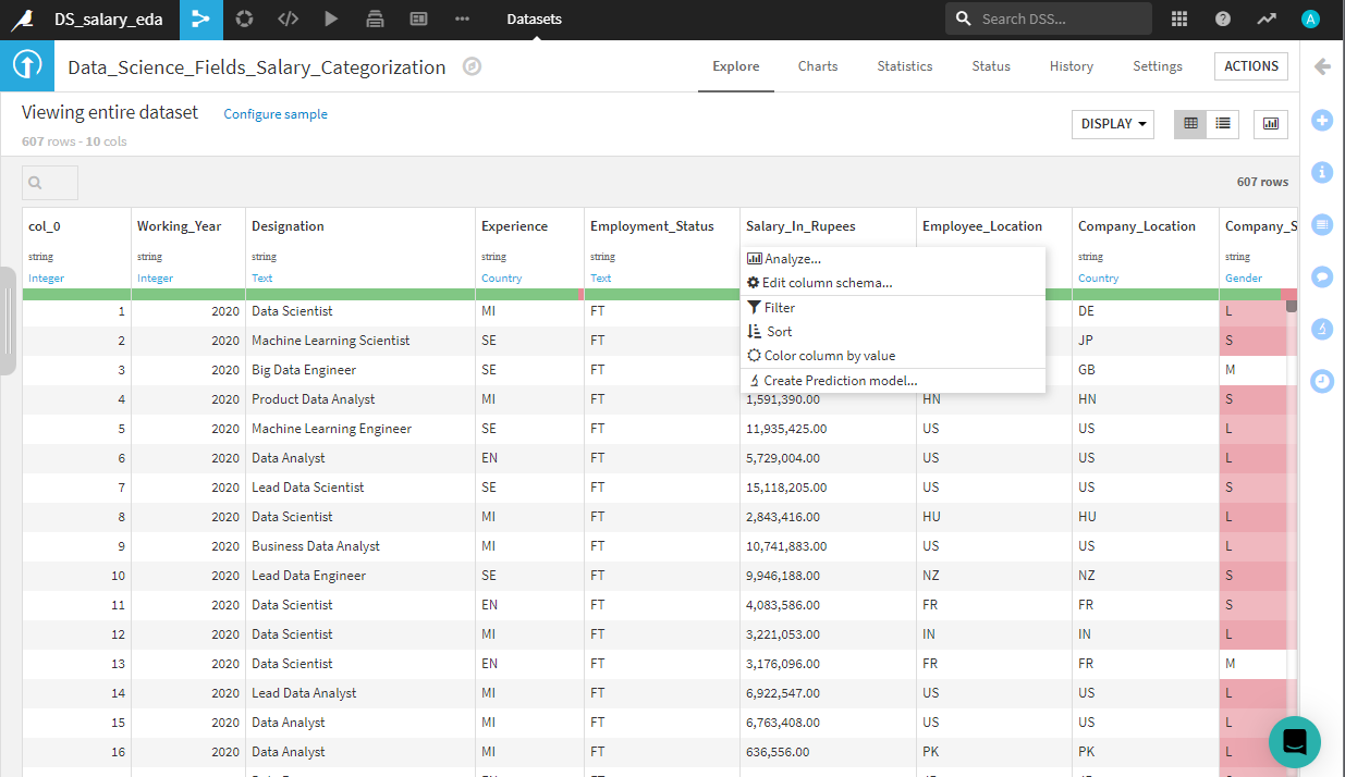
You can perform preliminary operations common during EDA on this tab, like typecasting, sorting, and other. Changing types is extremely easy. Simply click on the cell that displays the column's data type and select the correct format from the drop-down menu. You can take a deeper look at the salary in rupees column with ease by opening the analyze engine. Click on the column of interest — Salary_In_Rupees in this case — and select the Analyze button.
This prompts a screen with useful descriptive statistics about this specific column, as shown below.

This would have taken several lines of code to create, even with Python.
Now, you’re going to create a Salary column in dollars as you did with Python. To do this, you can use Dataiku’s recipe feature. A recipe is a custom transformation performed on an existing dataset with Python code or visually by leveraging the built-in recipes.
From the Analyze pop-up screen you’re in now, navigate to the top right corner of the main interface and click the Action button. Following these steps will result in the following screen.
Let’s attempt to recreate the function for converting currencies without writing any code. Locate the orange Prepare button under Visual recipes and click it. Your screen will look like the following:

Next, click on Add (if the fields are not autofilled), give your output a name, and click Create recipe. Now it’s time to get cooking!
Recall that recipes are transformations, which is why the column names are Inputs and Outputs. The input is the current state of your dataset, and the output is the resulting dataset after the transformation you apply.
After creating the recipe, you will be taken to the following screen. Here, you can create a new visual recipe by clicking the Add a new step button.

Try using the visual recipes to convert the data type of the Salary_In_Rupees column to a raw number usable for mathematical operations. (Hint: Look at the Data cleansing processors.) Finally, to convert to US Dollars, click on the Math > Numbers library and explore the options. There are two possible paths: using the Convert currencies processor or simply applying a custom Formula. This example used the latter. The result is shown in the following screenshot.
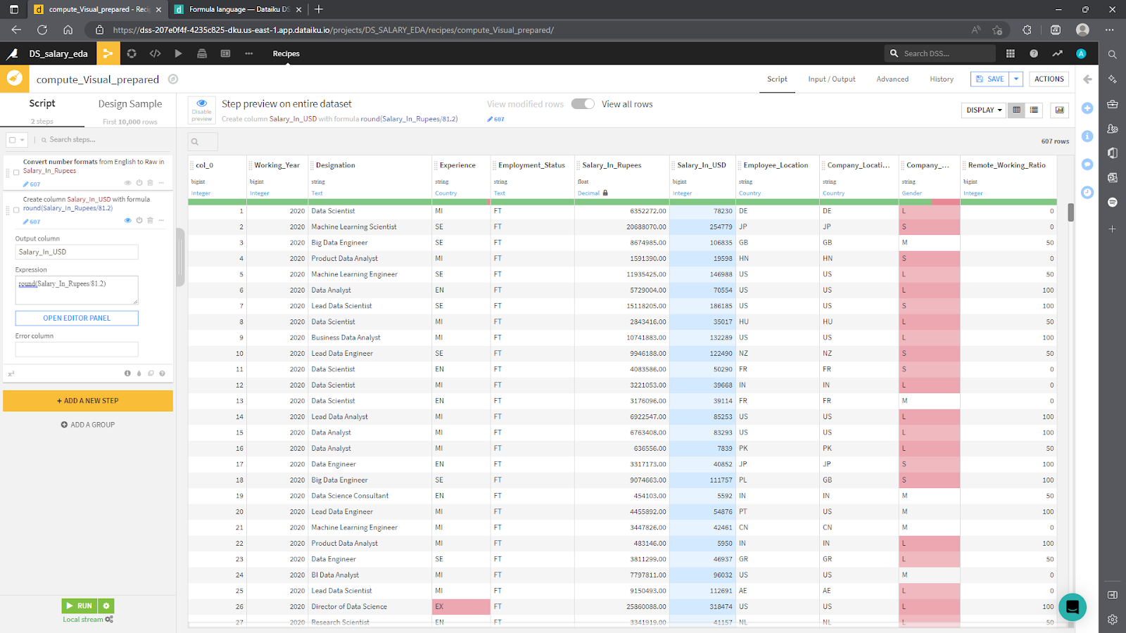
When you are done, click Run to automatically generate the transformed dataset. If you return to the Flow, you’ll find a new blue rectangle denoting the processed dataset (called example) in the top-left corner. Here is how the example looks so far. If you have experimented further on your own, it is likely your screen will look different.
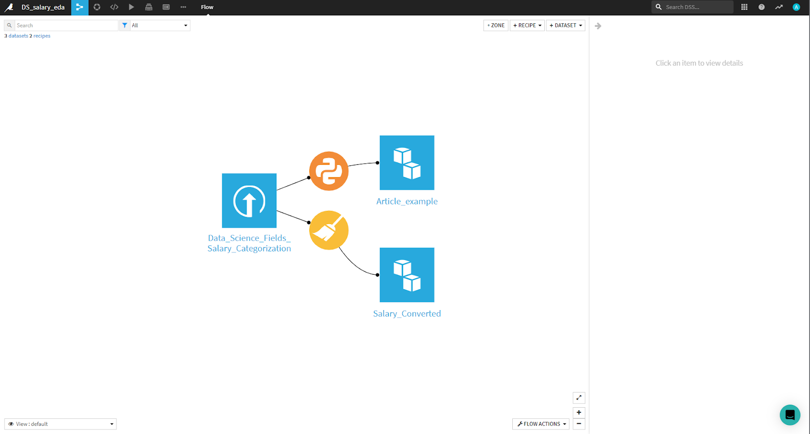
In the image above, note that there’s an additional orange circle. It corresponds to a code recipe used to prepare the dataset. Finally, as a small challenge, delete the column that displays salary in rupees using either the visual or code recipes Dataiku offers.
Data Analysis and Visualization
The next step is statistical analysis and data visualization. With Dataiku, you can seamlessly perform dozens of different statistical tests and analyses on the Statistics tab.
To analyze and visualize your data, go to the main Flow screen, navigate to the top left menu, click on the leftmost icon, and select Datasets from the drop-down menu. This will take you to a screen, shown below, that displays all the datasets you have available. You’ll find the original dataset you imported and the transformed dataset.

Select the transformed dataset for this exercise — here, called Article_example. This returns the same menu as when you first loaded your data.
Note there’s a menu on the top of the interface. You should be in the Explore tab at the moment. Navigate to the right until you find the Statistics tab, and click it. This will prompt you to create a worksheet with the following menu:
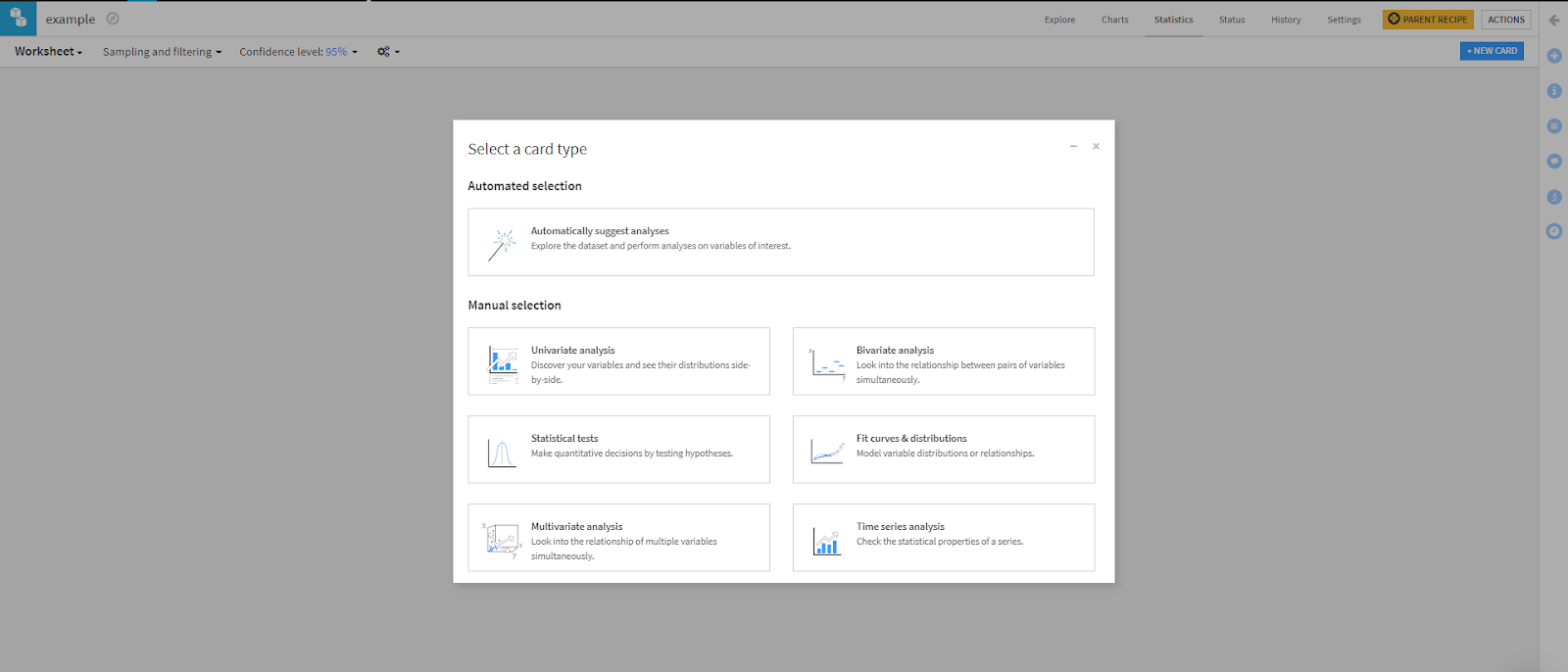
Dataiku prompts you to choose the kind of statistics you’re interested in running, or you can let the platform give you some recommendations based on the characteristics of your data. You can choose from a correlation matrix, summary statistics, density plots, and other values that would take numerous lines of code to create with Python.
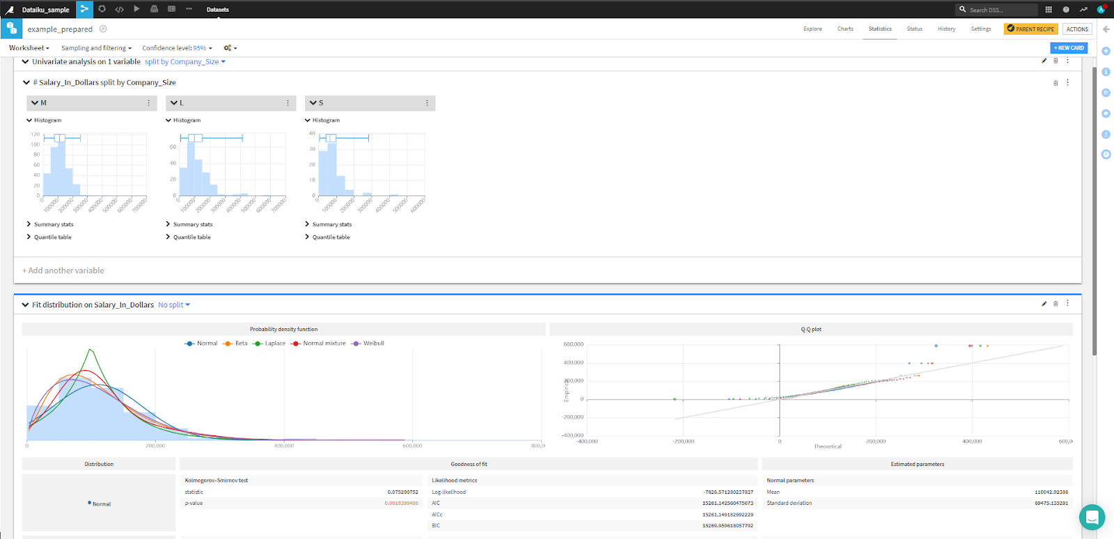
In this example, you’re trying to understand the effect on salary in dollars. So, you’ll plot a fit distribution and run an univariate analysis of Salary_In_Dollars by Company_Size to study how salaries differ among the three sizes of companies. All the information will appear on one screen and feature interactive plots. And it all only takes a few moments.
Additionally, if you want to conduct more experiments and must sample the dataset before training models, note that the drop-down menus Sampling and filtering and Confidence level provide many options for manipulating these parameters.
Machine Learning
All you have left to do is to train and test the linear regression model. If you have a code block you commonly use, you can create a new code recipe to generate the data frame you want to train your model on and a customized model. If not, you can rely on the automatic recommendations, which will quickly process the data and train suggested models.
While on the Flow tab, click the icon of the dataset you want to use for your ML model. Then, click Lab. A set of options will show up on the right-side menu. Dataiku provides AutoML to streamline the process of processing data, training, testing, deploying, and maintaining models.
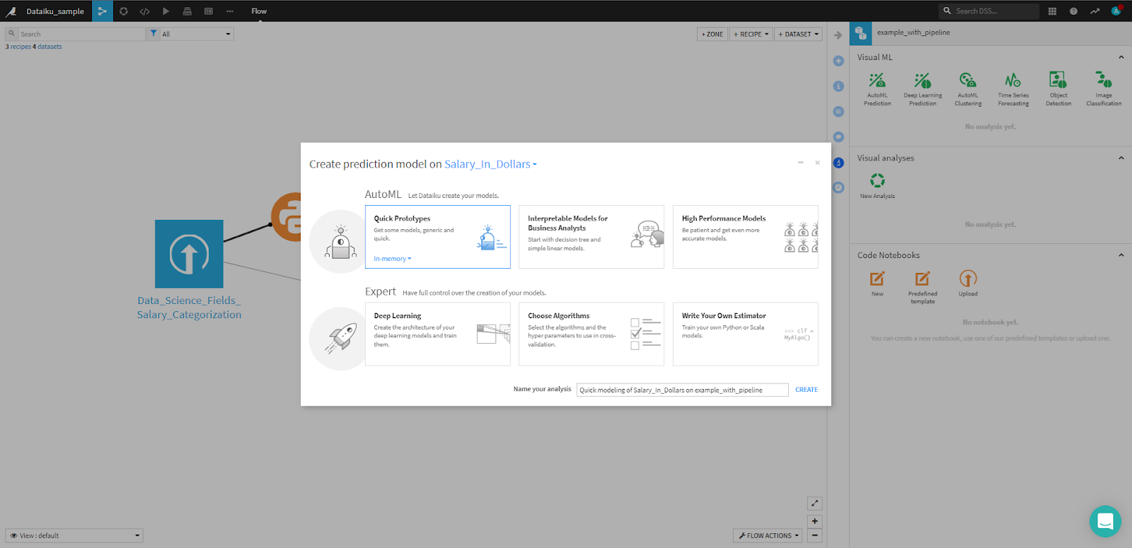
In this case, Dataiku recommends a random forest and a ridge regression. In Python, setting up the infrastructure to validate hyperparameters, transform the dataset, train, and evaluate various models would require a significant amount of code and knowledge of scikit-learn’s features. But you didn’t have to write a single line of code — Dataiku did all of that automatically.
Furthermore, you can access all the features, hyperparameters, training strategies, and models on the Design tab.
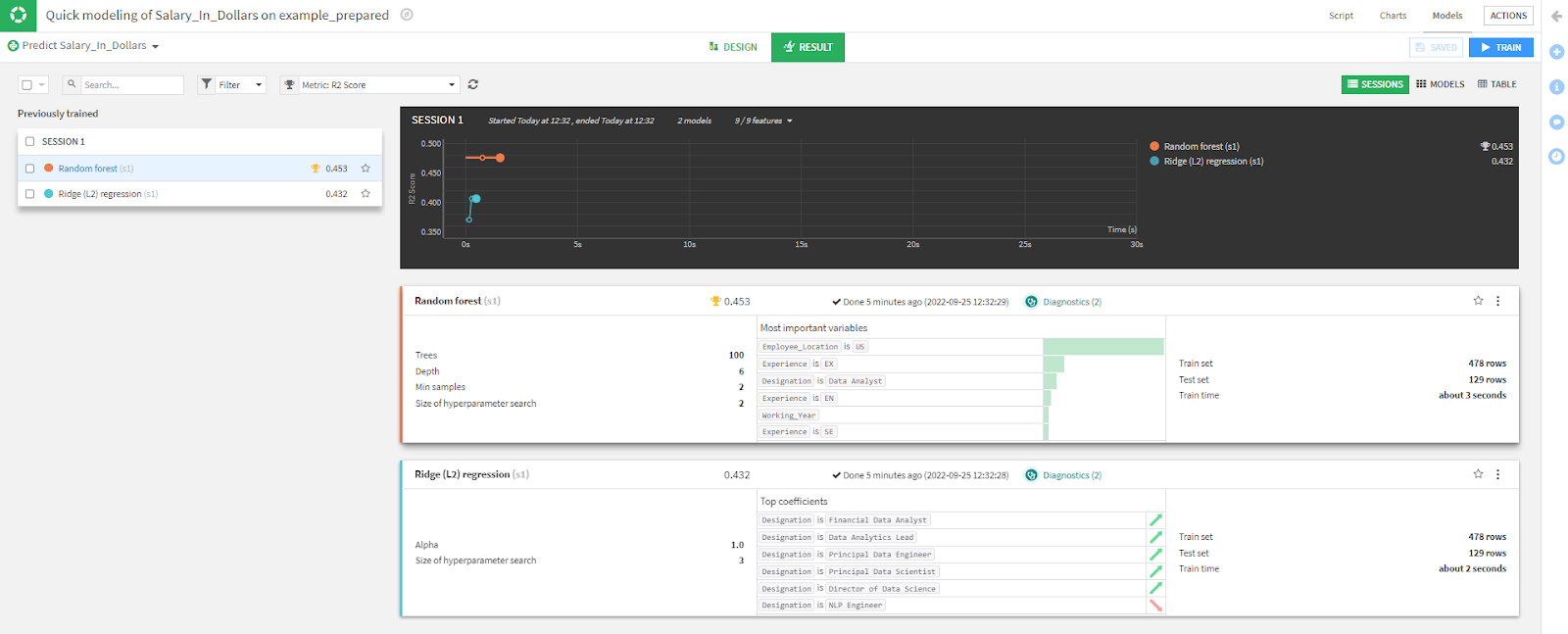
Now you have a complete dataset analysis, plus benchmarking models. You can now replicate the flow for any dataset and update it as often as you need.
Before concluding this article, a more thorough analysis of the relevance of Dataiku’s features for ML experimenting is in order. From the current screen, note that, in addition to key descriptive statistics, you can set different evaluation metrics from the drop-down menu located directly above the main chart.
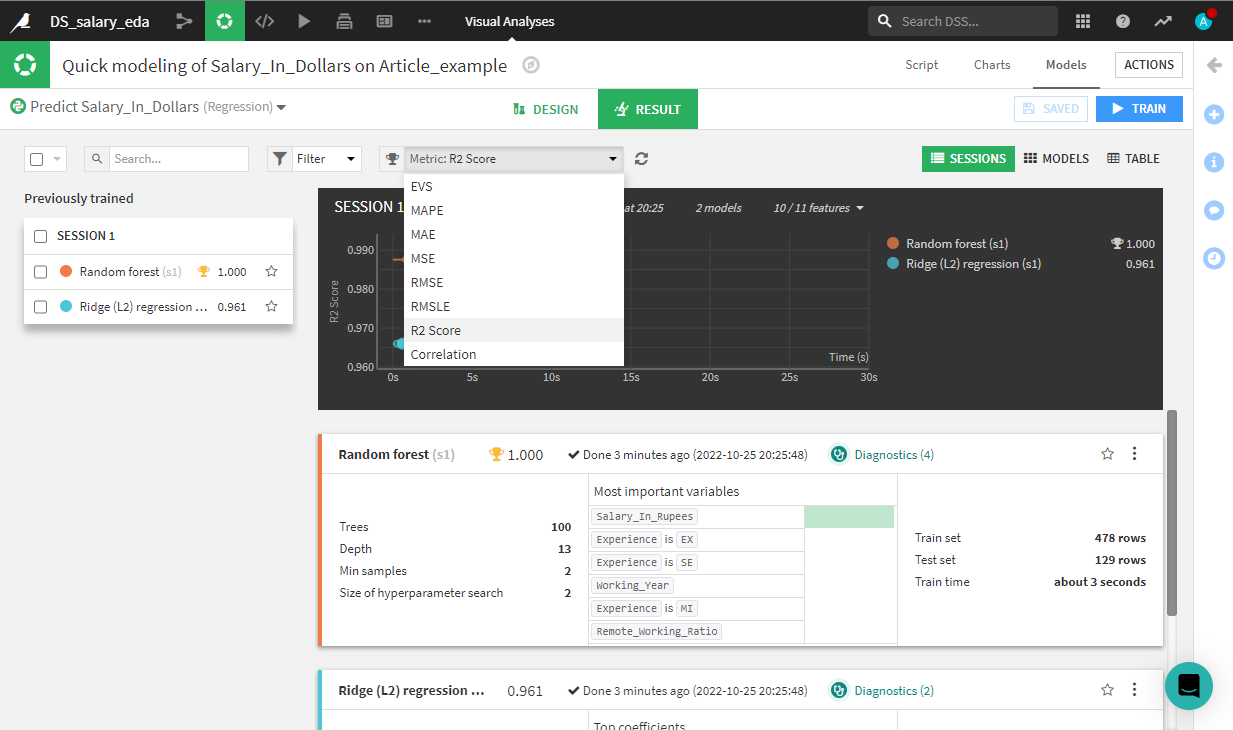
This feature of Dataiku’s platform allows you to quickly evaluate model performance across different metrics. But, the true innovation lies inside the Design tab. On top of the metrics drop-down menu, click on Design. Click on the Metrics tab, located under the menu titled Basic.

In Metrics, you can modify training parameters, feature engineering, customize the data splitting method, produce explainability reports, and automatically track your experiments. This is a very heavy task to perform with Python, so turning to Dataiku here saves you a significant amount of time.
Stay Data-Focused With Dataiku
Python has become indispensable in any data scientist’s toolkit. It allows for fast prototyping and facilitates quick analysis. Nevertheless, implementing each component of the data science project workflow requires plenty of coding and knowledge of external libraries. Dataiku’s platform saves you time by facilitating the experimental aspect of any research project and the creation of pipelines.
With Dataiku, you can automatically monitor your ML model’s evolution, facilitate collaboration, and fine-tune models. We can help you do everything in a centralized infrastructure, simplify model optimization, improve security, and promote data analysis.