Taking on a first data project is no easy task — it's not clear where to begin, and of course, there are lots of bumps along the way. Here are some tips and tricks that we learned while embarking on our first collaborative (while located in separate continents, no less!), data-driven project that will be useful for any first timer.

For our project, we chose to examine data from Divvy, the Chicago bike-share system, because it (and other bike-share services) are becoming more popular, because a great dataset was available on Kaggle, and because one of us (Megan) is from the windy city. We hoped to identify trends in rider behavior that would help Divvy increase revenue and customer satisfaction. Since this was our first data-driven project, we ran into many challenges but learned a lot along the way!
Our main (business) insight was that Divvy can boost revenue by building stations in the upper neighborhoods of Chicago (and that it’s missing out on a huge demographic - women!) But beyond the data, we took away a lot of practical insight for building better data projects more quickly.
Cleaning… and a Business Bump in the Road
We used this dataset of Divvy rider data (2013-2017) with weather, time, and rider variables. We decided to use the raw version so that we could clean the data ourselves (this is typically the most frustrating part of a data project, but it was very easy to do in Dataiku, which you can download for free here and use for your first data project). It was also simple to parse and extract dates with just one click of a column drop down menu.
After some more pre-processing, we ran a machine learning (ML) algorithm to predict which riders went over 30 minutes. We thought 30 minutes was the free time limit but later discovered that Divvy changed their payment plans in 2017. We filtered out just 2017 riders and tried running ML models on each type of rider (with different free time limits) but didn’t have enough instances of riders going over their limit to gain meaningful insights.
While we were disappointed that we couldn’t use the insights from our original model, it luckily only took about 10 minutes to build, analyze, score, and deploy with Dataiku’s quick model feature and ability to replicate workflows. Also, it was a valuable reminder that you can’t just follow textbook procedures without business insights and a comprehensive understanding of your data!
Putting it in Gear
We found that although 8am and 5pm were the most popular hours - suggesting that bikes were being used mainly for work commute - summer months were the most popular.
We then guessed that lakefront stations would be the most popular, and we were right. Divvy is aware of this (who doesn't want to bike by the lake?) and already has many lakefront stations, so we dug deeper to see how Divvy could increase revenue and customer satisfaction in less obvious ways.
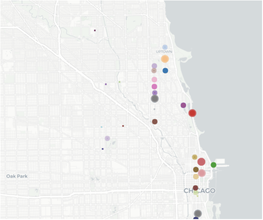
We discovered that 77.8% of Divvy riders are male. Wanting to understand the behavior of female riders, we built a map of the most popular stations among females. The most popular stations were in uptown neighborhoods and near Magnificent Mile (larger dots correspond to more popular stations).

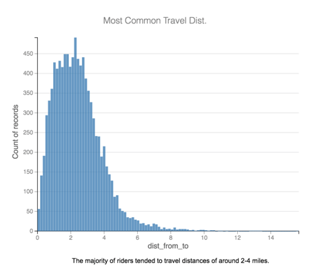
However, the shortest trip from these uptown neighborhoods to Magnificent Mile is 5.3 miles, which we can see is much longer than the average travel distance.

Given female and general rider trends, Divvy should strive to build stations in between, especially with upcoming attractions like the Chicago Music Hall of Fame in Little Italy.
A Rocky Side Road : Clustering
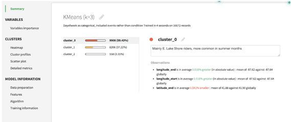
Another model we deployed that ended up being irrelevant because of new pricing plans was a clustering of groups who rode longer than 30 min (and paid extra in the old pricing plan). Although we can’t apply our model, we felt that talking about the challenges/model considerations we faced would be helpful for newbies.

Clustering models aim to identify groups in your data. We found that the hardest part of clustering was fine-tuning the variables to create meaningful groups with a high silhouette (measure of how far apart aka distinct groups are). The best practices often depend on the situation, and sometimes there’s a conflict between interpretability and performance.
For example, we found that making day of week, hour of the day, and month real-valued (rather than treating them as categorical and dummy-encoding) increased the silhouette. However, since they’re cyclical variables, it makes more sense to keep them as categorical (we only care that it’s Monday, not about which Monday it is). Even when we asked different data scientists, we got mixed responses.
We ended up keeping the model with a medium silhouette (increased significantly by PCA which helped with the high dimensionality from the added dummy-encoded columns) but clear interpretability: people who went over 30 minutes were summer lakefront riders, subscribers, or riders who got caught in the rain.
It’s the Journey That Matters
Though we only ended up using one of our analyses, exploring, manipulating (and sometimes huffing at) the data was a really great learning experience. Dataiku made it easy to do this project across oceans, and we loved that we could see the query code behind an automated visual recipe.
More than anything, the project showed us how understanding the business dimension of the data is just as important as having the data itself. We were getting caught up on things like pricing and terminology -- we can’t imagine how much of a nightmare it would be if that was scaled to the more complex business decisions data science is being used to make right now.
If we were to do this again, we would try to incorporate (learn) more code and try more advanced techniques: for example, to deal with missing values in our dataset, we just imputed the average value, but there are more accurate procedures.
Some analyses we would possibly run in the future include a predictive model for arrivals and departures to determine which stations are full (through the net difference of the model outputs) or clustering models by seasons or user type. We encourage you to download this dataset at Kaggle and try working on it yourself using Dataiku!


