


As a marketer, I had quite a lot of experience using Excel but never really ran predictive models. Kaggle - a platform for predictive modeling competitions - provides a "Getting Started" competition, which was a great opportunity for me to level up my analyst skills. In this post, I will show you how I used Dataiku to explore the Titanic challenge problem, an important first step to make future predictions better.
* Note: This blog post contains screen shots from an older version of Dataiku, though all of the functionality described still exists. Watch the on-demand demo to take a look at the latest release of Dataiku in action.
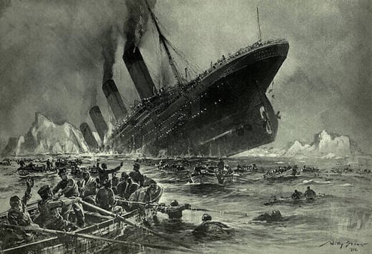
The Kaggle Titanic challenge is about predicting survival on the Titanic. As you probably know, one of the reasons that the Titanic shipwreck led to such loss of life was that there were not enough lifeboats for everyone. Let's find out what sorts of people were more likely to survive.
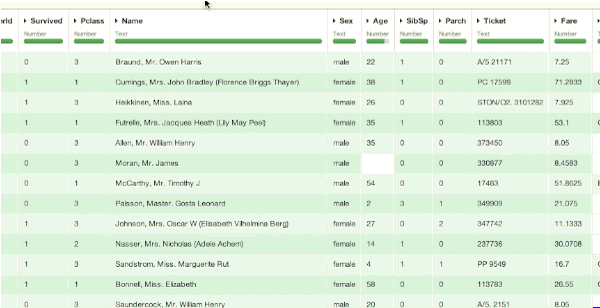
The Kaggle website provides us with a dataset to train our analysis containing a collection of parameters for 891 passengers (download the train.csv file):
- Id : a unique number
- Survival : 1=yes, 0=no
- Passenger class : 1=Upper, 2=Middle or 3=Lower
- Name (examples: "Braund, Mr. Owen Harris", "Heikkinen, Miss. Laina")
- Sex : female/male
- Age
- Number of Siblings/Spouses Aboard
- Number of Parents/Children Aboard
- Ticket number
- Passenger Fare
- Cabin
- Port of Embarkation
Analyzing the Titanic Dataset in Dataiku

Importing the Dataset
Importing the dataset in Dataiku is pretty easy: a single drag-and-drop of the file is required, and from there, Dataiku automatically guesses the charset and other parameters of the file (comma separated, etc.).
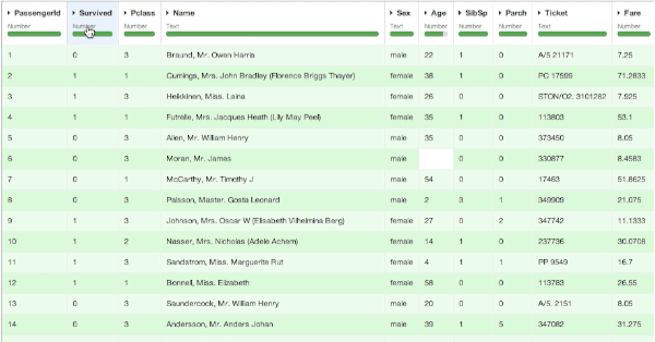
Once imported, we can visualize the data in a spreadsheet-like view (called Explore in Dataiku). It seems that nothing has really changed too much from Excel at this point. The biggest difference is that in Dataiku, each column receives a type: it can be a number, a text, a date, etc., and this allows us to quickly see if the data is not clean. Here, we don't have any problem, as Kaggle provided a relatively well-structured dataset.
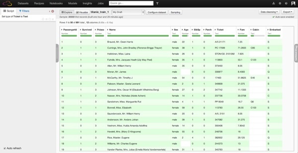
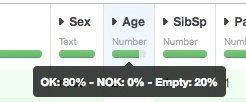
However, you can see that some columns have missing values (in Dataiku, each column contains a missing value indicator). For example, the Age column has roughly 20% of missing data and the Cabin column 77 % missing.
First Analysis
We can dive into the analysis by looking at the proportion of surviving passengers, which is easy to get in Dataiku by opening the Analyze tool on the Survived column. It looks like 342 out of the 891 people in our dataset survived, which corresponds to a 38.4% (not a lot...).
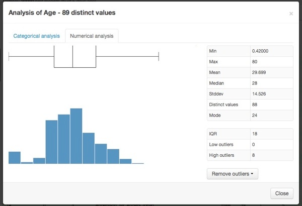
By using the Dataiku Analyze functionality on the Age column as well, we can see a quick overview of the passenger age distribution with a histogram and a box plot.
Repeating these steps on other variables, I can have a good overall idea in under a few minutes of what's in my dataset:
- The majority (64.8%) of the passengers are male.
- The majority are between 20 and 40 years old (the median is 28). Quite a high proportion is also very young (44 passengers out of the 714 passengers for which we know the age are below 6 years old).
- 24% had first-class tickets, 21% middle class, and 55% in the third class.
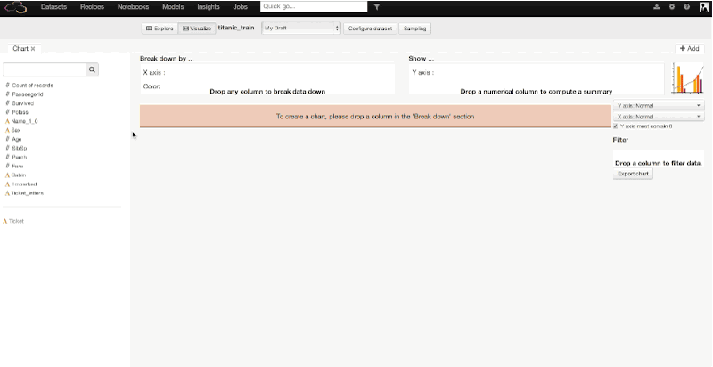
Data Visualization
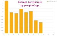
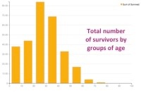
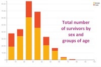
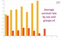
After exploring a bit, we can switch to the visualize view in Dataiku to build our first charts and go deeper in our analysis. Let's explore the relationship between age and survival more deeply. In a few clicks and using drag-and-drop functionality in Dataiku, we can plot the age of the passengers (split in 10 bins of 10 years) versus the average rate of survival, then versus the number of survivors. The third and fourth plotted graphs add a distinction between male and female among the survivals. With this quick visualization, it becomes clear that being a child or a woman was a clear advantage to survive:
Similarly, we could make a graph showing the average survival rate by the passengers' class. We would find :
- In first class, 60% of the passengers survived.
- In middle class, 1 out of 2 passengers survived.
- In third class, it falls down to 25%.
Data Transformation
Now that we have a good overview of the dataset, we should see how we can enrich our data. This will give our predictive models more data to work with later.
In the Explore view, Dataiku provides a large variety of transformation tools that we call Processors. It is easy to:
- Delete or keep columns/rows depending on different values
- Transform, parse or replace some textual values
- Split cells
- Calculate dates, etc.
- "Braund, Mr. Owen Harris" -> Mr.
- "Cumings, Mrs. John Bradley (Florence Briggs Thayer)" -> Mrs.
- "Heikkinen, Miss. Laina" -> Miss.
- "Master. Gosta Leonard" -> Master.
This extraction makes sense: it gives some extra information on the passenger, especially in the case of a missing age. Master and Miss refer to children and young men/women. This information will help for the predictive step later on.
The extraction of the abbreviated title is easy in Dataiku thanks to a double split of the column (on the comma and on the point). Then, we can delete the added columns that we do not need:
That is it! At this point, we'll deploy the script in Dataiku to save our dataset for the next part. We will use it to run our predictive model in the following blog post (part two).
To conclude, we saw how easy it was to load a dataset in Dataiku as well as to get some initial information thanks to different indicators. The data is very well structured, so the only problem concerns some missing data. Through quick analysis and charts, we assume that being young or a woman is quite a significant indicator to survival of the shipwreck. We will go deeper in the analysis in part two. Note that many other graphics or transformations could have been done. The idea is to show one easy way to explore the data without any programming!