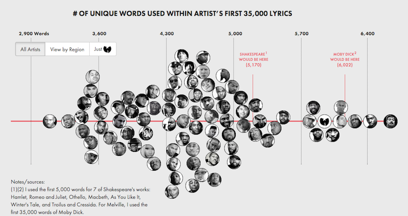
Before I had ever even heard about Dataiku and started really working with data, I remember reading this awesome article around March 2015 on the ranking of hip hop artists based on their vocabulary. At that point, I hadn’t ever thought of data or how powerful it is, but I remember that article hitting a cord, right in the heart of the Air Max-wearing nerd deep down inside me.

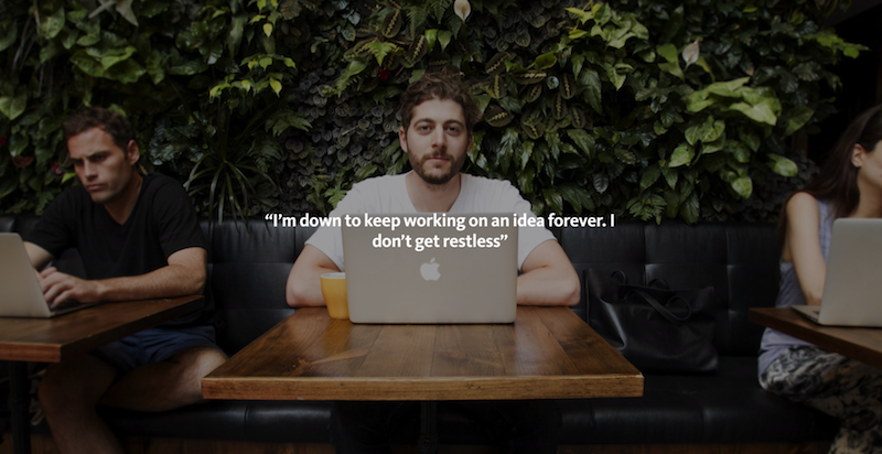
This picture is courtesy of the Little House Collective over here.
So imagine how psyched I was when in the middle of my tour of the New York data meetup scene this autumn, I ended up in the audience while Matt Daniels himself described how he’d worked on another one of his great projects: looking at which past hit songs had stood the test of time.
As he spoke, a lot of things he was talking about reminded me of subjects that came up of a lot of our discussions at Dataiku — the length and tediousness of the data cleaning model for instance. So I figured this guy probably had more interesting stuff to talk about, reached out to him and scheduled an interview. Because that’s how cool of a guy Matt Daniels is.
As you’d expect from someone who started out working on hip hop music data visualization projects in his free time, he welcomed me in an old warehouse-turned-coworking-space in Brooklyn. And we had a great talk about his vision of data storytelling and how he ended up quitting his job as a consultant to make data beautiful and meaningful.
“I want to find people that enjoy data visualization projects”
So, what is it that you do?
I’m building a data-driven storytelling site called Polygraph. I basically create content for the internet. A lot of it has to do with working on data and data visualization, writing prose about it, and describing it. That’s my day job. A lot of these projects are independent. A part of that work is also projects similar to sponsored content. A brand or a site pays me to work on a project that will then be published on the site Polygraph.

Find all of Matt's cool projects over here.
How did you get into that?
I had been working in consulting for eight years; mostly in digital marketing. For most of the projects I worked on, we were advising on how to make amazing stuff on the internet and getting clients to do well with digital marketing. I got a really good eye for what would do well from a content perspective.
So with that, I started working on projects outside of work that put a lot of these ideas into practice. The first thing I worked on was building a crowd-sourced profanity list, which was a fun idea that I thought would do well in terms of traffic on the internet.
I’d been doing stuff like that for five or six years, and a lot of these side projects had involved data viz in some way. Then, last year, I took a break from work and did a project on hip hop and vocabulary that did very well. I had enough momentum behind me with the traffic the article had generated to start getting clients and working on projects that I knew I had an audience for, so I decided to start doing this as my day job. And I started working on data visualization full time in June.

This is still my personal favorite, the Rap Vocabulary Project.
Do you find that audience is often less technical than one could expect when it comes to data?
A lot of people underestimate how interesting data-driven projects are. I think when you say data people often think: “Oh, we need someone who is a math or science major or who practices advanced statistics to understand.” I don’t think that’s the case; I think people are way more attracted to data as content then we anticipate. For example, Reddit has a community called data is beautiful which is one of the top 50 communities on Reddit. It’s completely about data and it’s in a similar level of popularity to film and music!
So I think there is a huge audience for this type of work that isn't necessarily technical. And is way more mainstream. In the same way that writing is mainstream; people read prose written articles all the time, and they aren't necessarily literature majors. I believe the data visualization aspect is just a different medium for expressing ideas and isn't necessarily out of reach for someone who isn't well versed in data statistics and other data fields.
Is that a long term goal of yours, to speak to that audience?
So my long term goal is to build this site for data visualization, and data-driven content and stories. From a more down-to-earth marketing perspective, I am trying to build an audience. I do want to find these people that enjoy data visualization projects, and give them a place where they can find great content, as they would on FiveThirtyEight or the Upshot. That’s the number one goal.
“I start with an idea I’m excited about”
What’s your typical process when you’re approaching a project?
Usually I’ll come up with a high level idea for something I want to do. I’ll tell a bunch of friends about it and see if they get excited. Then I’ll start scraping the data, and getting the data together. After that, I’ll start playing around with the data in Excel or SQL to get a sense of what’s interesting about it.
From there I’ll start designing some charts in keynote; not based on real data but what the aesthetic would look like and how I think the data would be interestingly visualized. At this point I’ll start coding those rough visualizations without any aesthetics in d3js, just to see if the data looks interesting when coded. I’ll start writing prose to accompany the charts with a story walking you through the data. From there, it’s just lots of coding and iterating and making it work on mobile and all the finishing touches that you get when you are publishing something on the internet.
From a process standpoint, I try to avoid doing too much analysis of the data and finding conclusions or “insights.” I want to share what’s interesting about the data from a high level and try to find a way to show that, rather than visualize one specific point I want to get through. This means I’m spending way more time in the design process than the data analysis one. This sounds pretty abstract, but more or less I’m trying to make it so people explore data in an article, rather than just read some results that I found from a data analysis.

Check out Matt's story on the definition of Punk.
What tools do you work with?
Let’s see. From a data perspective, and especially getting data and primarily scraping, I use Python. All the databases that I use are basic MySQL databases. And I use Amazon Web Services for hosting.
From a design standpoint, I use Keynote (the PowerPoint for Mac and a pretty good design tool.) It constrains the kind of design that you can do to build things that actually work on the internet. Often, a lot of the things you build with Photoshop or Illustrator for instance would be really hard to code in HTML or just wouldn't even work; so sticking with Keynote is usually a good idea. Then from a code standpoint, I use d3js for visualization. For animations, I also use d3 and a little bit of jQuery. For scrolling events I’ve been using ScrollMagic a lot recently, and waypoints. And I think those are probably it.
"Get an idea that you would want to read if it were finished.”
As a consultant, how did you approach the technological side of working on these projects?
I learned how to code along the way, by doing these projects. It’s simple: if I have an idea, to make it I have to learn to make a certain piece of code. It was very piecemeal. I didn’t take any classes or have any professional training. When I got an idea for a project, I learned how to code enough to do the project. In the past year, I’ve been doing more projects so I’ve still just been learning specific pieces of code, but at a faster rate.
Based on your experience, what advice would you have for people people who want to get started?
I always reckon that you should just find a project that you’re excited about, and that you find interesting enough to work on for a few weeks. And then go ahead and make the thing. It doesn’t have to be perfect. Just so long as you are passionate about the idea it makes it a lot easier. It matters a lot when you have to go through the hoops of the scraping, and the analysis, and the design, and the coding. You really have to be excited about the end product.

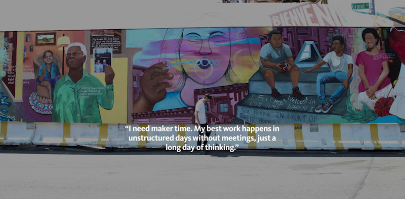
Again, I borrowed this picture from the Little House Collective over here.
Also don’t worry about skills that you need to make the idea. A lot of people think: “I don’t know d3, so I can’t work on any projects until I’m good enough at d3, or javascript, or Python, etc.” And they’ll do a bunch of classes and tutorials to get to a certain level of proficiency, and then they’ll think know I can go and make things. And that’s fine.
I think a more interesting route is: you don’t know how to do anything or you know how to do some things, and you think,“Okay, I have this idea that I want to make, and I’ll learn the skills necessary to see that through”.
Start with an idea that you’re passionate about doing. Like movie data for example. You have all the data on IMDb and you want to figure out how to get that. Instead of taking a bunch of classes on data scraping, just learn enough about Python and APIs to scrape IMDb. You’re not going to be an expert at data scraping, and you’ll probably need to learn new things if you want to work with Spotify data next, but worry about that later. Just learn enough to do the idea that you’re excited about. And then you’ll eventually get enough momentum where doing new things will get easier every time you do a project, and you’ll get better and better at it.


