Our recent version of Dataiku focuses on collaboration, and one of the new features is the completely revamped dashboards.
This new dashboards feature allows users to create multiple customizable dashboards that not only display charts and data, but also allow the dashboard readers to perform analysis and scenario testing directly in the dashboard.
We had no intention of designing the perfect dashboard; instead, we wanted to give dashboard creators the best user experience (UX) possible in order to allow them to create the perfect dashboards for their particular needs. At Dataiku, we believe that providing data scientists and analysts with powerful and easy-to-use tools is the key to unlocking the potential of data teams and of whole organizations. In other words, we need to make it simple for you to do your job, not do your job for you.
As a member of the R&D team, I work together with our product managers, designers, and other developers to design, build, and test our products. In this post I would like to share with you how we designed this user-centric version: with a lot of hard work, methodology and, well, collaboration!
Sketches, Templates, and Storyboards
Once we decide to move forward on a feature, Kenji, our product manager, and Olivier, our UX designer, start wondering about how to turn it into screens, buttons, and other interface elements. There are no trendy software tools; everything starts with pencils, paper, and sketches that we call “zonings” where we identify our new user interface (UI) elements and their respective positions.
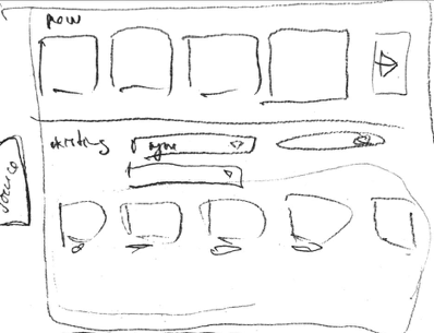
A rough zoning sketch
This exercise is iterative: the more elements you position, the more new elements you come up with. These new elements then challenge what you've done so far and push you to rethink the whole thing.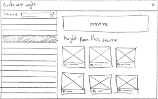
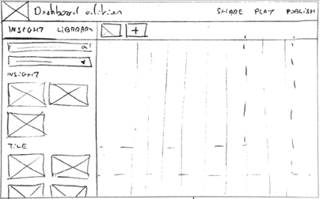
Two examples of how to create new tiles in the dashboard (one through a modal window and one as a sidebar).
Kenji and Olivier then list different scenarios the user could go through, and they sketch out the steps for each scenario. Here comes the tricky part: a layout that is satisfying for one scenario might prove unpleasant for another one. There is no secret to solving this problem; we need to go back and forth between our scenarios until we find an arrangement that satisfies all of them. This completed arrangement is called a storyboard.
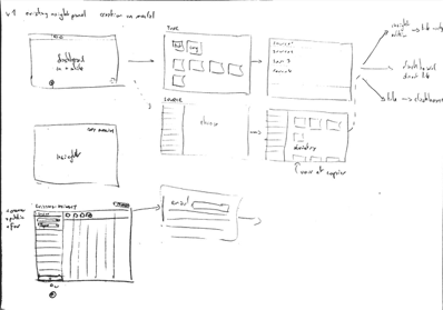
An example of a storyboard
Based on the storyboard, Kenji and Olivier turn their drawings into illustrated templates that look (but don’t act) just like Dataiku, and they start to iterate on their usability.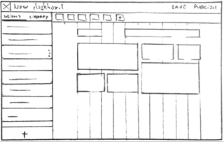
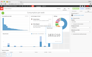
A zoning (top) and its equivalent layout (after many iterations!)
Bringing Developers (Including Me!) On Board
Kenji and Olivier brief the developers on what they've ended up with during the conception stage. Then, the dev team starts its developments.
Everyone who's been a developer knows what I'm about to say: since it's on you to keep bugs to absolute minimum, you need to make it solid enough to handle any kind of user behavior. This leads you to think about a wide range of cases no one had ever thought about. Iteration and collaboration between product owner and developers then leads to the creation of sub-features. It's like the movie Inception, except instead of dreams within dreams, we're starting to iterate within iterations!
Another phenomena that occurs while coding is that developers spend a huge amount of time on the new screens redoing the same actions again and again to make sure their latest lines of code didn't break anything. By redoing those same tasks multiple times, they kind of step into our future users’ shoes. Therefore, we developers really share the users’ need for efficiency in terms of number of actions needed to fulfill one task (pointing, clicking, dragging, dropping, and so on).
A good developer being a lazy developer, he will always seek the shortest and simplest code. This state of mind combined with those repeated actions usually gives birth to small ideas that will eventually have a smoothing effect over the UI they're developing. Of course, those ideas need to be shared and discussed with Kenji and Olivier before being implemented. This usually leads to a new -- wait for it -- iteration process! Iteration is definitely the cornerstone of good UX.
Dive Into Cold Water
The whole thing is starting to hold together. At this stage, we've lost what in zen and martial arts is called shoshin (“beginner’s spirit” in English). We've been staring at the new UI for so long that we've forgotten how it first appeared to us. Therefore, we need fresh eyes to test our new screens.
(By the way, sometimes you'll see calls for volunteers on our website. If you're interested, please don't hesitate - we can do it all remotely!)
Design Iterations Beyond the Team
Once the feature finally comes out, its development and growth cycle continues. Besides the user feedback that helps us spot and fix little bugs that manage to fall between the cracks, we also use internal feedback.
Dataikers (the name we use for Dataiku employees) are all fairly experienced users of Dataiku. This common interest in machine learning leads to a bunch of excellent and detailed ideas in terms of UX. The devil being in the details, this enable us to always keep polishing and smoothing out the experience for our users, making it faster, simpler, and easier.
This internal feedback usually leads to, yes, another iteration process. Rethinking really is part of the maturing process, and UIs are like good wine: they get better with, er, maturity.
We hope that you enjoy the product, and please give us any feedback you might have, because we’ll continue to work together for each new release. We’re already ready for our next round of iterations…


