


In data science, most data is represented in the form of tables that consist of columns and rows and we consider rows as independent (e.g., each row corresponds to a single person). However, these rows can be related (e.g., some people may have relationships with others). The underlying structure of our table now becomes a graph: a set of nodes (e.g., persons) that are connected to each other through edges (e.g., relationships).

I wanted to find an easy way to visualize a table as a graph network to get insights about complex connected data — insights that are not easy to get when only looking at the raw dataset, such as finding clusters and outliers. Displaying a graph as nodes and edges is quite intuitive and allows us to easily spot patterns.
Graph visualization has plenty of useful applications, such as detecting fake social media accounts. When looking at a graph of social media accounts and their interactions, for example, seeing many accounts pointing towards the same account could potentially mean that they are fake.
I work on the R&D team at Dataiku and we are always looking to provide users with novel ways to analyze their data within our data science platform. That includes machine learning, data visualization, third-party software integration, etc.
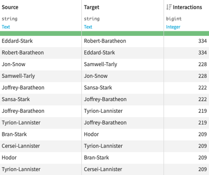
In this blog post, I will explain how I built a graph visualization tool and some of the challenges I had to overcome. I will illustrate this blog post using a well-known dataset of Game of Thrones character interactions:
The end goal is to obtain the following graph visualization where colors, sizes, width, and positions all have insightful meanings:
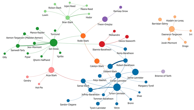
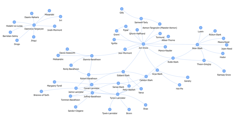
Game of Thrones characters with more than 60 interactions
Find a Graph Visualization Library
First, I need to find a graph visualization library that can easily display a few hundred or even thousands of nodes and be highly customizable. I also want to be able to set the node sizes, colors, positions, and labels. After considering multiple JavaScript libraries, I settled with vis.js.
Vis.js is a JavaScript library easy to use, designed to handle large amounts of data, and one of most complete graph visualization libraries. It also has many interactive features. Users can zoom in and out of the graph display, nodes can be selected and dragged, and hovering over a node can display its information in a tooltip.
What Layout Algorithm to Choose
One of the biggest challenges in graph visualization is finding a good layout, meaning figuring out where to place the nodes.
There are many different kinds of layout algorithms that achieve different purposes:
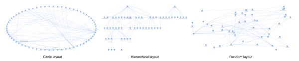
When choosing a layout, my goal was twofold: first, the nodes’ positions must be meaningful, as “similar” nodes should be close to each other, and secondly the layout should display graphs in an aesthetically pleasing way. Force-directed graph layout algorithms fit my goals exactly.
Force-Directed Graph Algorithms
These force-directed algorithms try to position nodes by considering forces between any two nodes (attractive if they are connected, repulsive otherwise). They are generally iterative and move nodes one by one until no more improvement is possible or the maximum number of iterations is reached.
Edges are of more or less equal length and there are as few crossing edges as possible. Connected nodes are pulled close together while isolated nodes are pushed away to the sides.
Simulation of force-directed algorithm iterations
Vis.js provides implementations of force-directed layout algorithms that are executed by the browser in JavaScript. The algorithm iterations can be visually displayed to the user, as you can see in the image above. However, running these complex algorithms in a JavaScript front-end makes the application really slow and could even crash the browser.
For that reason, I used a Python back-end to handle the computation of the graph layout. Then, the computed positions of each node need to be passed to the vis.js graph in the form of x and y coordinates.
I’m using igraph which is one of the most efficient graph libraries and provides many different graph layout algorithms. It is a library written in C with a Python interface that is pretty straightforward to install as a Python package.
Combining Multiple Layout Algorithms
Igraph implements two interesting force-directed graph algorithms: Kamada-Kawai and Fruchterman-Reingold. While the first one is very fast but gives bad drawing on big graphs, the second one is slower but outputs much better layouts. This is why I used a combination of both to get the best of the two algorithms. The Kamada-Kawai algorithm first generates a fast initial layout and then the Fruchterman-Reingold algorithm improves it to get a finer layout.
kamada_kawai_positions = iGraph.layout_kamada_kawai()

final_positions = iGraph.layout_fruchterman_reingold(seed=kamada_kawai_positions)
Combining the two layout algorithms of igraph in Python
Graph Customization and Clustering
In a graph, there can be groups of nodes that are quite similar — they belong to the same cluster. Some nodes can be more important than others if they connect to more nodes or are more central, for example. Edges can connect nodes with different intensities.
 Graph without customization
I wanted to display all of this information using different colors, sizes, and widths. The more important a node is, the bigger it is; nodes of the same color are in the same clusters; thicker edges represent stronger connections.
In order to do that, I ran some graph clustering algorithms (e.g., the Walktrap algorithm that identifies clusters in large graphs by simulating random walks) and used their output to set the node colors. Similarly, some node importance graph algorithms (e.g., the page rank ranks nodes based on the quality and number of their neighbors) can be used to set the node sizes. I can also set the edges' width based on their weight in the graph.
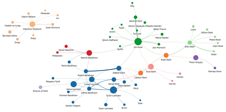 Graph with customization
In vis.js, each node is represented as a dictionary of attributes with a unique ID and each edge as a dictionary containing the IDs of its source and target nodes as well as some additional attributes.
node = {id: "Tyrion-Lannister, label: "Tyrion-Lannister", group: 3, value: 0.018}
 edge = {from: "Cersei-Lannister", to: "Tyrion-Lannister", value: 209}
Example of expected data by vis.js
In the example above, nodes belong to specific groups (e.g., the output of a graph clustering algorithm) and have different values (e.g., page rank). I need to map each group to a specific color in the vis.js graph. To transform the values attribute into sizes, I also needed to choose a scale in vis.js that map values between 0 and 1 and then fix a minimum and maximum node size.
Final Graph
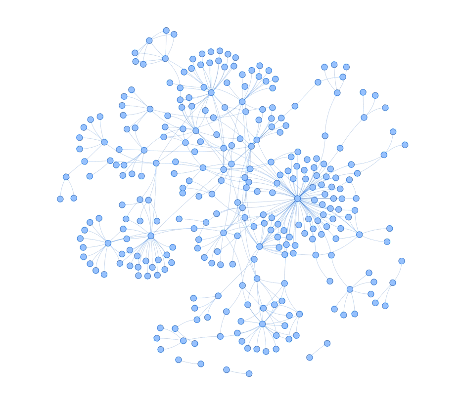
Finally, the complete graph of Game of Thrones character interactions looks like this:
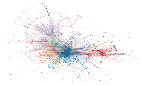
Complete graph of around 800 characters
I can zoom in the graph to see the nodes labels and understand who the central characters are and who makes up the different clusters. In the example below, we see that the red cluster is centered around Daenerys, one of the main characters, and contains her friends, family and servants.
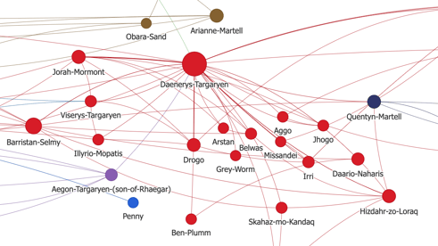
Zoom on the red cluster
Conclusion
I really enjoyed developing this tool for Dataiku, knowing that our users will now be able to visualize their datasets as graphs, simply by dragging and dropping some columns based on the type of graph and customization they want. It is now available as a Dataiku plugin with both graph algorithms and visualization capabilities.