


Previously, we showed that uplift modeling, a causal inference success story for businesses, can outperform more conventional churn models. As with any causal inference application, it relied on crucial assumptions about the data to correctly identify the causal effect. While we brushed those assumptions aside, contenting ourselves with the assertion that they hold whenever the treatment variable was randomized, we will present and examine the two fundamental assumptions of ignorability and positivity.
There are two other assumptions — no interference and consistency — that are generally more likely to hold outside randomized-controlled settings. As such, we will refer the reader to this textbook to learn more about those. On the other hand, ignorability and positivity are strong and very unlikely to hold in observational data.
For now, let's explore a scenario that is of particular interest for health insurance and healthcare providers alike: measuring the effect of taking anti-diabetic drugs on the probability of hospital readmissions.

A Story of Biases
Every year, thousands of diabetic Americans are admitted to the hospital to receive care that may or may not be related to their diabetes condition. For the sake of those patients, and to minimize costs to the U.S. health care system, hospital readmissions should be avoided. These happen when a patient who had been discharged from a hospital is admitted again within 30 days. As such, it is important to learn the effect of potential interventions. One of those is whether or not a diabetic patient is prescribed any type of anti-diabetic medication (ADM) during their hospital stay.
To measure this effect, we could collect hospital discharge data of diabetic patients and model hospital readmission as a difference in average between two groups: one group with ADM prescription, the other without. We would estimate the following as the expected difference:

Unfortunately, this difference in conditional expected readmissions does not identify a causal effect! Indeed, consider the unmeasured severity of one's diabetic condition or other health issues. This severity is likely positively correlated with the probability that the patient was prescribed ADM drugs. That same patient is more likely to suffer complications after discharge, thereby increasing her chances of readmission. There we have it — a bias. Our difference in expected readmissions is inflated through some unmeasured health severity.
A Quick Refresher on Causal Graphs
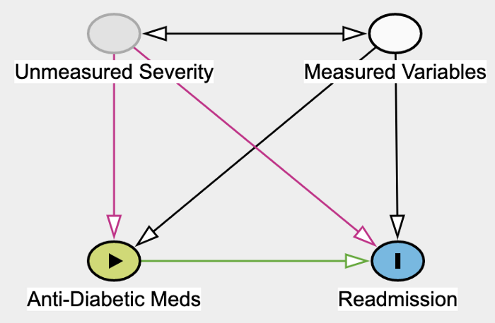 Directed Graph showing our assumptions about the data. Graph made with Daggity.
The above Directed Graph encodes the assumptions we are making about the data. Each node represents a variable or group of variables. An edge from A to B means that we assume that A causes B. A bi-directional edge means we're simply assuming a correlation. While it is true that the Unmeasured Severity of one's health causes health indicators in the Measured Variables group, the other direction is also possible. Age is contained in the Measured Variable group and likely causes health severity. For the purpose of this post, the relation between those two groups of variables is not important. We could have also assumed no correlation at all (i.e., no edges).
The green edge going from Anti-Diabetic Meds into Readmission represents the causal effect that we would like to measure. To identify this causal effect, we need to neutralize so-called confounders, that is, variables that cause both the ADM (the treatment) and Readmission (the outcome).
Unmeasured Severity and Measured Variables are both confounders. To neutralize their effect, we need to control for them, meaning include them as features in our model. Obviously, only measured confounders can be included, and so the bias from still Unmeasured Severity persists.
Causal Effects and the Do Operator
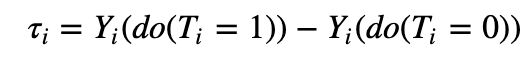
Definition. Let Y_i and T_i denote the outcome variable and a binary treatment variable for the i-th person, and let X_i denote its observed features. In our running example, Y_i stands for hospital readmission and T_i represents the indicator for ADM. The causal effect is defined as:
The do operator amounts to forcing the treatment variable to take on value t.
To measure the effect of an ADM on hospital readmission, we're looking at the difference in two potential outcomes. Only one of those two outcomes is observed; the other is what is referred to as a counterfactual. In terms of graphs, the do operator severs all edges going into the ADM node which becomes deterministic (see graph below).
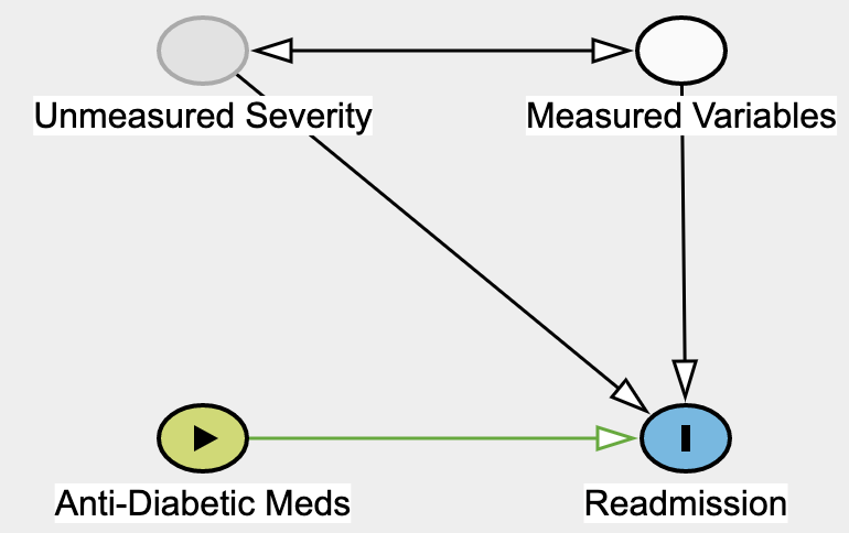 By forcing Anti-Diabetic Meds to a certain value, we're essentially severing all of its causes. Graph made with Daggity.
How do we do that? Obviously, we can't go back in time and force people to choose a different treatment option with the hope of measuring their counterfactual readmission outcome. We are never be able to directly measure τ_i. This impossibility is referred to as the fundamental problem of causal inference. Lucky for us, under the four assumptions laid out at the beginning, the Conditional Average Treatment Effect (CATE):

can be estimated as a simple difference in conditional expectations:
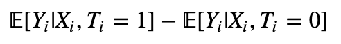
whenever X_i is a so-called valid adjustment subset of variables.
The Ignorability Assumption
The ignorability assumption states that all the variables (X_i) affecting both the treatment (T_i) and the outcome (Y_i) are observed and can be controlled for. Formally, we need to find a set of variables X_i such that:
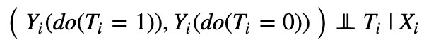
This says that potential outcomes are independent of treatment once we control for this specific set of features. Put differently, treatment has no other effect on the potential outcome through some backchannel. Given that Severity is not observed, it cannot be included in X_i. Ignorability is therefore violated and a bias likely present.
Our example highlights the importance of constructing a causal graph. They allow us to see clearly what variables are observed or not observed, and how unobserved variables could yield biases in our estimates. Generally, X_i must contain all variables that cause — either directly or indirectly — the treatment. While it would be tempting to throw in all observed features at our disposal, we need to be wary of not including any colliders. Those would actually introduce a bias when controlled for.
Here, we feel confident that our unobserved severity breaks our assumption. What options do we have then? One possibility would be to explore other causal inference techniques such as instrumental variables estimations or using a mediator variable and the front-door adjustment criterion. Unfortunately, those alternative techniques are no more likely to work as they rely on very specific graph configurations.
Another option is to try to assess the strength and plausibility of our health severity bias. This is done via sensitivity analysis which we hope to present in a later blog post.
The Positivity Assumption
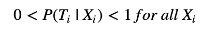
The positivity assumption ensures that every observation has a strictly positive chance of being in the treatment group or control group.
Intuition. Violation of this assumption for individuals characterized by X_i means that we cannot hope to construct some matching counterfactual for them. How you would go about estimating the effect of taking ADM in a subpopulation of diabetic people that have never been exposed to ADM? Additionally, we can check — using Bayes' theorem — that this ensures E[Y_i|X_i, T_i] to be well defined everywhere, and therefore so is our CATE estimator.
Unlike ignorability, positivity is more easily evaluated thanks to a series of tests. This is the topic of the next section.
Testing the Positivity Assumption
Many of the tests we will introduce are available in the IBM causallib notebook (see this paper for more details). To drive the point home, we apply those tests to observational data.
Data. We use hospital discharge records from people who were admitted to the hospital for any health reason and who also happen to have been diagnosed with diabetes; readmitted(=Y) is the variable indicating patient readmission. The treatment variable diabetesMed(=T) is an indicator of an ADM prescription during the hospital stay. The other variables are demographic data (age, race, gender), various medical features characterizing care provided (diagnoses and treatment received, etc.), as well as count of previous hospital admissions.
Propensity model. All the positivity tests rely on an estimator of the propensity score P(diabetesMed_i | X_i). Our estimator is a random forest model trained on 80% of our data; the remaining 20% is used to conduct the tests. Model predictions are calibrated using an isotonic regression.
This model scored a AUC of … 1, indicating likely leakage in our data. To confirm this, let’s look at its feature importance bar chart. Highly important features are suspicious as they herald leakage in our data.
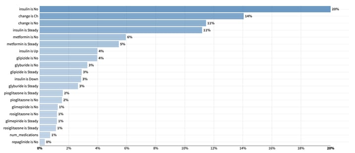
Variables importance from a random forest model trained to predict the use of ADM. Unsurprisingly, indicators for anti-diabetic substances use or medication adjustment play a significant role in predicting the diabetesMed indicator.
Unsurprisingly, indicators for anti-diabetic substances use or medication adjustment play a significant role in predicting our diabetesMed indicator.
Even in the absence of leakage, high relative feature importance concentrated in a few variables remain suspicious. This means that those few features play a crucial role in determining who gets ADM and who doesn't. As a result, it is very likely that those features can define sizable regions of homogenous treatment assignment in the feature space, hence indicating that the positivity assumption is unlikely to hold.
To tackle this apparent leakage and the resulting violation of positivity, we will rerun our model after having excluded any feature related to anti-diabetes substances or medication adjustment. As we remove features, we are trading off the possibility of abiding by the ignorability assumption for increased chance of abidance by the positivity assumption. By excluding features, we are indeed losing potential features that we could have thrown in as controls to satisfy the ignorability assumption. This is known as the positivity-ignorability tradeoff.
We now present three different tests: the first one checks the positivity assumption and the other two are rather designed to evaluate the quality of our propensity model. Having accurate propensity predictions is of paramount importance to the training of consistent propensity-based causal models.
Cumulative Distribution Functions Support
We plot the cumulative distribution function of the predicted propensity on the test data among those people who were using ADM (treated, in orange) against those who were not (control, in blue). For the positivity assumption to be satisfied, we expect to see no observations at either 0 or 1.
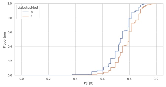
However, we see that the blue CDF starts at 0 and the orange CDF ends at 1, thereby suggesting that the positivity assumption is breaking for a few observations. Whenever this happens, it is important to study the data and interrogate domain experts to check for potential features or combination of features that would drive the use or non-use of ADM.
Once a pattern is identified, researchers face the choice of either removing those driving features or filtering out non-compliant observations. In our case, with only 339 (out of over 20,000 observations) falling outside the [0.05, 0.95] predicted probability range, combined with highly granular data, we were not able to identify any insightful pattern. As a result, and as is standard in the propensity-score literature, we removed those 339 observations.
Once we have checked the validity of the positivity assumption, we have access to more robust causal estimators that directly leverage the propensity model (the so-called propensity-based causal models). However, those models rely on proper calibration of the propensity model.
Assessing the Effectiveness of Inverse Propensity Weighting
At their core, the remaining two tests recognize that the treatment and control groups differ along other features. To standardize the feature distribution across groups, those tests reweigh data using the inverse predicted propensity. In other words, they weigh each sample i by:
For our weights to be well defined, it is crucial to remove any observation whose P(T_i|X_i) is too close to 0 or 1. That's the main reason why we removed observations whose propensity score fell outside the [0.05, 0.95] range.
The Good Old-Fashioned ROC Curve and Its Variants
Having a good ROC curve is a desirable outcome in any classification problem, but not when we’re checking the positivity assumption! For our propensity model, this suggests the presence of pockets in the feature space that systematically got prescribed ADM while other pockets did not. On the ROC curve, this translates into jumps in the true positive rate for given constant false positive rates (vertical segments in the curve) and vice-versa (horizontal segments).
While this standard ROC helps us spot possible violation of the positivity assumption, we can further use this curve to assess the performance of our propensity score model. Specifically, we can compare this standard ROC curve to an expected ROC to check that the predicted probabilities from our model are well calibrated.
To understand this expected curve, first note that we will never know the true probability of receiving ADM. Yet, if we are willing to make the assumption that the predictions from the propensity model are the true probability of being treated, a patient with propensity p of receiving ADM would be expected to be in the true positive group with probability p and in the false negative group with probability 1-p.
The expected ROC curve makes that assumption and creates a curve that ignores the actual treatment assignment and uses these expected value instead. As a result, observations with very high or low propensity weigh almost the same as they did in the standard ROC curve. Indecisive propensity (around 0.5) contribute a segment closer to the 45-degree line.
In the graph below, the standard and expected ROC curves overlap and feature an AUC of 0.64. This overlap is welcome as it indicates that our probabilities are well calibrated. This was further confirmed by plotting a standard calibration curve, and after recomputing the two ROC curves without prior prediction calibration (we obtained an AUC and expected AUC of 0.64 and 0.56, respectively).
Note also that there are no vertical or horizontal segments in the two curves. As explained above, this is great news as this gives us even more confidence that the positivity assumption holds.
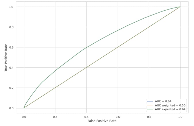
Three different ROC curves. The standard, expected, and inverse-propensity weighing one. The overlap between the the standard and expected ROC curve indicates that our propensity predictions are well calibrated. The absence of vertical or horizontal segments in the standard curve suggests that the positivity assumption holds. This is further confirmed by the inverse propensity weighed curve is no different than chance prediction (45-degree line).
If ADM had been prescribed at random — as would have been the case in a clinical trial — we would have expected the standard ROC curve to be close to the 45-degree line (AUC of 0.5). However, our model retained some discriminatory power which could be chalked up to difference between the treatment and control groups. In other words, people who received ADM might have been overrepresented or underrepresented in some regions of the feature space.
The model would then be able to classify ADM assignment solely based on those differences in characteristics. To check that it is not the case, we can rebalance our dataset using the inverse propensity as mentioned in the previous section. Once reweighed, treatment and control groups should feature similar characteristics, and the weighted ROC curve should be close to the 45-degree line. This confirms that our propensity model worked as intended.
We now introduce one last test to compare characteristics across treatment and control groups.
The Absolute Standardized Mean Difference (SMD)
Definition. This measure consists in taking the mean of each feature in the treatment and control group and looking at their absolute difference. This difference is normalized by the standard deviation of each feature computed from the data of both groups pooled together.
Any difference greater than say 0.1 will be taken as evidence that the feature is distributed differently in the ADM group than it is in the non-ADM group. Ideally, most of this difference should vanish after inverse propensity weighing.
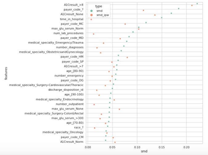
The Absolute Standardized Mean Difference with and without inverse propensity weighting.
The above graph shows the 30 largest SMD (teal dots) and their inverse propensity weighed counterparts (orange dots). Only a few dots are greater than our arbitrary yet standard 0.1 threshold. Those high values are poorly handled by the inverse propensity weighting — this would warrant further investigation of our data or improvement of our propensity model.
One could try to run different models with various regularization constraints or exclude features such as the A1C results variables while keeping in mind the positivity-ignorability bias alluded to earlier. Remember that at the beginning of the this post, we suspected that unmeasured bad health severity could yield a bias in our causal estimates. An A1C test measures the percentage of a patient's red blood cells that have sugar-coated hemoglobin. It is arguably a proxy for unmeasured diabetes severity. Getting rid of that feature would probably exacerbate our bias.
Conclusion
This post should have convinced you that causal inference is not an easy task! This is especially true outside of a randomized-controlled trial setting where researchers are left to study observational data. In that setting, the two crucial assumptions — ignorability and positivity — are strong, if not completely unrealistic sometimes.
While ignorability is fundamentally untestable, we showed that we can assess the positivity assumption by checking for the undesired presence of observations near 0 or 1 in the CDF of the propensity predictions. In addition, those predictions need to be accurate as they are the building block of propensity-based causal models.
To evaluate the accuracy of those predictions, we introduced two additional tests. The first test involves comparing three different ROC curves: a standard curve to an expected and propensity-weighted curve. The second test studies SMD/Love plot with and before and after propensity weighting. A failure of any of those tests can be fixed through some combination of domain knowledge, removing features, filtering out rows, or trying out different propensity estimators.