


Data visualization is tightly linked to data democratization and the goal of Everyday AI. Why is that? To achieve data democratization (when people with different skills and experiences work together to develop and use AI), we need to give everyone a seat at the table when it comes to working with data.
Data visualization can help with this. The aim of data analysis and visualization is to make the data easier to comprehend for a larger audience. This, in turn, allows more people to access and understand the data.

So, before we dive into what exactly data visualization tools are, let’s first define data visualization. According to Harvard Business School, “Data visualization is the process of creating a visual representation of the information within a dataset.” While there are seemingly limitless ways to visualize data, some of the most common data visualization techniques include:
- Bar charts
- Pie charts
- Line graphs and charts
- Lift charts
- Tables
- Donut layouts
- Histograms
- Box plots
- Heat maps
- Correlation matrices
- Scatter plots
- Maps
The data visualization technique of choice will depend on the data at hand. It will also depend on the story the presenter wants to communicate with the viewer. This could be vastly different if the viewer is a C-suite executive or a teammate. The actual work of data teams and the insights they generate often remain obscure for many business teams and decision makers.
In an ideal organization, data understanding would be distributed across teams and data visualization tools would be a critical route to breaking down silos and making sure the business impact and value of data is actually visible. In the next sections, we’ll define what data visualization tools actually are, give an overview of Dataiku’s data visualization tools and features, and highlight the data visualization tools that the platform integrates with.
What Are Data Visualization Tools?
If there’s any statistic that reinforces how critical data visualization is in allowing business teams to understand data teams’ work and conclusions it’s the following. The global data visualization market is on target to more than double from 2019 to 2027 and is on track to surpass $19 billion by 2027.
While communication and alignment between data and domain experts is absolutely compulsory in any analytics or AI project, data visualization tools provide an excellent way for these teams to ensure tight collaboration, knowledge and insights sharing and, ultimately, airtight stakeholder decision making.
At their core, data visualization tools are software products that are used to accomplish the tasks described above involved in visualizing data. While the features by tool will vary, they allow teams to input a dataset and produce some form of a graphic representation of that data.
Key Traits to Look for in Data Visualization Tools
Data visualization tools should be easy to use. While the input dataset might be massive (i.e., thousands of data points), this shouldn’t impact the data visualization tool’s usability. That ties directly into the second quality to keep in mind when looking for a data visualization tool: It should be able to handle massive datasets (or multiple datasets in one visualization).
Lastly, data visualization tools should offer variety. It’s probably not going to be a future-proof or scalable tool if it only offers dashboards or only offers charts. Teams like to have options when it comes to differing chart, graph, or map types and don’t want to be siloed to just one way to represent their data. Additionally, they should look for interactivity: Teams should be able to easily interact with and explore trends through the data visualization tool they are using.
What Data Visualization Tools Does Dataiku Collaborate With?
For cases where reaching critical stakeholders and business users requires the use of existing BI tools, Dataiku integrates with platforms like Tableau, PowerBI, and Qlik to ensure that everyone has the information they need to generate value from analytics and AI projects developed in Dataiku.
What Data Visualization Tools + Features Does Dataiku Have?
Organizations use Dataiku for accomplishing tasks like connecting data sources for data preparation, machine learning (ML) model creation (i.e., what happens behind the dashboard), and even insight discovery. So, going off that last point, how can they interactively explore data and create statistical analyses, charts, and dashboards to share insights with the broader team? The answer lies with Dataiku’s data visualization tools. Here’s how Dataiku’s platform can help with data visualization:
Exploratory data analysis (EDA): An essential part of any data project, EDA in Dataiku helps teams understand what the data contains, get a feel for what cleaning is required, and draw conclusions on how useful the data will be for further statistical analysis and/or ML. Dataiku provides automatic profiling of columns, including the counts and distribution of values, top values, outliers, invalids, and summary statistics. It also has data quality indicators and sharing to provide visual cues for missing or invalid values.
Statistical analysis: Dataiku includes a wide range of statistical tests and analyses including univariate / bivariate / multivariate analyses, fit curves and distributions, location and distribution tests, and time series-specific analyses. A smart assistant helps uncover patterns by automatically exploring the data for interesting relationships, which are visualized through box plots, scatterplots, heat maps, and more.
Charts and graphs: Data and domain experts alike can create visualizations to understand or share data insights across a team or entire company. Options include bar charts, lines, curves, pie charts, donut layouts, box plots, lift charts, scatter plots, and more.
Dashboards: The quintessential data visualization tool, dashboards in Dataiku enable teams to easily share information about an analytics or AI project with stakeholders such as charts, model reports, interactive web applications, wikis, and more. Automatic dashboard refresh allows teams to ensure that business counterparts always have the latest and greatest information at their disposal.
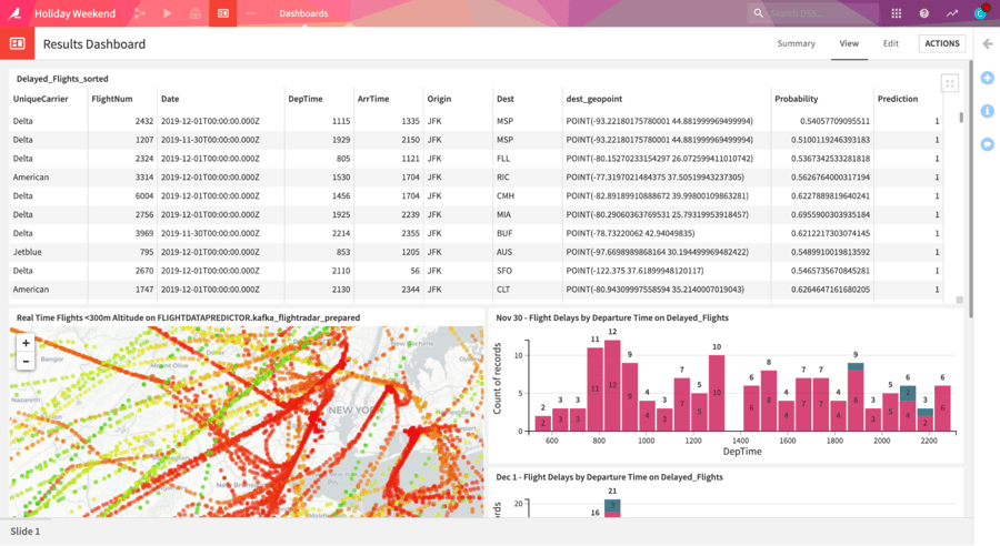
Geospatial analytics: Dataiku includes special storage formats, transformation processors, and presentation elements for geospatial data.
Regardless of your current data visualization tools, it’s critical to keep in mind who your audience is at all times. If you’re presenting complex P&L data to a team that works in marketing, you may want to choose a fairly simple visualization. Conversely, if you’re presenting that financial data to the finance team, you can likely include more complex data and more complex visualizations. And remember: Your data visualizations are only as good as the data fueling them.