


At Dataiku, we’re passionate about using data science to solve real-world problems. And what’s more real than the question of which Airbnb to rent for your next vacation? In this guest post, one our our customers delves into how they used data science to uncover the best bang-for-buck Airbnb locations in Paris (and how you can do the same for other cities!).

About the author: Yann Massé-Guillaume is a student at Ecole des Ponts and HEC Paris. He is also a data scientist at Luckey Homes, a technology-driven hospitality company for short-term rentals based in Paris.
![]()
Choosing a good place to stay in Paris on Airbnb is a tough job: it’s all about location vs. price (and how much you’re willing to sacrifice on either variable). But where can you find the best of both worlds, the optimal balance of location and price? Where are the tourist traps, and where are the undervalued beds in the City of Light?
Paris has a dense subway network, and the districts are arranged in the form of a clockwise spiral, so it is common for Parisians to think in terms of subway lines rather than street names or districts. The Métro de Paris is a parallel, underground city, one that is as deeply embedded in the French psyche as it is in the limestone of Paris itself. Each metro station name comes with its very own significance and history (like Jaurès, which used to be called Allemagne - French for Germany - or Liège, which was called Berlin before World War I).
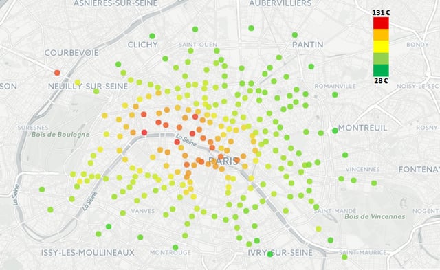
We thought it would be fun to represent and analyze the distribution of Airbnb rental prices across the subway network of Paris.
Unsurprisingly, our analysis found that generally, the closer the stations are to the center of the city (and thus the closer to popular tourist attractions), the higher the prices. The area around La Défense (€120), which is an economic district of the city installed in a near suburb, is an exception to this rule.
Nevertheless, it is still possible to find well-placed stops offering studios at affordable prices. Our analysis found that:
- The stops République, Falguière, and Censier-Daubenton, which are gateways to the more central neighborhoods, are very accessible both in terms of location and price at €70 per night (the median price observed for the city of Paris).
- But it is certainly Gare de Lyon (€60 per night) that wins for the best value since it is reasonably priced and also well-connected by transit (accessible by lines 1, 14, and the RER A) and by foot, as it’s located next to the historical district of Bastille, renowned for its nightlife and good restaurants.
![]()
Click to enlarge the map!
But how did we get here? And how can you easily create your own analysis of optimal Airbnbs for your next vacation spot?
Gather Data
You’ll find datasets for the Paris area on Inside Airbnb - the site provides a dataset containing more than 50,000 rentals in Paris in CSV format. This is the richest dataset available online; if your city is not listed, you might want to check out Tom Slee. The data tends to be of lesser quality, but he has open-sourced his scraper.
As for the data on transit, even though data.ratp.fr offers a set of the stations with their name and their location, we opted to use the dataset available on opendata.stif.fr, which does not include bus stations.
Choose Your Tool
Carrying out an analysis on such a wide range of data requires a good data science tool. We chose Dataiku, which offers plenty of features to clean the data, make calculations, build machine learning models, and present the results, all via code (Python, R, Scala, etc.) or via a point-and-click interface. We used the free Community Edition of Dataiku for this project, which is more than enough for what we need to do here.
Choose a Variable to Study
We wanted to choose a variable that would reflect the price of the apartment for one night, depending as little as possible on the apartment’s intrinsic characteristics. In other words, we had to find a way to normalize the price. The dataset provides numerous parameters (such as the number of bedrooms, the facilities, the number of reviews, etc.), so we ran a quick machine learning model to determine which variable had the strongest impact on the price.
We tried different models until we had a decent correlation factor (R²=0.75). The conclusion was that the number of bedrooms is the most relevant indicator of the price (yes, size does matter!). On the graph below, one can see “bathrooms” and “accommodates” come as the third and fourth explicative variables. However they are, to an extent, also correlated to the number of bedrooms:
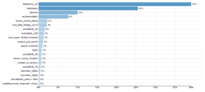
Variable importance in the price explanation (random forest model with 84 trees)
Following this analysis, we normalized the prices by dividing the price by the number of bedrooms so that our new indicator is “How much I should pay to accommodate one or two people?” Now we can focus on the impact of the location (and the location only).
Filter and Enrich the Data
For our analysis, we determined that the price has to be “true” - i.e., it must be a fair price that customers are willing to pay, not just any listing’s price. Thanks to Dataiku’s cleaning tool, we were able to apply this requirement quickly by filtering and removing the listings that did not have at least X reviews. We carried out a sensitivity analysis to determine which value of X would be the best for our model, and in the end, X= 7 reviews was chosen as the final condition.
After filtering our data, the next step was to associate each property to the closest station. For that, we originally wrote a Python script that looked at the distance from each metro station for each apartment and selected the closest one. However, the script ended up taking hours and hours, so to improve it, we implemented a quad-tree algorithm, which significantly reduced the computation time (from ~ 10 hours to 1 hour).
But this still wasn’t quick enough, so that’s where the Dataiku magic came in: by creating a join between our two datasets, we were able to associate each property to its closest station in a matter of mere minutes.
Map and Analyze Data
Knowing which station is the closest to each apartment, we computed our indicator (the median price for the night normalised by the number of bedrooms) and aggregated the results by station using the group-by function.
By mapping the data in Dataiku DSS, we found that areas of Paris where prices are the highest also have fewer apartments. However, because the inverse statement is not true (i.e., areas where prices are the lowest don’t necessarily boast a higher quantity of apartments), one cannot bound the price only to the lack of offer. Instead, there must be a location effect: the more touristy the area where accommodations are located, the more they cost.
More precisely, the metropolitan map shows that places around the western part of Métro Line 1 are the most expensive Airbnbs of the capital city. Among the 10 most visited places in Paris, five are accessible using Métro Line 1. The three stations associated with the highest Airbnb prices are Alma-Marceau (€131), Assemblée Nationale (€126) and Tuileries (€125), all of which have valuable assets: who hasn’t dreamt of living in a flat with a view of the Eiffel Tower or living in a street tucked between Vendôme Place and the Tuileries Garden?
Interestingly, results are rather consistent (with the aforementioned exception of the station Esplanade de La Défense at the end of Métro Line 1, which is a peculiarity due to the demand for places near the business center). Moving away from the center of Paris, the median prices decrease pretty uniformly.
Make it Pretty
Dataiku DSS has some great data visualization features that allowed us to get instant feedback on the output of the analysis we did:
Results of the analysis mapped using Dataiku
But once we were sure that the results was satisfying, we used Illustrator and added each metro spot one by one (featured above, click for full resolution - a painful 3 hours of work!).
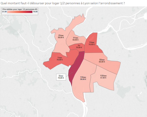
We did the same analysis on additional cities, and for those, we just plugged the output of the analysis into Tableau, which specializes in robust visualization features. Here's just one example:
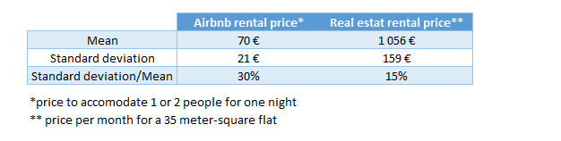
One Step Further: Comparing Airbnb Prices to the Real Estate Market
We also took our analysis one step further and compared the results to the real estate rental market, also aggregated by Métro stations, Airbnb prices are much more variable than normal rent prices (i.e., they have a higher standard deviation):
 Comparison between prices on Airbnb and on the real estate market
This is not surprising since Airbnb attracts a lot of tourists for whom a few hundred meters in proximity to a point of interest represents a real gain of value for a short stay.