Here, I'm going to tell you how I developed my very first machine learning model in Dataiku DSS and managed to make some great predictions.
The problems I didn't have
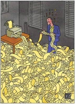
 source: www.newyorker.com
As you probably guessed from the title, I study theoretical maths. In fact, I am halfway through my first year of a statistical Master’s degree at Paris Dauphine University. During this first semester, a lot changed for me as I started to work as a data scientist intern at Dataiku.
Entering the professional world is as scary as it is amazing, and everyone here at Dataiku made sure the scary part was minimal. They were all happy to answer my (numerous) questions and their combined experience was priceless. Everyone is serious in their respective work but this is also a place where you feel comfortable and happy to work. For example, during the holidays season we saw a lot of our co-workers' children playing in the office, and nothing says Christmas more than happy children!
Anyway, back to work: once Dataiku gave me a laptop and a desk, I had to download some EEG (ElectroEncephaloGram) data from the Kaggle Epilepsy challenge. Even though the challenge is over, you can still download the dataset and see where your model would be on the leader boards. This was a great challenge to start my internship with; there was a lot of labeled EEG data which in itself is rare and, more importantly, thanks to maths, we can predict with pretty high certainty when someone suffering from epilepsy could have a seizure. I am really glad I didn't listen when people were telling me maths was useless and I wouldn't actually use it in the “real world”!
Downloading the Kaggle data (over 65 GB of compressed numbers) made me realize what was starting to unravel. Once the data was downloaded, I began having my first “real world” problems. I needed to read through and organize the data but I had no idea how. I had never seen a .mat file before and I really didn't know how to best store this much data in an efficient way that would make my life easier afterwards. I was a very long way from my i.i.d. samples of Gaussian.
Once I was finally able to open the file and see its content, I understood I was leaving the theoretical plane for good. For the first time in my life, I was going through data which wasn't generated randomly. This data meant something and now all I had to do was to figure out... what? So, basically, do what everyone else is trying to do.
The first thing I understood and was quite happy to hear was that the data is too big and that it needed to be shrunk down. I had to do some data mining and find what information was useful and what information could be discarded. And to do this there is no way other was than trial and error. You can see what others have done, try their way, and add your own features to see what works and what doesn't. This means going from your raw data to a cleaner dataset, and running a model on this cleaner/smaller dataset, seeing which features perform well and which don't, and start everything again with other features.
The plugin, or how to gain a significant amount of time
At this point I kept taking my entry dataset and changing the features I was extracting. They were from SciPy, PyEEG, or from my own making, and it quickly became a mess as I started to have recipes piling up, even though there were only a few lines of code changing form one recipe to the other. I then discovered the plugin.
The plugin gave me the opportunity to gain a significant amount of time as I didn't need to change my recipe code. The small errors, such as a variable name missing a capital letter or syntax issues, became a thing of the past.
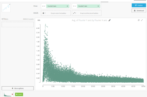
I was then able to quickly select new features and look at the correlation between multiple electrode. I started with the unavoidable ones, such as mean, standard deviation, skew, kurtosis, min and max. I added spectral entropy computed on different frequency bins, as it is a good indicator of the complexity of a time series. I decided on my bin size's by looking at the Fournier transform of my data (with the plugin).

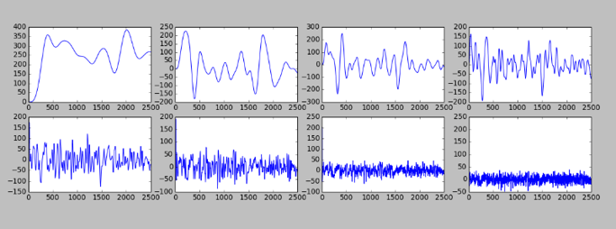
I also decided to analyze the data in different frequency bands. With five low pass filters in a row, I had now decomposed my data into eight smoother curves. I added some new statistics on these bands such as standard deviation.

I also tried to compute the correlation between bands and electrodes but the model did not perform any better and it was a really long computation. Overall, with these features and a simple linear model, I managed to reach a 0.8 A.U.C (Area Under the Curve) in cross-validation score, which is pretty great for my first model. From discussions within the Kaggle community, it appeared that random forest performed poorly. This was also my experience with a small number of trees, but someone has trained a classifier with 3000 trees and outperformed everyone. You can download his paper here.
I will now add a couple of features such as the quantiles of the Fourier transform, and a general energy and standard deviation computation on a sliding window for each channel. I will also try to change the 'l2' penalty to 'l1' on my model to see the improvement I get.
How the Plugin looks in Dataiku DSS
If you would like to know more on the implementation of plugins into DSS, you should go look at one of the many articles in the learn section of Dataiku's website. You can also check out all of the already available plugins here. If you have any questions, would like to discuss plugins, or contribute, feel free to send me an email.


