


You may have read, heard, or experienced first hand the value of geospatial data for a variety of business and daily life applications. You might be also aware that this field of analytics is gaining more and more traction and can get quite complex and challenging in terms of talent and resources.
So, whether you are working with geospatial data already or are looking for inspiration to get started with some analysis leveraging geospatial data, this article will give you an overview of how Dataiku makes such analysis simpler and more accessible for a variety of users (i.e., data scientists, data engineers, analysts).
We will focus on Dataiku 10, which has facilitated not only easy access to performing complex operations for geographical data but also leveraging in-database performance and increased options for drawing insights on a map. In this two-part article series, we will walk you through some of these features (listed in Table 1) and demonstrate how we use Dataiku to implement distributional modeling of a bird species, paying particular attention to the applied use of the geospatial features of the platform.
| Task | Feature in Dataiku 10 |
|
Filter locations that fall within area of interest |
geoContains formula (prepare recipe) |
| Create a proxy for observation habitat area | Create area around geopoint processor (prepare recipe) |
| Enrich observation data with habitat features | Geojoin recipe (contains condition) |
| Draw concentrated areas of detected sightings | Density map (charts) |
Table 1 - Mapping of tasks to features in Dataiku 10
Inspiration
Besides demonstrating the geospatial features of Dataiku, this project is also inspired by raising awareness for citizen science projects and resources, which — for example — allows for contributions to ecological research and conservation. Furthermore, the range of applications that use the type of analysis we will discuss in this article concerns various stakeholders. For example, resource managers, policy makers, and scientists apply similar techniques to study and understand the environmental change dynamics to ensure sustainable development. Regarding the private sector, answering where questions are becoming more valuable for operations, marketing, and risk departments. Applications therein include reducing costs for managing vegetation along power lines, identifying locations for office site selection, and optimizing supply chain networks, to name a few.
Objective
The objective of this project is to produce a distributional encounter rate model for a predefined bird species within a particular geographical area and to use that model to make predictions and plot them, as shown in Figure 1. For this use case, encounter rate is defined as measuring the probability of a person encountering a species predetermined by effort and time variables.
To achieve this objective, we will need species occurrence data as well as environmental data and a model that learns the relationship between those. By using the relationships between species occurrence and environmental variables, we will be able to predict the species occurrence in geographical areas where environmental representations are known but were not sampled.
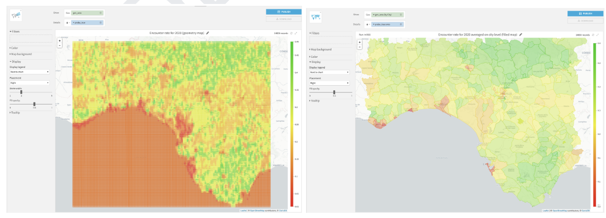
Figure 1 - (left) Geometry map showing the encounter rate for April 1, 2020 5:30 A.M. and (right) Filled administrative map showing the average encounter rate on the municipality level for April 1, 2020 5:30 A.M. For both maps, the greener the area, the higher probability of encountering the bird species of interest provided that one spends one hour traveling a distance of 1 km.
In the next section, we will elaborate on the datasets that are used in this project.
Datasets
eBird Dataset
The full eBird dataset (Sullivan et al., 2009; eBird, 2021) is a massive text file that hosts more than 600 million bird observations from all over the world and is updated monthly. Cornell Lab of Ornithology offers free access to this data together with a free ebook that guides the user from setup to hands-on modeling using R programming language on this data. For the scope of this article, we will be working with a pre-processed version of the eBird dataset which is suitable for modeling a particular species’ distribution. In general, we will be following the methodology outlined by Strimas-Mackey et al., however, we will focus on the use of visual recipes in Dataiku for the implementation, especially demonstrating how the geographical data processing and transformations are made simpler with the new features introduced in Dataiku 10.
Let’s have a quick look at our input data in Dataiku as shown in Figure 2. In particular, we will work with features from this dataset that convey information on the location and time of the observations, together with several measures of the effort expended while collecting this data (e.g., distance traveled, duration of the observation period, number of observers, etc.).
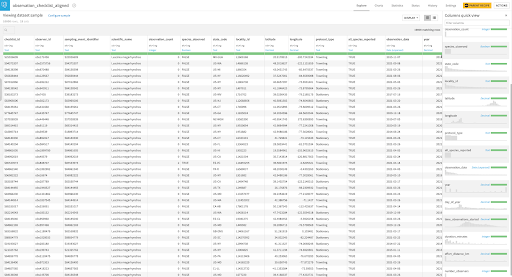
Figure 2 - Explore view of the pre-processed input eBird dataset with quick columns view of the sample data on the right hand side (each row is a record of a bird species observation, could be detection or non-detection) with the corresponding checklist location information indicated by latitude and longitude. Note: the concept of a checklist is defined to be the representation of observations from a single birding event, such as a 1 km walk through a park or 15 minutes observing bird feeders in someone’s backyard (Strimas-Mackey et al., 2020)
Habitat Dataset
In order to perform distributional modeling on the eBird dataset, we need to identify and put together a set of environmental variables to be used as features in our model. The particular set of variables would depend on the focal species, region, and time period of the intended study, as well as the availability of data (Strimas-Mackey et al., 2020). For the scope of this article, we will represent the species’ habitat using land cover data provided by Copernicus Climate Change Service (C3S) Climate Data Store (CDS). It is worth noting that, using only the land cover data will act as a proxy for the habitat and for more accurate modeling, it is advised to consider several environmental features (e.g., climate, weather, and soil type) that are important for the focal species (Strimas-Mackey et al., 2020).
For this project, we will use the satellite-based land cover product which provides annual land cover maps at 300 m spatial resolution and annual temporal resolution between 2016-2020. These maps are available in NetCDF-4 (Network Common Data Form) format which stores multidimensional scientific data such as temperature, humidity, pressure, land cover class all of which can be displayed through a dimension (such as time). The land cover classification system has 21 class labels which are listed in Figure 3.
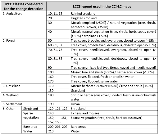
Figure 3 - Land Cover Classification System (LCCS) class labels used in this project (table taken from Table 2 and further information can be found in Appendix A)
After applying some pre-processing on the downloaded land cover data, let’s have a look at the dataset we will work with in the rest of this article as shown in Figure 4.
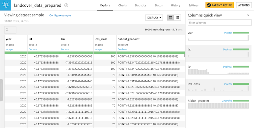
Figure 4 - Explore view of the pre-processed input land cover dataset with quick columns view of the sample data on the right hand side (each row is a record of a land cover classification system class i.e., lccs_class that are explained in Figure 3 per location indicated by the geopoint for a particular year).
Implementation
Let’s get hands-on with the platform and start implementing the flow. For brevity, we will focus on the processing, generation, and extraction of geographical (and habitat-related) features.
As advised by Strimas-Mackey et al. (2020), the first thing we will do is to bring a more consistent structure by filtering on the effort variables as well as on the geographical area for which we will extract environmental features. One approach to identify our geographical area of interest in a custom manner is by using an online tool to determine the bounding box in latitude and longitude as shown in Figure 5. Note that Dataiku uses the WGS84 (EPSG:4326) coordinate system when processing geometries.
For the scope of this article, we will work with this custom geographical area in the south of Spain, where there are some natural reserves, for filtering the observation data as well as making predictions. For simplicity, we will work with the corners of the bounding box and create a simple polygon. This design choice does not affect the usage of the features we will describe in the coming sections and it is possible to work with more complex geometries for the identification of the study area.
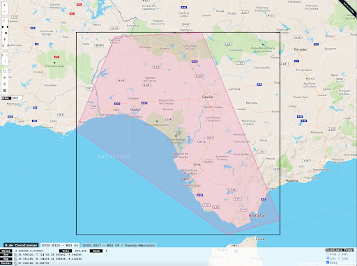
Figure 5 - Custom defined bounding box showing the geographical area of interest (source)
Observation Data Preparation
We will use a prepare recipe to perform filtering operations on the observations data and to perform geographical processing for data enrichment purposes. Figure 6 illustrates the steps taken to perform these operations, in particular the use of the geoContains formula processor in Figure 6b and the ‘Create area around geopoint’ processor in Figure 6c which are among the new features released in Dataiku 10.
The geoContains formula processor will allow us to apply filtering on the data so that we only work with those checklist locations that fall inside our area of interest as box-outlined in Figure 5. Next, the ‘create area around geopoint’ processor will allow us to identify a neighborhood, which we will refer to as an observation habitat area. By creating this observation habitat area, our objective is to account for the habitat characteristics at a suitably-sized landscape around the checklist location and work with a summary of habitat information.
Strimas-Mackey et al. (2020) advocate the need for summarizing land cover data within a neighborhood centered around the checklist location based on the fact that organisms interact with the environment not at a single point, but at the scale of a landscape. It is also important to note that checklist locations may be imprecise as the observers may travel some distance during the birding event. So, by including the area surrounding the checklist location at a distance of 2.5 km, we are aiming to work with a land area whose size also aligns with our constraints on the maximum travel distance, which is chosen to be 5 km.
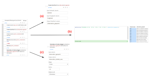
Figure 6 - Steps performed for geographical filtering and enrichment on the observations data. a- Creating a geopoint using latitude and longitude columns which will be used in b- Implementing a geoContains formula to identify the observation geopoints that fall within our area of interest and c- Creating a circular polygon around the checklist location that will provide a proxy for observation habitat area.
Let’s have a look at how our observation data looks on the map by using a geometry and a scatter map side-by-side (Figure 7) to visualize the impact of the transformation performed in Figure 6c.
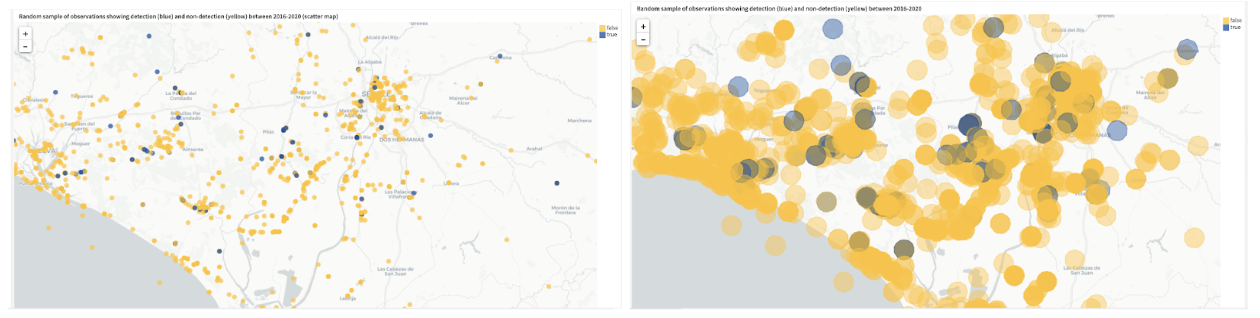 Figure 7 - (left) Scatter map illustrating the geopoints that belong to a random sample of observations where the detections are marked with blue color (true label) and the non-detections are marked with yellow color (false label) and (right) Geometry map illustrating the circular polygons of habitat areas belonging to the same sample of observations as depicted in the visualization on the left. Both visualizations show a zoomed-in view of the study area to confirm the geographical transformation.
Visualizations on maps can take many forms to convey different insights. Density maps are a preferred way of demonstrating density differences in geographic distributions across a landscape. Figure 8 depicts a density map, which is another new feature added in Dataiku 10, to reveal the concentrated areas driven with abundance information of detected sightings of our bird species of interest. In the density map, we see dense green areas towards Gibraltar where there is a nature park.
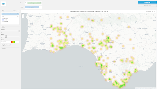
Figure 8 - Density map showing a random sample of detected observations of the bird species. (Note that we filter the data on the left hand side to show only true labels, and we also add details with the count of observations detected to add more density to those regions where there is more recorded abundance of our bird species of interest.)
Habitat Features Enrichment
In order to enrich our observations data with the habitat features around the checklist locations, we will join the distinct observation habitat areas, which are the circular polygons we created in Figure 6c, with the filtered and sampled land cover data. Filtering is done based on the custom defined geographical area and sampling is performed randomly to reduce the amount of records for faster iterations. For the join operation, we will use a geojoin recipe, which is another new feature introduced in Dataiku 10, as highlighted in Figure 9.
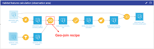
Figure 9 - Part of the flow showing the dependencies required for the calculation of the habitat features with a particular focus on geo-join recipe which allows to perform a join between two (or more) datasets based on geospatial matching conditions.
Let’s take a closer look at how we define the geospatial matching conditions for our use case. Figure 10 depicts the contains condition that we need in order to gather those locations (habitat_geopoints) with land cover classification information within the observation habitat areas (observation_habitat_area) so that we can create a summary of the land area centered around the checklist location. The output dataset of this geo-join operation will have rows from several years (2016-2020) and several geopoints per observation habitat area with corresponding land cover class labels, which facilitates further interesting analyses such as tracking the land cover change over time for our study area.
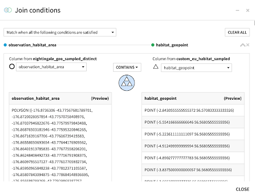
Figure 10 - Configuration of join conditions based on geospatial data showing how we enrich the observation data with habitat geopoints that have corresponding land cover class information.
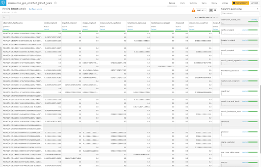
For the scope of this article, we will use this set of land cover class values within a neighborhood around each checklist location and further process them to eventually calculate the proportion of the neighborhood within each land cover class which will provide us with the summary information we need to obtain. These transformations are depicted in Figure 9 and achieved with the use of other visual recipes to the right of the geo-join recipe. Figure 11 presents a screenshot of the output dataset, focusing in particular on the environmental features (i.e., proportion of land features) that we will use for modeling.
Figure 11 - Explore view of the (rightmost) output dataset in Figure 9 with a quick columns view of the sample data on the right hand side. Each row is a record of a species observation (could be detection or non-detection) similar to Figure 2 which has been enriched with environmental variables whose labels are taken from Figure 3.
That’s it for the data preparation and enrichment part of our project. To recap, we have looked at how to apply the geoContains formula processor, the ‘Create area around geopoint’ processor as well as the geojoin recipe during the data preparation stage of our project. The dataset in Figure 11 is almost ready to be used for modeling encounter rate, which we will explore in the second part of this article series.