


We’re back with the final article of our three-part series on building our first predictive model. We’ve laid the groundwork, learned how to build and evaluate the model, and now we want to learn how to interpret it.
Model interpretability is the degree to which models — and their outcomes — can be understood by humans. Model interpretability has become increasingly important over the past few years for two reasons:
- For the business, as they start to use the results of ML models for their day-to-day work and decision making. Sometimes, they need to explain those results to end customers — imagine, for example, a customer service representative who needs to explain to a client why they were quoted a certain amount for car insurance.
- As a part of larger risk management strategies, especially as the use of ML and AI by organizations are becoming increasingly regulated by government entities.
This section will unpack a few key interpretability techniques by which you can evaluate your first model.
Black-Box vs. White-Box Models
We live in a world of black-box models and white box models. On one hand, black-box models have observable input-output relationships but lack clarity around inner workings (think: a model that takes customer attributes as inputs and outputs a car insurance rate, without a discernible “how”). This is typical of deep-learning and boosted/random forest models, which model incredibly complex situations with high non-linearity and interactions between inputs.
On the other hand, white-box models have observable/understandable behaviors, features, and relationships between influencing variables and the output predictions (think: linear regressions and decision trees), but are often not as performant as black-box models (i.e, lower accuracy, but higher explainability).
In the ideal world, every model would be explainable and transparent. In the real world, however, there is a time and place for both types of models. Not all decisions are the same, and developing interpretable models is very challenging (and in some cases impossible — for example, modeling a complex scenario or a high-dimensional space, as in image classification). Even in less-complex scenarios, black-box models typically outperform white-box counterparts due to black-box models' ability to capture high non-linearity and interactions between features (e.g., a multi-layer neural network applied to a churn detection use case).
Despite higher performance, there are several downsides to black-box models:
- The first downside is simply the lack of explainability internally in a firm as well as externally to customers and regulators seeking explanations for why a decision was made (look at the case in 2019 of a black-box algorithm that erroneously cut medical coverage to long-time patients).
- The second downside to black-box models is that there could be a host of unseen problems impacting the output, including overfit, spurious correlations, or "garbage in / garbage out," that are impossible to catch due to the lack of understanding around the black-box model’s operations.
- They can also be computationally expensive compared to white-box models (not to mention more expensive in terms of potential reputational harm if black-box models make poor decisions).
- Another downside of not spending enough time understanding the reality beyond the black-box model is that it creates a "comprehension debt" that must be repaid over time via difficulty to sustain performance, unexpected effects like people gaming the system, or potential unfairness.
- Finally, black-box models can lead to technical debt over time whereby the model must be more frequently reassessed and retrained as data drifts because the model may rely on spurious and non-causal correlations that quickly vanish, ultimately driving up OPEX costs.
Interpretation Techniques for Advanced Beginners
If you want to turn your predictive models into a goldmine, you need to know how to interpret their results, review performance, and retrieve information relative to their training. It can get complicated because the error measure to take into account may depend on the business problem you want to solve. Indeed, to interpret and draw the most profit from your analysis, you have to understand the basic concepts behind error assessment. And even more importantly, you have to think about the actions you will take based on your analysis.
This section delves into a few common techniques for model interpretability, how they apply to our T-shirt example, and how Dataiku can help. Note that this section goes in-depth on interpretation techniques and is slightly more advanced than the rest of this guide, so if you’re not ready for it yet, you can always come back to it once you have a few models under your belt.
Partial Dependence Plots
Partial dependence plots help explain the effect an individual feature has on model predictions. For example, if you’re trying to predict patients’ hospital readmission rate and compute the partial dependence plot of the Age feature, you may see that the likelihood of hospital readmission increases with age.
For all models trained in Python (e.g., scikit-learn, keras, custom models), Dataiku can compute and display partial dependence plots. The plot shows the dependence of the target on a single selected feature. The x axis represents the value of the feature, while the y axis displays the partial dependence. A negative partial dependence represents a negative relationship between that feature value and the target, while a positive partial dependence represents a positive relationship.
For example, in the figure below from our T-shirt example, there is a negative relationship between age_first_order and the target for people under 40. The relationship appears to be roughly parabolic with a minimum somewhere between ages 25 and 30. After age 40, the relationship is slowly increasing, until a precipitous dropoff in late age. The plot also displays the distribution of the feature, so that you can determine whether there is sufficient data to interpret the relationship between the feature and target.
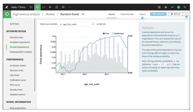
A partial dependence plot in Dataiku for the Haiku t-shirt example
Subpopulation Analysis
Before pushing a model into production, one might first want to investigate whether the model performs identically across different subpopulations. If the model is better at predicting outcomes for one group over another, it can lead to biased outcomes and unintended consequences when it is put into production.
For regression and binary classification models trained in Python (e.g., scikit-learn, keras, custom models), Dataiku can compute and display subpopulation analyses. The primary analysis is a table of various statistics that you can compare across subpopulations, as defined by the values of the selected column. You need to establish, for your use case, what constitutes “fair.”
For example, the table below shows a subpopulation analysis for the gender column in our Haiku T-shirt example. The model-predicted probabilities for male and female are close, but not quite identical. Depending upon the use case, we may decide that this difference is not significant enough to warrant further investigation.
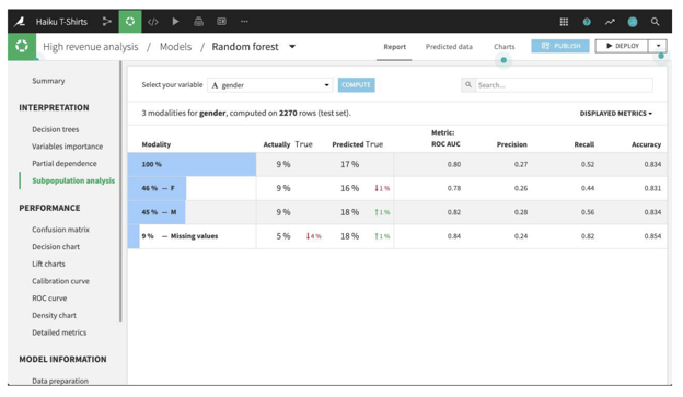
A subpopulation analysis in Dataiku for the Haiku t-shirt example
By clicking on a row in the table, Dataiku allows you to see more detailed statistics related to the subpopulation represented by that row. For example, the figure below shows the expanded display for rows whose value of gender is missing. The number of rows that are Actually True is lower for this subpopulation than for males or females. By comparing the % of actual classes view for this subpopulation versus the overall population, it looks like the model does a significantly better job of predicting actually true rows with missing gender than otherwise.
The density chart suggests this may be because the class True density curve for missing gender has a single mode around 0.75 probability. By contrast, the density curve for the overall population has a second mode just below 0.5 probability.
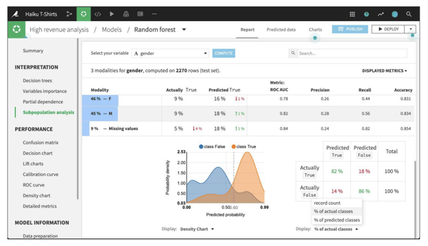
More detailed subpopulation analysis in Dataiku for the Haiku t-shirt example
Individual Prediction Explanations
Partial dependence plots and subpopulation analyses look at features more broadly, but they don’t provide insight into the factors behind each specific prediction that a model outputs — that’s where individual prediction explanations come in.
The explanations are useful for understanding the prediction of an individual row and how certain features impact it. A proportion of the difference between the row’s prediction and the average prediction can be attributed to a given feature, using its explanation value. In other words, you can think of an individual explanation as a set of feature importance values that are specific to a given prediction.
Dataiku provides the capability to compute individual explanations of predictions for all Visual ML models that are trained using the Python backend.
Putting It All Together
In this blog series, we have walked through some of the main considerations when building your first predictive ML model. Noticeably missing is the concept of operationalization, which is critically important, but could be an ebook in and of itself. While outside the scope of this series, it’s important as a part of your journey into creating machine learning models to understand what it means.
Operationalization is the process of converting data insights into actual large-scale business and operational impact. This means bridging the huge gap between the exploratory work of designing machine learning models and the industrial effort (not to mention precision) required for deployment within actual production systems and processes. The process includes, but is not limited to: testing, IT performance tuning, setting up a data monitoring strategy, and monitoring operations. We highly recommend following up this series with additional resources to understand operationalization processes.