Government data can often reveal surprising insights about the way communities are served. Here, I used Dataiku DSS to analyze data about 311 calls in New York City. My goal was to determine whether some parts of the city were served faster than others.
New York City 311 Calls
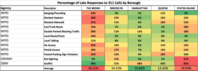
An analysis of more than a half million 311 call records reveals that 311 complaints to the NYPD are often closed much later in the Bronx than the same complaints in other boroughs. The Bronx had the most late responses and the slowest average response time in each of the top ten most popular complaints routed to the NYPD in 2015 — with slow responses ranging from loud neighbors to animal abuse or blocked fire hydrants. An analysis of all calls routed to the NYPD in 2015 showed that the Bronx had twice as many calls closed late as other boroughs. In fact, the average time to close a call was approximately two hours slower in the Bronx than in other boroughs.
New York’s 311 call data, available and updated daily on NYC Open Data, allows for many interesting insights about New Yorkers and what they complain about. But it also reveals some important facts about how fast an array of city agencies close those complaints. While many blogs and articles have looked into this dataset, the goal at Dataiku was a little bit different. I wanted to attempt to predict — at the time of a call — whether the response to it would end up late.
The term “late” is defined by 311 when a call comes in and is categorized into a complaint type. Each call is assigned by 311 with a certain due date when it should be closed. Some — like complaints that are routed to the NYPD — should be closed in a matter of hours (between eight and 31 hours), while others — rat sightings, for example — can have a timeframe that spans weeks.
A wider look at all NYPD complaints is in the graphic below. You’ll notice that both response time and the percentage of overdue calls are consistently higher for the Bronx (the red circles) than the other Boroughs. Manhattan (the green circles) usually gets the fastest response time and the lowest percentage of late responses.
Data Source
The NYC open data API is quite generous on request limits (there are none), so I was able to pull down every available call from the past several years. For the purposes of this analysis, I decided to limit my investigation to calls in 2015, in order to avoid any censoring errors that might have occurred had I taken data from more recent days and minimize the possibility of governmental policy changes affecting the data.
(Although I built my model using only data from 2015, I continue to pull down the 311 call data into a partitioned database daily — which means that I could turn on live prediction any time I want.)
Data Preparation
The call data includes a created_date, a due_date and a closed_date . Therefore, to calculate whether a call was late, I just had to set late = (closed_date > due_date). After dropping a few strange records that were listed with a closed_date prior to their created_date, I saw that around 17% of 311 calls were closed after their due date. This, of course, varied widely across agencies, and complaint types, with some seasonal fluctuations.
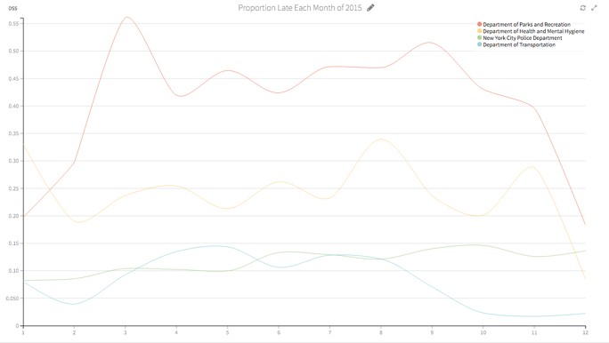
This chart shows the percentage of late calls among the top four agencies by month for the year of 2015:

My next step was to build some features. I used Python to write a time window function that calculated — for each call — the number of calls in the prior one hour, 24 hours, and week, in that call's tract, borough, and overall. I used a little trick to speed up this code in which I calculated the cumulative sums in SQL first, then operated on the rolling averages with Python.
Python to calculate rolling averages:
time_range = {'hour':1,'day':24, 'week':168}
area       = ['tract','borough','global']

# sub_agg is the dataframe to rolling agg over
# area is the array of sublocations
# time range is the dictionary of time sizes to operate over

def rolling_total(sub_agg, area, time_range_dict):
    for key in time_range_dict:
        for i in range(len(area)):
            timeframe  = datetime.timedelta(hours = time_range_dict[key])
            sub_agg    = sub_agg.sort([area[i],'created_date_parsed'],
                                       ascending = True).reset_index(drop = True)
            date_col   = sub_agg['created_date_parsed']
            cum_sum    = sub_agg[area[i] +'_cum_amt']
            sub_area   = sub_agg[area[i]]
            index2     = 0
            last_range = []
            for index in range(len(date_col)):
                matched    = False
                prior_date = date_col[index] - timeframe
                while not matched:
                    if (date_col[index2] > prior_date and
                       sub_area[index] == sub_area[index2]):
                        last_range.append(cum_sum[index] - cum_sum[index2])
                        matched = True
                    else:
                        index2 = index2 + 1

            sub_agg[area[i] + "_last_" + key] = np.array(last_range)

            print "finished with " + key + " hour " + area[i]
    return sub_agg
new_totals = rolling_total(sub_agg, area, time_range)
In order to account for outside influences to our dataset, I also pulled in tract-level data from the U.S. Census American Community Survey, and hit Weather Underground's API for New York's daily historical weather forecasts. The U.S. Census American Community Survey includes literally thousands of variables about the people living in every census block in the country. However, for this initial analysis, I limited the variables to those that described age and income. (As a side note, I am happy to report that after accounting for location, very little predictive power remained in these variables).
I used R to make sure that all of the census data was divided by the population for that area, so that the individual blocks could be compared against each other.
R code:
tracts   <- census_data_selected[,data_list]
pop_data <- census_data_selected[,!(colnames(census_data_selected) %in%
                                 colnames(tracts))]

pop_data[,-1]     <- pop_data[,-1]/pop_data[,1]
pop_data$logrecno <- tracts$logrecno

prop_data <- merge(tracts, pop_data, id='logrecno')
Next, I used PostgreSQL's amazing PostGIS and the Shp files from the U.S. census to put each phone call into the correct census block and gain access to the census data for that call.
Finally, I used Dataiku's built-in date extraction and analysis abilities to create numerical features for my date components and construct flags for weekends and holidays.
I guess it is worth pointing out here that this blog post is different from a lot of similar technical write-ups — primarily because I am jumping between many different tools. Dataiku DSS is really what allows me to do that painlessly. Since I don't need to limit myself to a single tool or worry about transferring my datasets between tools, I am always free to choose the best one for the problem I'm trying to solve.
Model Construction
After cleaning and merging the data into a single PostgreSQL dataset, I began model construction. This initial pass was with no parameter tuning or automated feature generation:

As often happens when I can quickly begin modeling in Dataiku, my modeling actually pushed me further into a new vein of exploratory data analysis. Our first pass model showed that location was really important in determining whether or not a 311 call was responded to on time, so I decided to dig a little deeper.
This further investigation, in which we used the Dataiku DSS chart features to break down our data by many different geographic segments, was what revealed the surprising slowness of the NYPD in the Bronx.
Chart on sample data of 30,000 randomly selected calls:

Further iterations and cleaning of our model eventually lead to a stronger model, which accurately predicted whether a call would be handled on time 85% of the time, with 55% precision (given that I predict the call will be late, is the call late?) and 58% recall (given that the call is late, did I predict that it would be late?)
I used the F1 score to optimize my threshold cutoff, since my data was unbalanced. Random forest parameter selection was as follows:
- 200 trees
- Max tree depth of 20

Conclusion
In this project, we looked at a project that encompassed both analysis and prediction. For the prediction side, we built a model that can decently predict whether NYC 311 calls would be closed in a timely fashion. For the analysis, we found that there was a large geographic disparity among the timeliness of completed calls — especially from the NYPD — with the Bronx getting slower service. Overall:
- 21.6 % of NYPD calls in the Bronx were closed after their due date compared 10.7 % of calls to other boroughs.
- It took an average of 5.9 hours to close an NYPD call in the Bronx and 3.9 hours to close a call elsewhere.


