Recently, Dataiku announced our strategic partnership with Snowflake, the cloud data platform. At Dataiku, we support agility in organizations’ data efforts via collaborative, elastic, and responsible AI, all at enterprise scale. Snowflake helps organizations easily transform, integrate, analyze, and securely share data across all major clouds, enabling them to collect and process more data than ever before. It is no surprise, therefore, that the partnership is an organic fit, helping organizations build end-to-end data science workflows and accelerate their data science and AI initiatives.
To demonstrate how the Dataiku and Snowflake integration for machine learning can help organizations deploy and govern their analytics and AI projects at any scale — as well as quickly generate actionable data science insights that drive recurring business value — we’ll share a recent project the Dataiku and Snowflake teams worked on together.
At the time this article was released, counties in the U.S. are currently focusing on the recovery of COVID-19 as well as a gradual loosening of restrictions and eventual reopening. As states and counties begin easing restrictions, the potential for another spike in cases is a serious and legitimate concern. However, we know little about how this risk may differ from one region to the next.
Dataiku and Snowflake worked together to analyze data from the outbreak in order to identify patterns in the data that could potentially drive local and individual decisions and ultimately improve recovery. The remainder of this blog post highlights the key steps that were taken during the project.
Project Background and Hypothesis
The data used was made publicly available through the Snowflake Data Marketplace. It is managed by Starschema and consists of multiple COVID-19 datasets from reputable sources. The datasets we used were The New York Times, several datasets from the Henry J. Kaiser Family Foundation, and demographics data from the U.S. Census. Below are the datasets that were used in the project:
- NYT_US_COVID19: number of cases and deaths per county by day (3/24/20-Present)
- KFF_US_POLICY_ACTIONS: health related policies enacted by state (e.g., paid sick leave)
- KFF_US_STATE_MITIGATIONS: social policies by state (e.g., large gatherings ban)
- KFF_US_ICU_BEDS: number of hospitals, ICU beds by county
- DEMOGRAPHICS: male/female, total population by county
Features relevant to COVID-19 incidence rates and demographics were used to group similar counties. We can further group counties by high vs. low risk based on increasing incidence rates, for example. Then, we can see which policies and resources are related to high vs. low-risk clusters to potentially inform steps to mitigate the spread and personal risk of COVID-19.
Inside the Project
First, we began with data preparation. We selected and requested access to the relevant datasets from the Data Marketplace in Snowflake. Once we had access to the datasets, we created a connection to our Snowflake instance in Dataiku. Next, we joined datasets together by county and date using the various recipes available in Dataiku. Then, we calculated the percentage change in new cases and deaths from one day, one week, and two weeks prior per county. Finally, we normalized numeric features (such as the number of hospitals) by population.
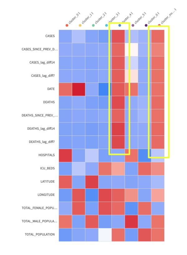
Modeling: We used K-means clustering to group similar counties together (k=8 emerged as the optimal number of clusters based on silhouette scores). Each cluster was defined by the following features:
- Total cases and deaths per county
- Change in cases and deaths from previous day
- Change in cases and deaths from previous week
- Change in cases and deaths from two weeks ago
- Number of hospitals per county
- Number of ICU beds per county
- Latitude
- Longitude
- Male population
- Female population
- Total population
- Date
Upon viewing the results, two clusters seemed to stick out from the rest of the dataset which were determined to be high risk. The main contributing factors that drove the clustering results were the number and increase of cases and deaths per capita (per day, per week, and previous two weeks). These two clusters were labeled high-risk counties and all others were labeled low risk.
Results
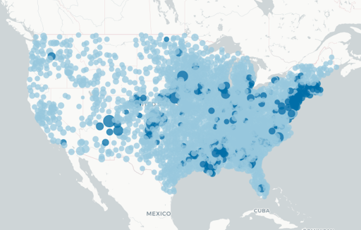
Data was normalized prior to clustering, meaning there is no natural bias toward more or less populated areas. With that being said, high-risk counties on average have a larger population than low-risk counties, but a larger range in population. They are across essentially all areas of the U.S., particularly in the Midwest and East, including areas that have notably been affected by COVID-19 (e.g., Michigan, Louisiana).
High-risk counties (darker dots on the map below) have a significantly higher number of cases and deaths per capita, higher increases in cases (per day, per week, per two weeks), fewer hospitals, but more ICU beds per capita compared to low-risk counties (measured by two-sample t-tests).
Comparing High vs. Low Risk: Area Policies
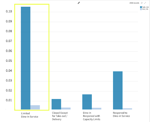
After identifying high-risk and low-risk counties, we examined relationships between risk and state and county policies. The graphs below show the average difference in cases per day per county by high-risk and low-risk groups. Then, the average number of cases increase per day by country and risk is broken out by stay-at-home order, essential business operations, and by bar and restaurant limits
1. Increase in Cases by Stay-at-Home Order
- Overall, increase in cases is relatively flat for low-risk groups.
- The one-day increase in cases per capita for high-risk counties is almost twice the value of new cases per day per capita in high-risk counties where there is a statewide, lifted, or vulnerable population only stay-at-home order.
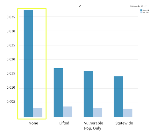
*y-axis values are change in cases from the previous day normalized by population
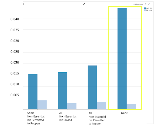
2. Increase in Cases by Non-Essential Business Closure
- Increase in cases is flat for low-risk groups.
- Increases are highest for high-risk groups when there is no non-essential business closure guideline.
3. Increase in Cases by Bar and Restaurant Limits
- Increase in cases was highest for high-risk counties that reopened with limited dine-in service.
- Increase in cases was lowest when bars and restaurants were closed except for take-out/delivery or reopened dine-in with capacity limits.
Looking Ahead
The value of a data-driven project like this one enables people to be informed about what is going on at a more micro level, especially the policies that are enacted in their areas, to ultimately better inform their individual decisions.
It’s clear that not all counties are the same — they vary in terms of level of risk and a blanket reopening solution cannot be applied across the U.S. People can now search their county to see if they live in a high-risk or low-risk one. They can also see which policies are implemented in their county, whether these policies are associated with high-risk or low-risk counties, and make decisions based on their own comfort level.
Together, Dataiku’s collaboration-driven platform and Snowflake’s performance and ease of deployment allow customers to enact holistic and seamless data science and analytics integrations across their organizations, therefore eliminating data and process silos, promoting cross-functional collaboration, and empowering teams with valuable insights for thoughtful decision making.


