In many ways, companies today approach their product help sections the same way they approach data strategy: we’ll just stick it over here in this place, we’ll keep adding lots of stuff to it, and we’ll worry about how to make sense of it and organize it later.
While we pride ourselves on our approach to data strategy being quite the opposite, like many other startups without staff specifically devoted to help content maintenance, we were admittedly guilty of this mindset when it came to our website’s Learn section.
The Before
How did we know we’d reached the critical point where we needed to revamp our help materials? Well, there were several glaring issues:
- Most of the support questions we received could be solved by materials that we had on our site, but the fact that people were asking them meant they were not easy to find.
- Our own employees, especially those new to the company who have a similar use case as our customers searching for help, had trouble finding the information they needed.
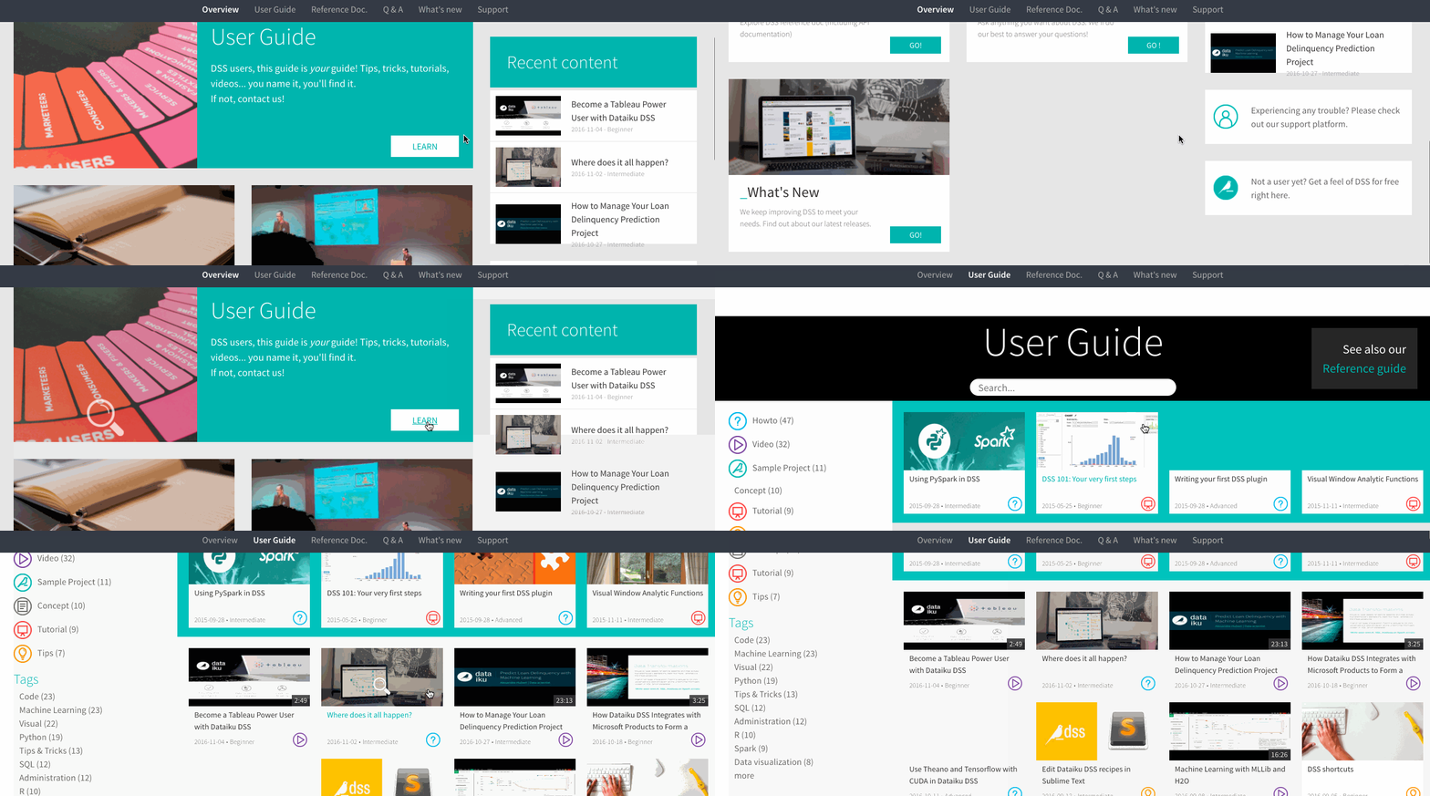
- From a purely aesthetic standpoint, the Learn section was visually overwhelming and didn’t jive with the clean, user-friendly design we pride ourselves on in our product.
Here's what it looked like:
 Overall, we knew that our Learn experience was objectively poor for users, especially those new to Dataiku DSS. So we took action.
The After
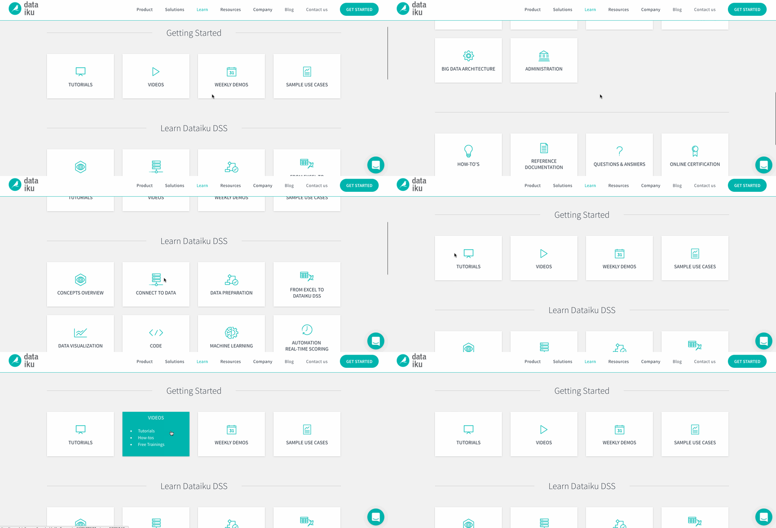
The process to arrive at our new, fresh Learn design was surprisingly easy. Because Dataiku has clear steps built into the product itself, we knew we wanted the portal to reflect that so that any user stuck at a particular stage in their data project could easily find resources relevant to that task.
And, of course, we knew we wanted a section specific to onboarding so that brand new users could quickly get up and running without having to dig around for tutorials, basic videos, etc. And that’s it! We wanted to keep it clean and simple, and our brilliant design lead JB took it from there. Here’s where we landed:
 The longest part of the process was actually filling in gaps where we were missing content, making sure that each section had everything a user might need on that particular subject. This is still a work in progress, but we’re getting there.


