


Data science isn't just about mixing data to extract value. On a daily basis, data scientists also juggle between different tools, languages, databases, data formats, mathematical theories, etc. It's a mess without a name.
The best example to understand this complexity is probably in the famous subway map that traces out the pathways to becoming a data scientist, or this article on the six core skills to become a data scientist.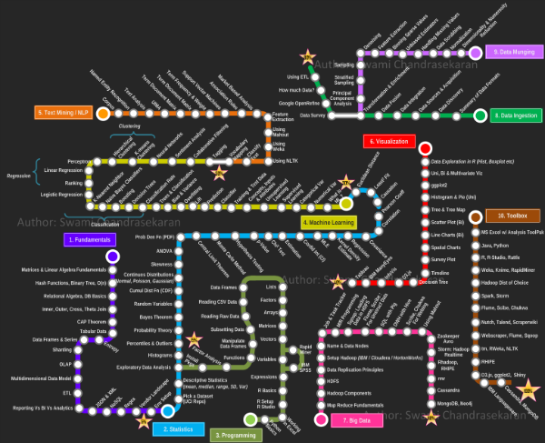 Source: Swami Chandrasekaran
Dang! How do you find your way in there? A plethora of tools are focused on subsections of this map. Others seek thoroughness and list these items infinitely according to various grain sizes. They categorize them, and set-up research tools.
Then it's a question of remembering the exact name describing the item searched for. These tools may even have their own database system.
In Short, Data Science Is a Jungle
Dataiku DSS covers a very large part of the subway stations shown above and, so you can survive in this dark and dreary metropolis, it offers a map of the data science world in simple, recognizable visual elements (or we hope at least!)
Let's look at the everyday job of data workers:
- They load their data into various databases
- They create processing operations that overlap each other
- They create displays and share them with business experts for validation
- They create models and put them into production
- They monitor the predictive application
Navigating the Jungle With Dataiku DSS
All the visual grammar of Dataiku DSS is made to reflect these business operations through structural graphics.
For example, let's look at the following application that predicts a churn score for telecom users. It is represented by a pipeline of datasets:
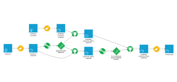
-
In yellow, we have the dataset preparation steps. The icons illustrate the nature of this preparation (join, group, cleansing, etc.). In this case, they are all the same: cleansing.
-
In blue, we have the datasets. The icons illustrate the nature of the database in which the associated data lives (Hadoop, SQL database, filesystem, remote ftp, etc.).
-
In green, we have the machine learning elements. The icons represent the step (model training, prediction or scoring).
Note that transformations are in circular elements while persistable elements (data, models) are in square elements (or diamonds like Diamond Shreddies).
Here's another pipeline for a log analysis application:
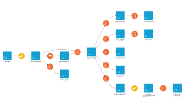
This time the dominant color is orange: the color of the code. The icons of these transformations tell us that the languages used are pig (the little pig's head) and hive (beehive). The datasets live on Hadoop (the elephant).
Now let's select one of the datasets in the pipeline. A bar populated with icons appears on the right.
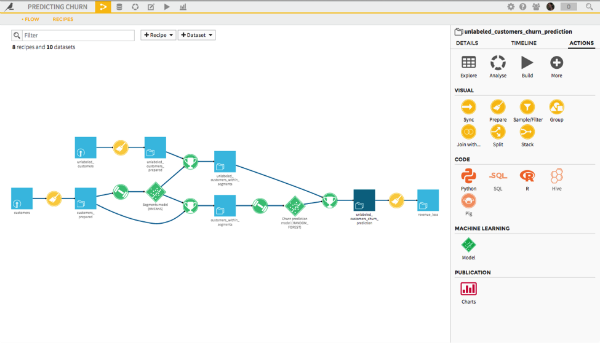
Each Universe With Its Own Color
Here, there are several colors:
-
Yellow, these are the data preparations called visuals. These recipes are used to operate the most common transformations without coding, with a graphical user interface.
-
In orange, there are the different languages which can be used with the studio. We see that Python and R are dark orange. They are active. The dataset selected has its data living on the file system. So we can not use SQL, Hive, or Pig unless we copy this data into an appropriate database. Had they been in Hadoop, all languages would have been active.
-
In green, there is the model icon. It leads us into the analysis module, used to build different models before checking their quality and depositing them into the data pipeline as suitable. Green is the color of machine learning.
-
In red are the items that can be used for communication, such as charts that can be put on a dashboard.
-
At the top, the gray icons present the most standard actions related to this dataset: explore, export, analyze, (re)build, etc.
The bar on the right is available throughout the studio and guides the user by showing the list of actions that are available from the item they are displaying. It makes the user's everyday life easier by filtering out the choices that would be inappropriate and enables new users to be guided while they are building their first predictive application.
In addition to the data pipeline, the tools are stored in worlds that follow also these same colorful conventions. Each world is materialized in the top bar next to the project name for an icon:
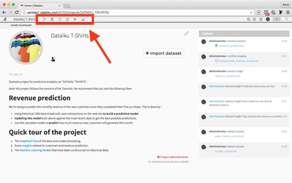
Here, we find:
 |
The world of the data pipeline with transformation recipes. |
 |
The world of datasets. |
 |
The world of analyses in which predictive models are built. |
 |
The world of notebooks (Python, R, SQL). |
 |
The world of application monitoring (a new color!) |
 |
The world where you store all shared items at the end of communications between team members on a dashboard. |
And there you go — it's just as colorful as the map of subway lines but everyone can find their way without having the station list in front of them!