


Some people love surprises and others hate them, but there’s nothing fun about running a predictive model and then getting head-scratching results. In our sample project gallery, we’ve set up a project with a bit of a riddle in the evaluation of the model, and here we’re going to talk about how we can use Dataiku DSS to figure out the riddle before getting a surprise.
The project is pretty simple: we’re trying to predict the energy usage of three different accounts (which we call sites) that consume energy. We have two datasets, one with some info about the three different sites (for example, the first is in the chemical industry and the other two are hotels), and another with energy usage readings and temperature readings every ten minutes for each of these sites.
The data is from 2011 and 2012, and what we’re going to do is join the two datasets, prepare the joined dataset to create some new features, split the dataset into 2011 and 2012 data, and then train a model on the 2011 data in order to predict the 2012 data. Easy, right?
The surprise is that when we evaluate the accuracy of the model, we get wildly different measures of accuracy between the first site and the second two, namely, the accuracy is much higher for the first site. Why could that be?
In order to avoid the surprise, we build dashboards with our prepared dataset, and first we see that the consumption levels of the first site are higher -- much, much higher -- than of the other two sites. Pay attention to the y-axis of this chart: it’s in logarithmic scale, which means that the first site consumes over an order of magnitude more energy than the others. This is interesting, but it doesn’t really explain why accuracies would be so varied among the different sites.
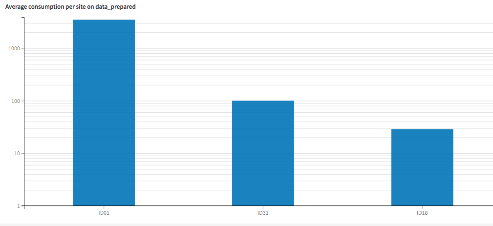
The first site uses about 30X more energy than the second!
The following dashboards provide us our clue: distribution of usage across days of the week and hours of the day is remarkably consistent at the first site and varies significantly at the second two. Of course accuracy will be higher with our predictions for the first site -- it’s much easier to predict a number that rarely changes than one that is constantly changing.
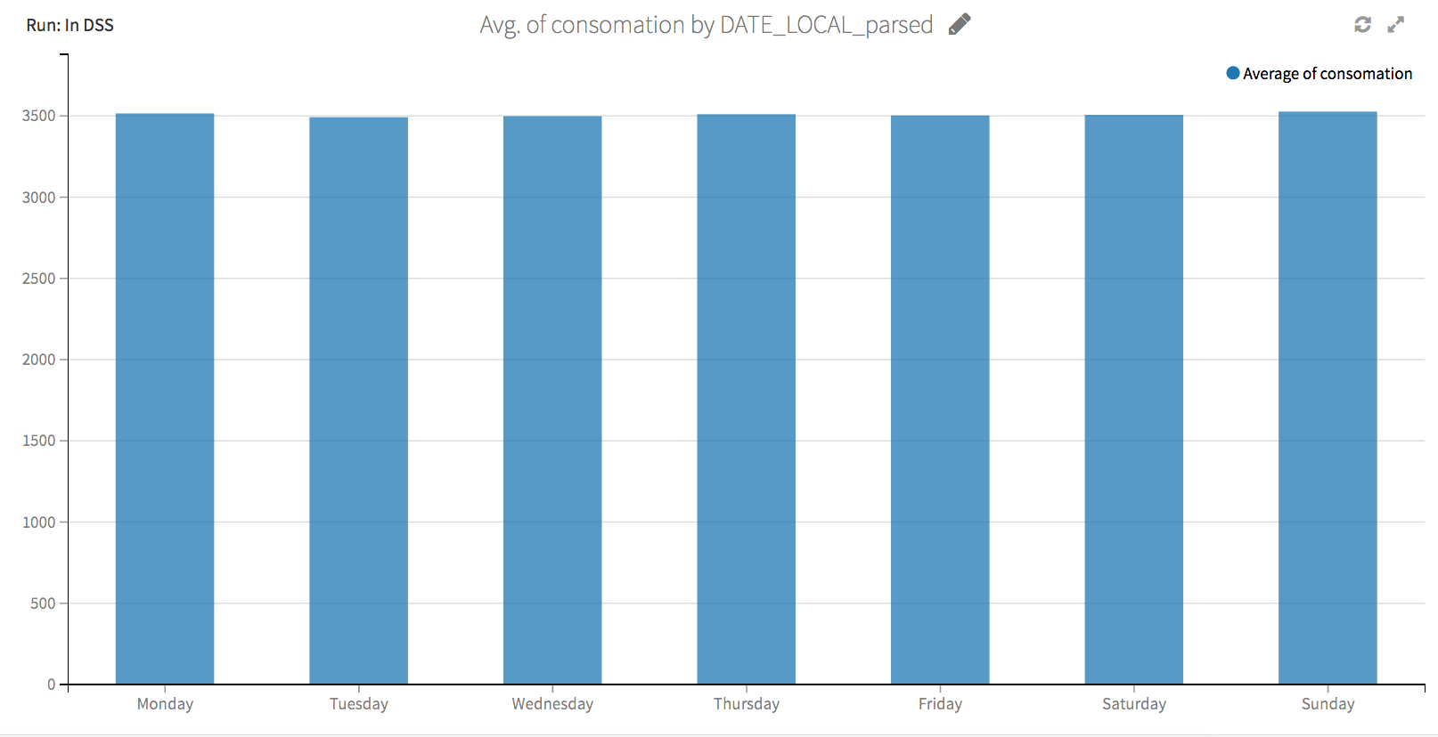
The average energy usage at the first plant is about 3500 every day of the week...
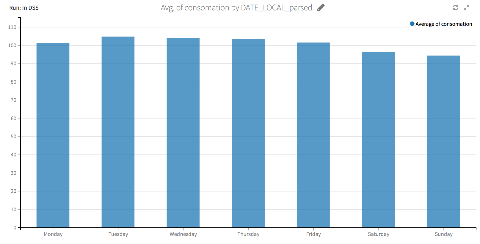
...but at the second plant plant it varies between 90 and 105.
When we built our interactive and customizable dashboards in Dataiku DSS, we did it with the idea of visualizing every step of the process, not only at the end when your analytical work is completed. Dive right into the project and see Dataiku (our Data Science Studio, as we like to say) just as you’d see it if you were a user, and explore the datasets, the predictive model, and the code notebooks. If you want to play around even more, don’t hesitate to download a free edition and import the project directly into your personal Dataiku DSS gallery.