


This is part two of a series of articles, "Deep Beers Playing With Deep Recommendation Engines Using Keras."
Recall that in Part 1 we created two recommendation engine models on top of our data: a matrix factorization model and a deep one. To do so, we framed the recommendation system as a rating prediction machine learning problem. Note: If you haven’t read Part 1, this won’t make much sense so head over here to catch up.
The embeddings are trainable layers, which means that throughout the training, we learn a new dense representation of users and beers. In this part, we will try to explore these spaces by looking at:
- Similarity of beers. What does it mean for two brews to be close in the embedding?
- 2D charts created using the t-sne algorithm for dimension reduction.
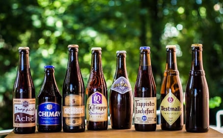 This is what I got by searching "Chimay similar taste beers" on Google images. Can we get something as good? Can you guess what the beer on the right is?
Getting the Embeddings of the Beers
The first thing we need to do is to get these embeddings for all beers, i.e., a table with nb_beers (or nb_users) lines and p columns, with p the dimension of the trained embedding (in our case 10).
Turns out, it’s really simple in our case because our embeddings correspond exactly to the weights of the model. Here is the code for the matrix factorization model:
In the case where the embeddings we want to look at are not directly connected to the inputs (this will be the case in Part 3), it is not possible to extract the embeddings as a weight matrix. It is possible, however, to use the predict function on a model that outputs the embedding layer.
- Line 2 assigns the input of the new model as being the beer one from our matrix factorization
- Line 3 declares the output (here the embedding of interest)
- Line 4 declares a new model with corresponding input and output. This allow us to run a forward pass in the network graph to get a layer values.
- Line 6 runs the prediction on all distinct beers.
Now that we have gathered the representations, let’s explore them.
Similar Beers
The first thing we can do is to visualize whether the distance between two beer embeddings makes sense. Are IPAs close together? Are they closer to APA than to Pilsner ? More precisely, we are going to check the closest beers to a given list to see if it matches our expectations. I chose the following beer list (“Description” field might reflect personal opinions).
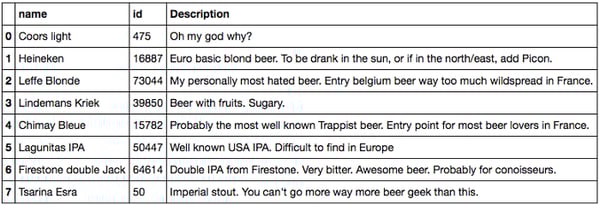 List of beers we are going to analyze
I wanted to have the most diverse list in terms of style, taste, and ABV (light, fruit, Belgium, IPA, imperials, etc.) containing beer I knew. In what follows, I used the cosine similarity score, but I got similar results with euclidian distance. The code to perform this calculation can be found in my notebook.
Matrix Factorization Embeddings
Let’s have a look at the 10 closest beers to each one on the list, starting with the ones with low ABV.
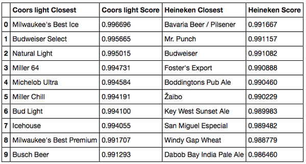
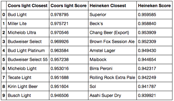 Cosine similarity closest beers to Coors Light and Heineken
- For Coors Light, we do pick up similar light beers, as well as the Budweiser assortment, which makes sense.
- For Heineken, the results match our expectations. We find mostly blond lagers from all over the world: Birra Peroni from Italy, Asahi from Japan, Beck’s from Germany, Sol and Superior from Mexico, or Amstel from the Netherlands (and actually, Amstel belongs to Heineken). It’s interesting to see that most of these beers are not from the United States even though equivalents exist. This is because our users are mostly from the U.S., so Heineken is consumed there as a foreign beer, leading to a high similarity to other foreign beers.
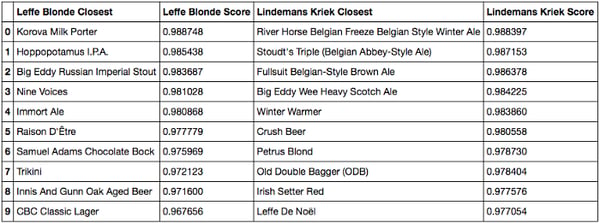 Cosine similarity, closest beers to Leffe and Kriek
- For Leffe, the results are less interpretable. It seems to be consumed along other styles of beers like IPA or Stout though it’s a classical Belgium beer. If all users were French, we would probably find Grimbergen or Affligem instead.
- For Lindermans, the results are not that good either. We find that it’s associated with some winter or Belgium beers (Petrus for example), but we totally miss the fruit idea. My interpretation is the following: the hypothetic segment of people who would like this kind of fruit beer and only this one are not prone to rate beers on a website. So the fact that we do not find a fruity cluster may come from our user bias, again. Because people rating beer on the internet do not just like one kind of beer.
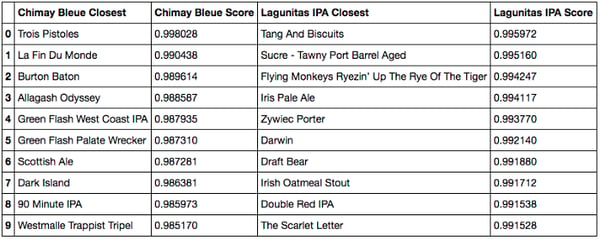
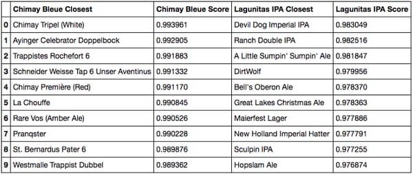 Cosine similarity closest beers to Chimay Bleue and Lagunitas IPA
- Chimay is different. The matches make a lot of sense, and our results match the ones from Google images. First, because we propose the two other Chimays (blue and white). Then, because we also happen to find other Trappist beers (Rochefort, Westmale) or Belgium beers (Chouffe, St Bernardus). From my perspective, recommending these beers to a Chimay drinker would indeed be relevant … unless it’s way too obvious.
- I’ll let the American beer fans comment on the Lagunitas. I know the Sculpin, which seems like a good match, but my American IPA culture is not strong enough. We do see mostly American IPA and Ales though, which seems consistent.
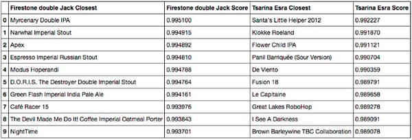 Cosine similarity closest beers to Firestone Double IPA and Tsarina
- Finally, for the Firestone double IPA and the Tsarina Esra, we find mostly beer geek beers: double IPAs, imperial stouts and unusual beers.
Conclusion: Overall, we do have a good match between a beer and its neighbors. It is possible to check the euclidian distance instead of the cosine similarity, but the results are very similar. The unexpected behaviors (like the one of Leffe) seem mostly due to the bias of the dataset, since most users are American. Another bias that we should be aware of is the fact that most users are likely to be beer geeks, and thus the Coors Light-types of beer will (on average) get low ratings.
Deep Model Embeddings
What happens if we now check the embeddings retrieved by a deeper model? Since the performance is better, we should have better embeddings… right? Wrong! Here it comes:
 Cosine similarity closest beers to Coors Light and Heineken
 Cosine similarity closest beers to Chimay Bleue and Lagunitas IPA
When restricting to the beers that were working the best previously, we see that the ranking makes less sense. While it is still good for Coors Light and correct for Heineken, the results worsen (at the interpretation level). For Chimay, we lost the Chimay beers, one of the trappists and got IPAs instead. For Lagunitas, we recommend fewer IPAs and more malty beers.
It is not perfectly clear why the embeddings show less intuitive results. This is probably because introducing the dot product forces two beers rated the same way to be close regarding the euclidian space, whereas we have no such guarantee for the deeper model.
Now, let’s see if we get similar conclusions using the t-sne dimension reduction technique.
T-sne of the Embeddings
Basically, t-sne is a dimension reduction technique (a bit like PCA, in a non-linear way) that helps you visualize your data in 2D or 3D. There has been a lot of hype around t-sne algorithm. Mostly because it helps generate nice charts, even if sometimes they may lack interpretation (see below). For more on how to use properly the algorithm, check this nice distill article or the original paper.
But back to our beers: we want to check wether we can find structure in the embeddings created by our models. Will Belgium beers be close together ?
Matrix Factorization Model
I used scikit-learn to produce charts of the embeddings.
Notice that I perform the t-sne on a “small_embedding.” This is because the algorithm does not scale very well with the number of lines, so I had to restrict myself to a random sample of 10,000 beers.
I got this very nice chart:
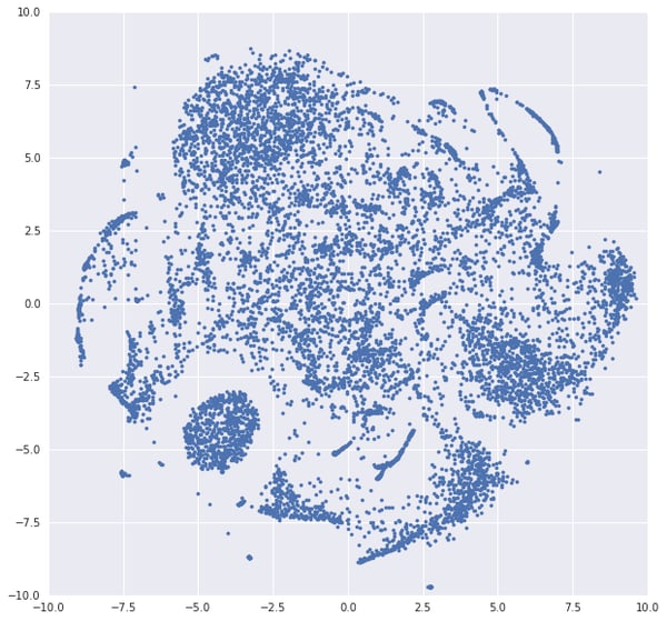 T-sne representation of the beers embeddings
Wow! I know what you think. This t-sne chart looks fine! And you may think at first that we have here very structured information with well-separated clusters. Maybe the oval cluster is mostly composed of pale ales? Turns out, it is not possible to correlate any of these shapes with a style or origin of beer (trust me I tried). I manually checked some areas and was not able to make sense out of it.
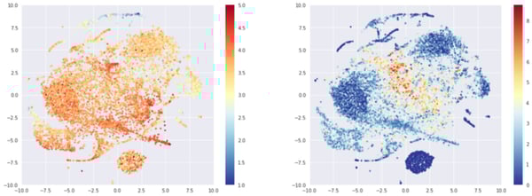
In fact, the structure that we have is mostly driven by two axes: the average rating of the beer and the number of times it has been rated. Below, the left graph shows the same data colored by average rating. We see on the left side a cluster of poorly rated beers (mostly American lagers) and some red of yellow clusters (top, center, bottom).
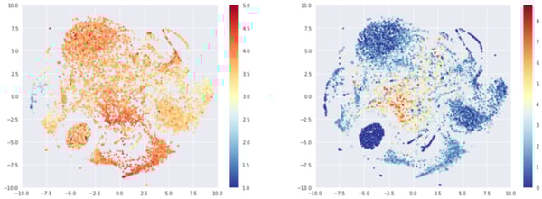 T-sne representation of the beers embeddings, colored by average rating (left) or log of number of times rated (right)
The second charts shows the t-sne representation colored by the log of the number of times the beer was rated. We can see that at the center of the map lies the most popular beers, while the round cluster on the bottom left consists of beers that were rated only once.
The exact same effect appears if we look at the user embeddings.
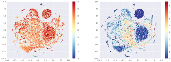 T-sne representation of the user embeddings, colored by average rating (left) or log of number of times rated (right)
Interestingly, we get the 1 rating cluster again. It would be interesting to dive into the math of this. This may be due to the fact that beers rated only once and by a user who left only one rating cannot be linked to any other beers and are therefore, in a way, interchangeable with each others. Which could mean close, in our space. It could also be due to a t-sne artifact.
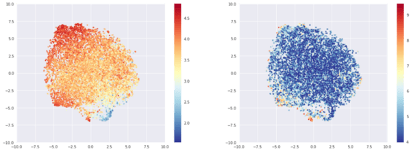
If instead of choosing 10,000 random beers, we’ve now chosen the 10,000 most popular beers in terms of records. The structure disappears, and we get a big blob with an almost linear rating gradation.
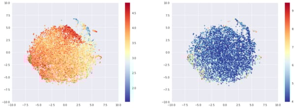 T-sne representation of the most rated beers embeddings, colored by average rating (left) or log of number of times rated (right)
Again, no obvious structure appears when comparing the coordinates and metadata (such as origin or style of the beer) except if we look at Imperial stouts or light beers, but these styles are highly correlated with average rating.
Dense Model
Since we saw in the closest beer section that the dense model embeddings were less likely to be interpretable, we expect similar results here. Indeed, for 10,000 random beers we got (below) the same structure with a cluster of beers being rated only once. There is also a linear average rating effect a bit perturbed by t-sne artifacts.
 T-sne representation of random beers embeddings, colored by average rating (left) or log of number of times rated (right)
If we choose instead the 10,000 most rated beers, we observe again a big blob, driven by average rating.
 T-sne representation of the most rated beers embeddings, colored by average rating (left) or log of number of times rated (right)
Again, no correlation between metadata and t-sne position can be found. Except for variables obviously correlated with average ratings (imperial IPAs and stout are well rated, light beers are not). For example, position is highly correlated with ABV (because of ratings average).
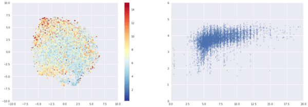
Left: t-sne colored by ABV. Right: x axis is ABV, y axis is rating.
Conclusion
It is fairly easy to visualize embeddings using Keras. By looking at closest beers and t-sne representation, we found that:
- Dot layer seems to improve interpretability of the embeddings (similar beers make sense). On the contrary, using deep model leads to less interpretable embeddings. This is probably due to the fact that dense models do not rely on the euclidian distance at all.
- T-sne representations are mostly driven by average rating and number of ratings. I conjecture that the number of ratings is an artifact from training with little information coupled to the t-sne algorithm.
- Overall, we do not find expected style or origin clusters like double IPA, Belgium beers, or fruit beers. Instead, the biggest driver is the average rating. My interpretation is that this is due to our beer geek user bias. The users will tend to drink every style (sour, ipa, porter, etc.) and rate beers not based on style but on their intrinsic goodness. In other word, we do not really have observable taste clusters in our dataset. This phenomenon might be enhanced by the geography frontiers, i.e., people rating available beers in their geography.
- Another limit to acknowledge is my restricted knowledge of American beers, leading to poor results interpretability. If you have any insights on the beer lists we retrieved, feel free to share.
That’s the end of part 2! Since we could not retrieve style or origin insights from the embeddings, we can wonder if it would make sense to add this knowledge in the model in a content-base-filtering-kind-of-way. If you want to learn more about and hybrid recommendation engines and grid searching the network architecture, check out Part 3 (to come).
Cheers!